Overview
LifestyleFeatures
May 2025
Typography as Direction: Choosing Fonts for Film & Web
UC3
y23
Company
oracm
Year
2023
Synopsis
orcam hear-Designing for a Disability People Hide
Background
OrCam Hear, released in 2023, paired AI earbuds with a mobile app to isolate a single speaker's voice and suppress background noise in real time — assistive technology for people with hearing difficulty. I led the research and interface design for the mobile app that controlled it. I came into the project to answer one question the hardware team couldn't: how does someone actually operate this in the messy, social, real-world situations where hearing loss matters most?
Deliverable
User interviews
Information Architecture
Wirframes and components Usability testing
Concept exploration
Credits
Sarai Beris: Product Design
Typography as Direction: Choosing Fonts for Film & Web

About
Tags
Saas B2B
Position
Design, Research
Year
2025
OrCam Hear used AI earbuds to isolate a single voice and suppress background noise in real time, but the real design problem wasn't acoustic — it was social. Research showed people used it in restaurants and family dinners, where the cost of visibly managing a hearing problem felt higher than the cost of mishearing. I designed an interface operable without looking or interrupting, built on a spatial "room" metaphor that let users place speakers in or out the way they already described their world.
The Premise That Sounded Simple
When the Data Had the Wrong Audience
Let's start with the basics. What was OrCam Hear, and what were you asked to design?
OrCam Hear was a wearable — AI-powered earbuds — paired with a mobile app. The technology underneath was genuinely impressive: using machine learning to isolate the voice of the person you're talking to and reduce everything else in real time. Competing conversations, ambient restaurant noise, background music.
The hardware could pull a single speaker out of chaos.My brief was to design the mobile app that gave users control over that capability. On paper, it sounded like a clean assignment — build the interface that lets someone choose which voice to amplify and adjust their hearing to the situation. A control panel for the ears, essentially.
I came into it with the same assumption you'd probably make. That this was fundamentally an audio problem with a UI wrapped around it — sliders, toggles, signal controls. Make the powerful technology accessible through a clean interface, and you're done.
That assumption lasted exactly as long as it took to do the research. Because the moment I started looking at when and where people actually used this, the problem stopped being about audio at all.
"The real problem was never 'this person can't hear in a noisy room.' It was 'this person can't hear in a noisy room and doesn't want anyone at the table to know.'"
When the Research Changed the Subject
What did you find when you studied how people actually used it?
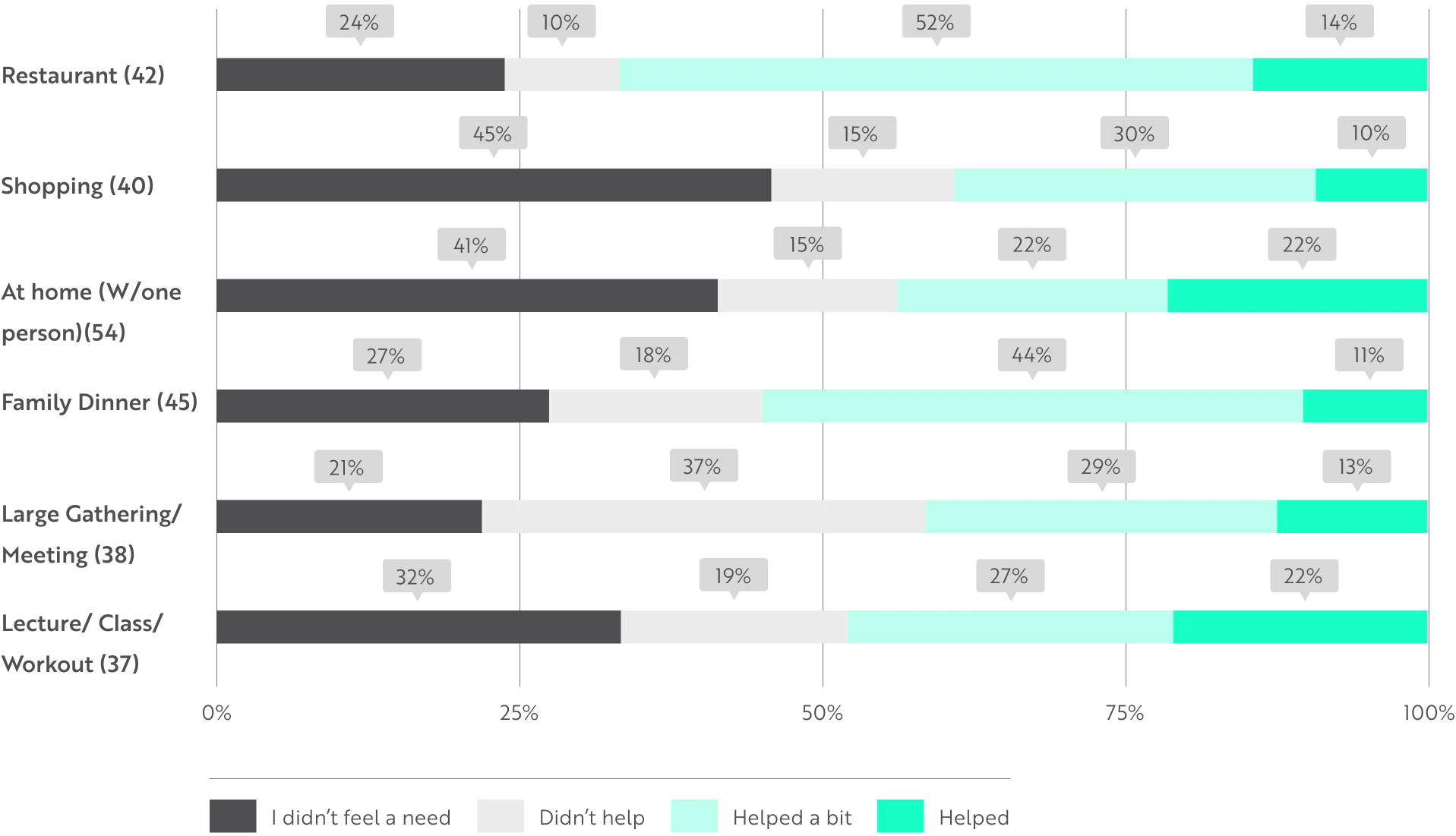
The first thing was the context. People weren't using this alone in quiet rooms, where hearing aids generally work fine anyway. They were using it in exactly the hardest situations — family dinners, restaurants, group conversations at work.
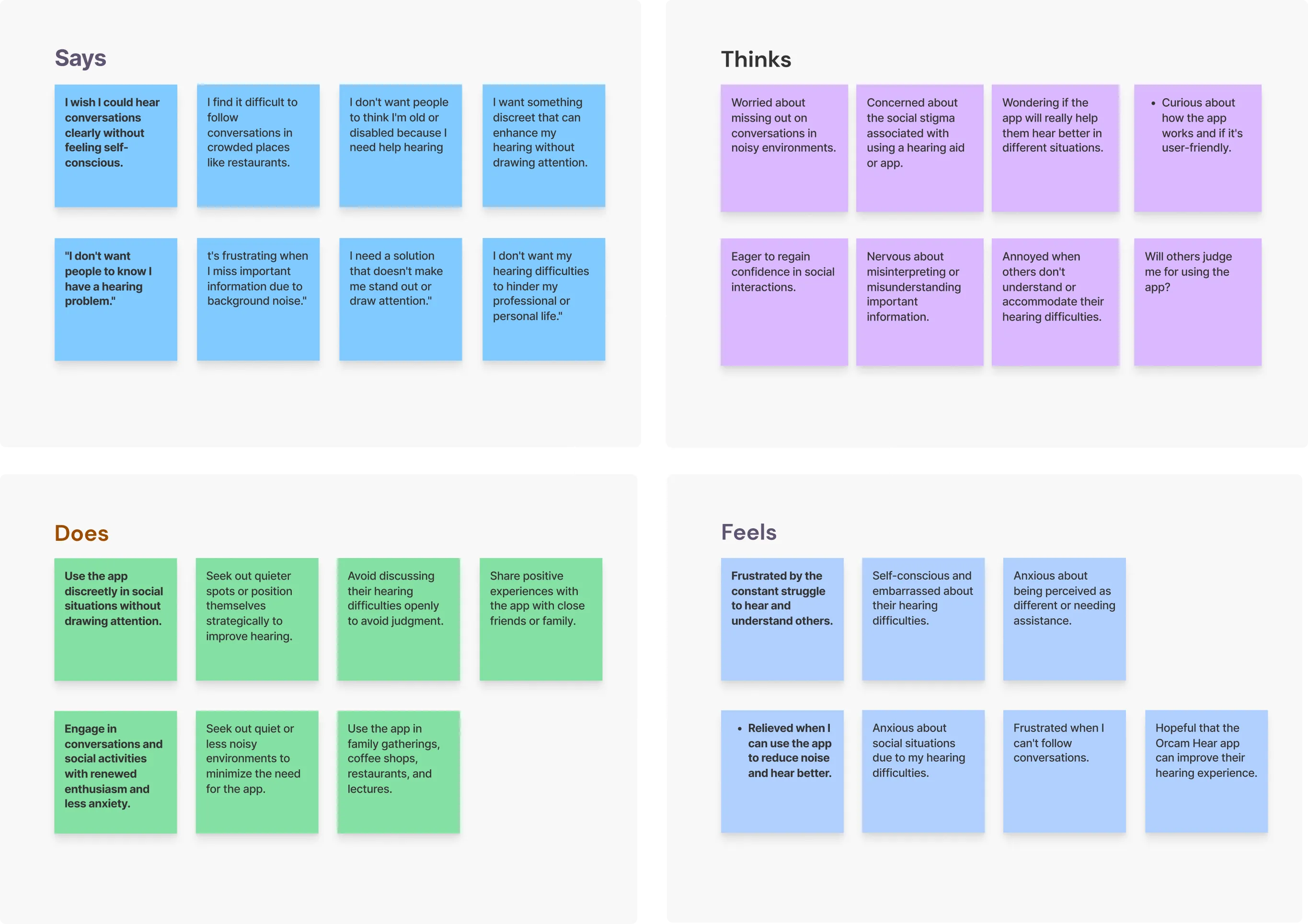
Crowded, unpredictable, acoustically messy environments where several people talk at once.The second thing was more important, and it reframed everything. Users were embarrassed. Hearing loss is a disability people actively hide. They've spent years developing invisible workarounds — positioning themselves to read lips, choosing the seat that puts their good ear toward the table, asking people to repeat things while pretending they were just distracted. The struggle is real, but the performance of not-struggling is just as real.
So the actual problem was never "this person can't hear well in a noisy room." The real problem was "this person can't hear well in a noisy room and does not want anyone at the table to know it." If I'd only designed for the first version, I'd have built something technically correct and socially unusable.
That's the moment the project changed subject for me. It stopped being an audio-controls problem and became a problem about dignity — about how to give someone power over their hearing without forcing them to announce, in front of other people, that they need it.
"The obvious pattern for 'select a speaker' is a list. But you can't look down, read, and tap precisely while holding eye contact mid-sentence. The one obvious solution was the one I couldn't use."
Mapping the Moments of Friction
How did you translate that insight into an actual design process?
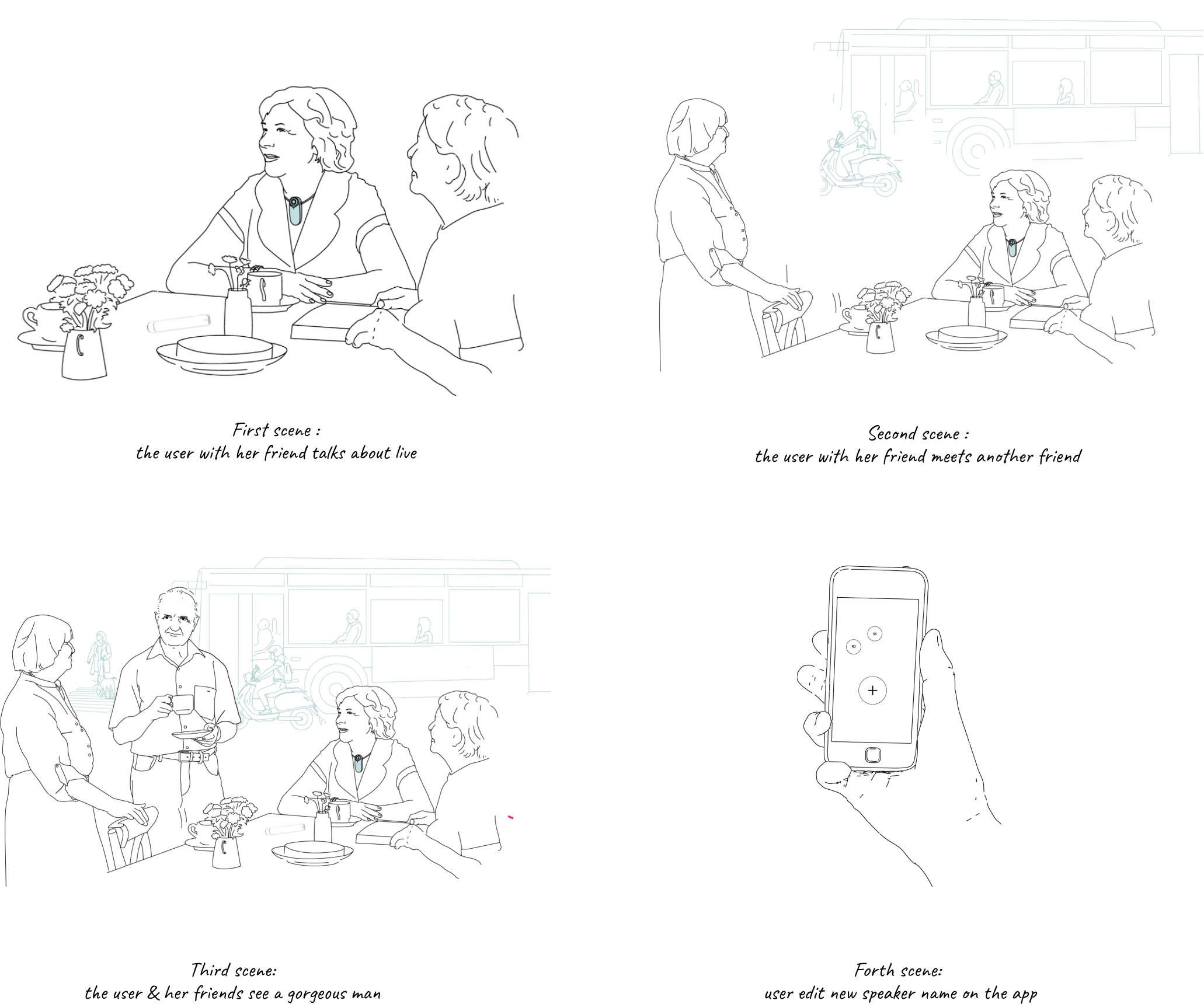
I mapped the user journey not as a series of features, but as a series of social conflict points. Every specific moment where the hearing difficulty created friction inside a social interaction. Not the audiological gap in isolation — the lived experience of sitting at a table and losing the thread of the conversation.So I'd lay out the real situations. Arriving at a loud restaurant and needing to set things up before you even sit down.
Being in a group where three people are talking and you have to pick whose voice to lock onto. Moving from a quiet indoor room out onto a noisy street, where the entire acoustic profile flips in a second. Each of these became a discrete design prompt with its own constraints.
The governing constraint across all of them was the same brutal one: the user's hands are occupied, the conversation is happening in real time, and they cannot be seen managing a device.
So whatever control I designed for each conflict point had to be operable almost ambiently — without stopping the conversation, without staring at a screen, without breaking eye contact with the person across the table.That constraint killed a lot of otherwise reasonable design ideas. Any solution that required opening a menu, reading options, and making a careful selection was dead on arrival. You don't get to do that mid-sentence with another human watching your face.
"Nobody says 'speaker two is generating excess signal.' They say 'she's across the table.' The spatial language was already there — the interface just had to listen to it."
AS
Componenets Highlights
RD
After many iterations, we chose the most intuitive flow, even though it offers fewer features.
"People will choose to keep struggling silently over being visibly accommodated. That's not irrational — it's social cost weighed against functional benefit."
The Hardest Gesture to Design
What was the single most difficult interaction to solve?
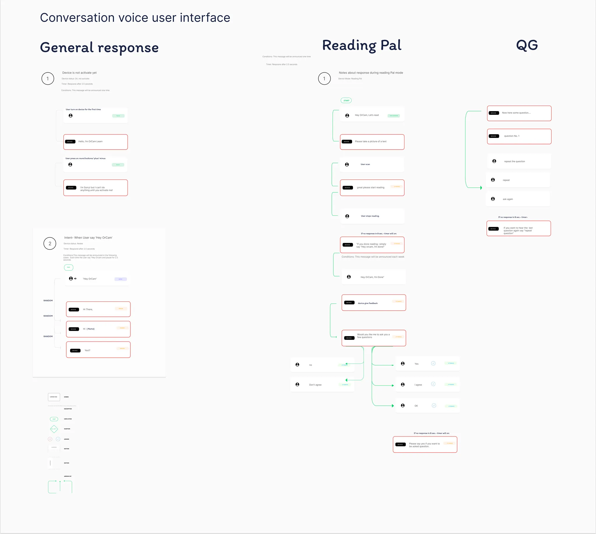
Selecting which voice to amplify, without looking at the screen. That was the core action of the entire product, and it ran directly into the constraint I just described. The user needs to choose a speaker — but the moment of choosing is exactly the moment they're mid-conversation, holding eye contact, unable to be seen fiddling with a hearing aid.
A normal app would solve "select a speaker" with a list. Tap the name, done. But a list requires you to look down, read, and tap precisely — three things you can't do while nodding along to what someone is saying to your face. The obvious interaction pattern was the one thing I couldn't use.
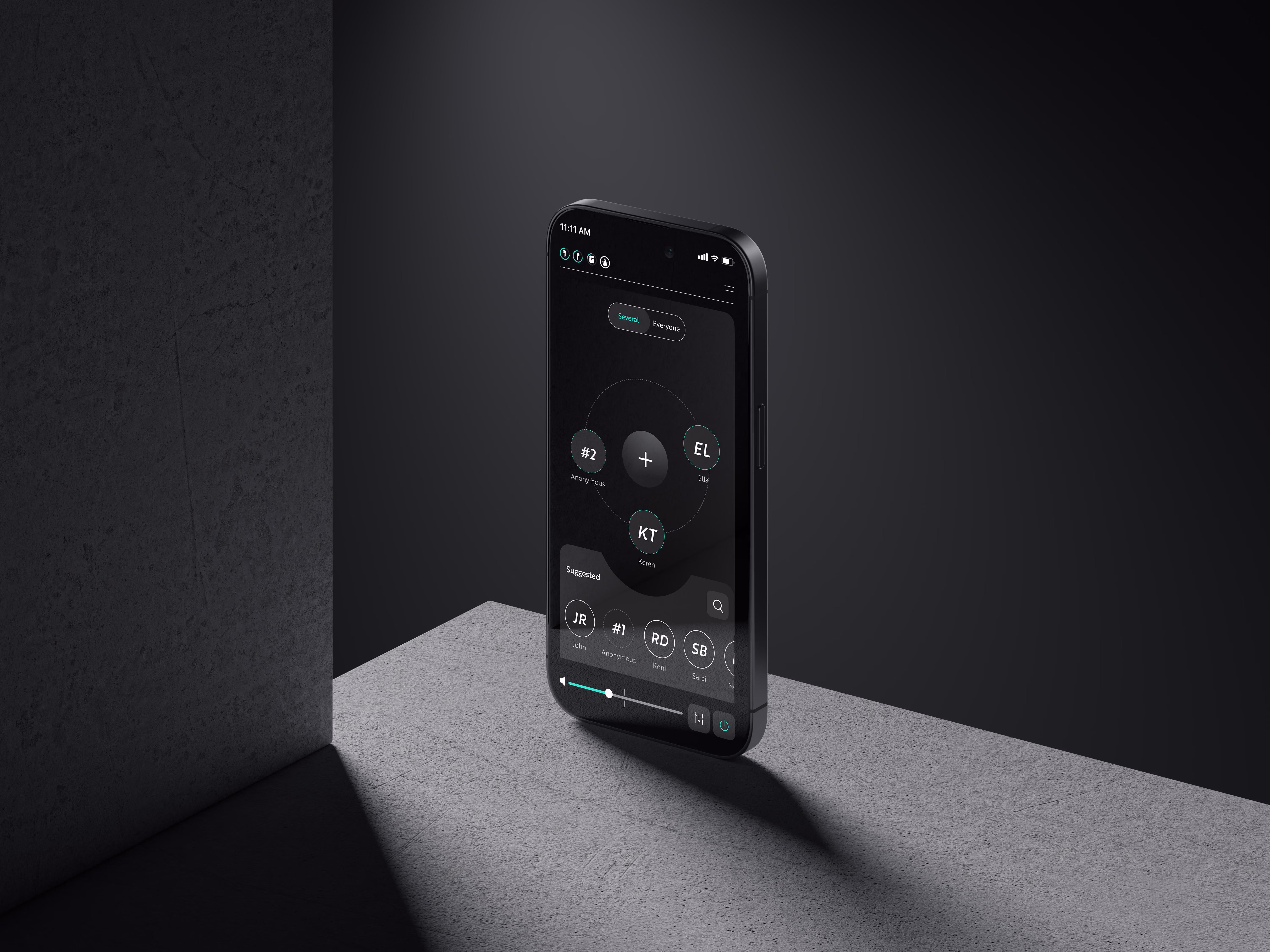
This is where I had to stop thinking like someone designing a settings screen and start thinking about how people already understand the situation they're in. And that led to the part of the project I'm most proud of — the spatial model.I noticed that users never described their problem in technical terms. Nobody says "speaker two is generating excess signal.
They say "she's across the table" or "that conversation behind me is the problem." The spatial language was already there, fully formed, in how they talked about their own experience. The design just had to listen to it.
"Embarrassment was a design material, as real as the audio signal. The best accommodation is the one nobody else in the room can see."
Heading
Tell me about that spatial model — the "room" concept.
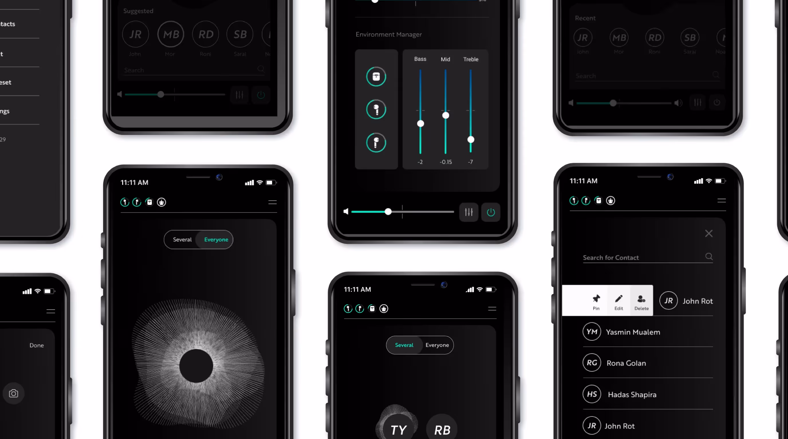
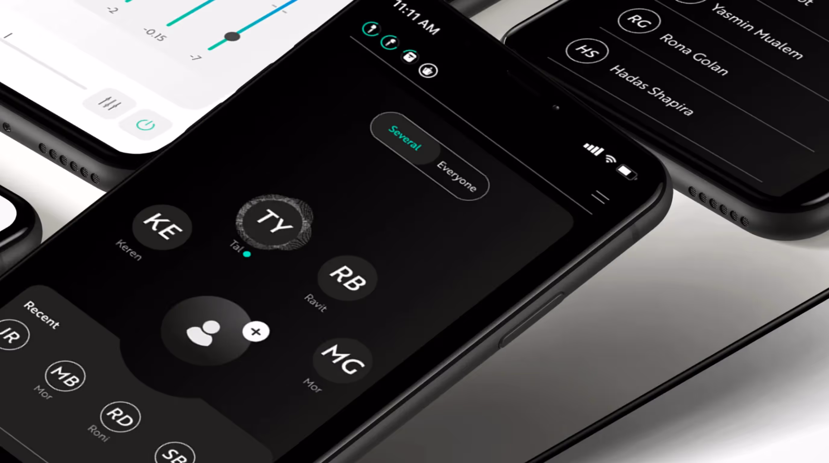
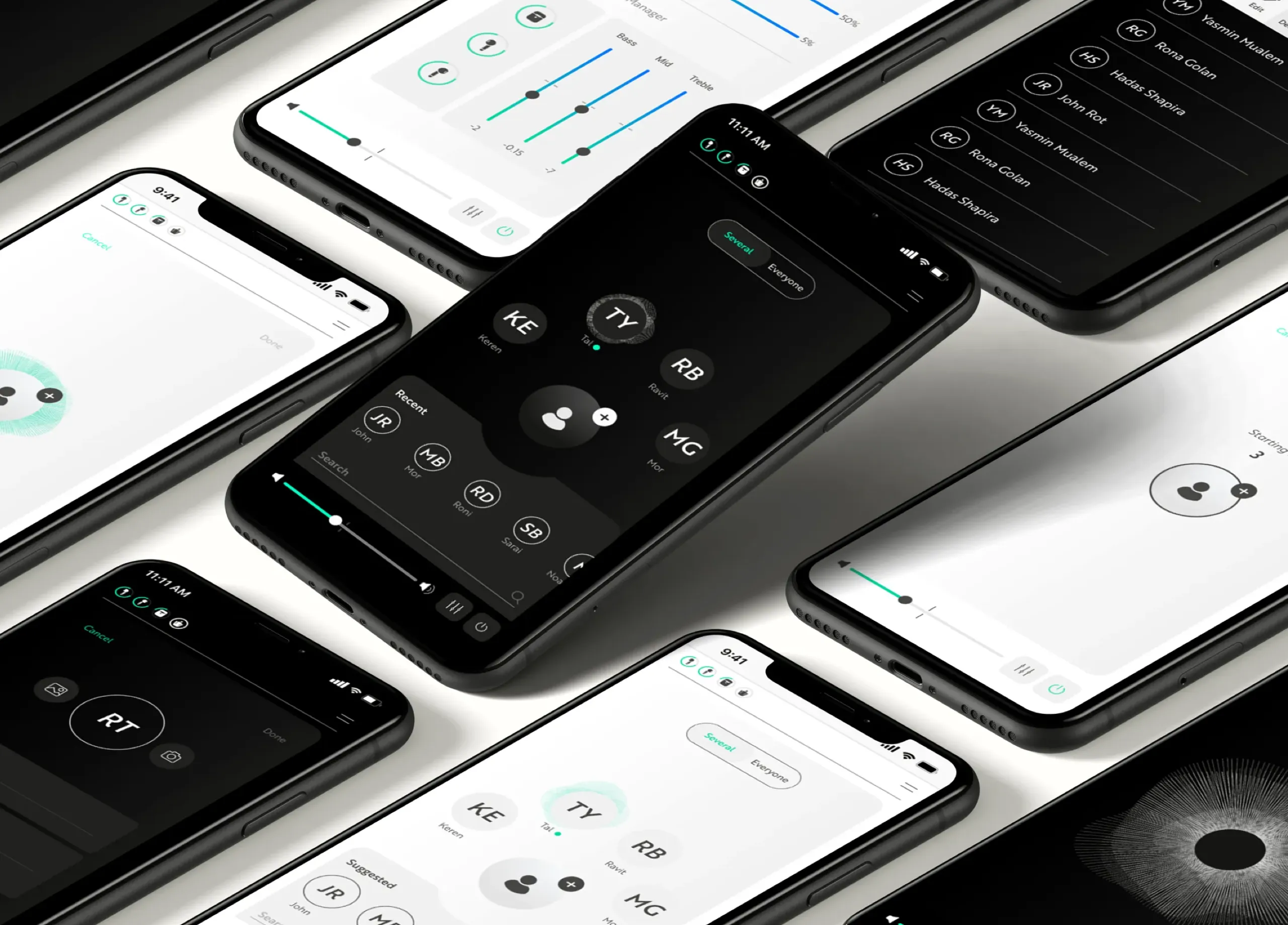
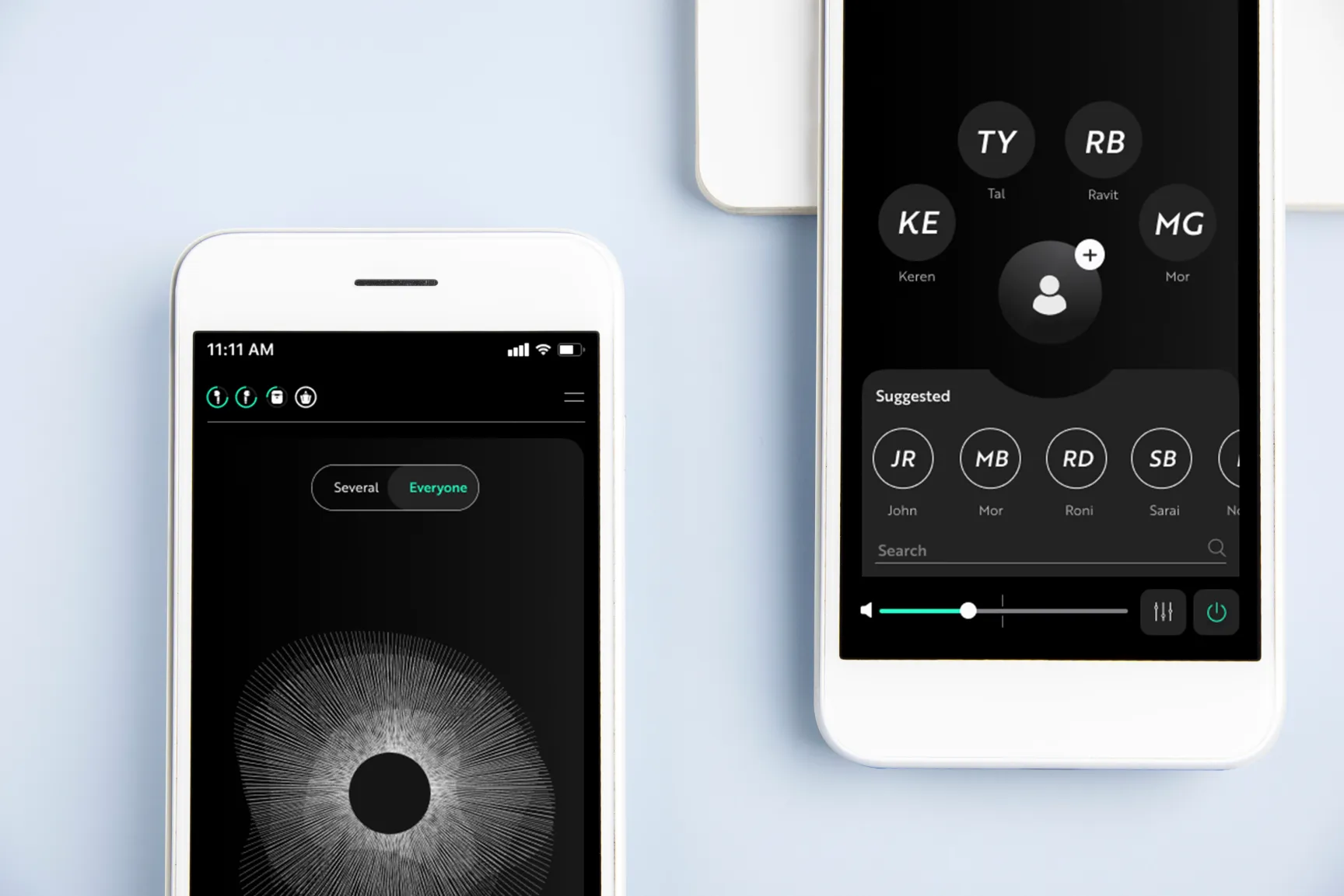
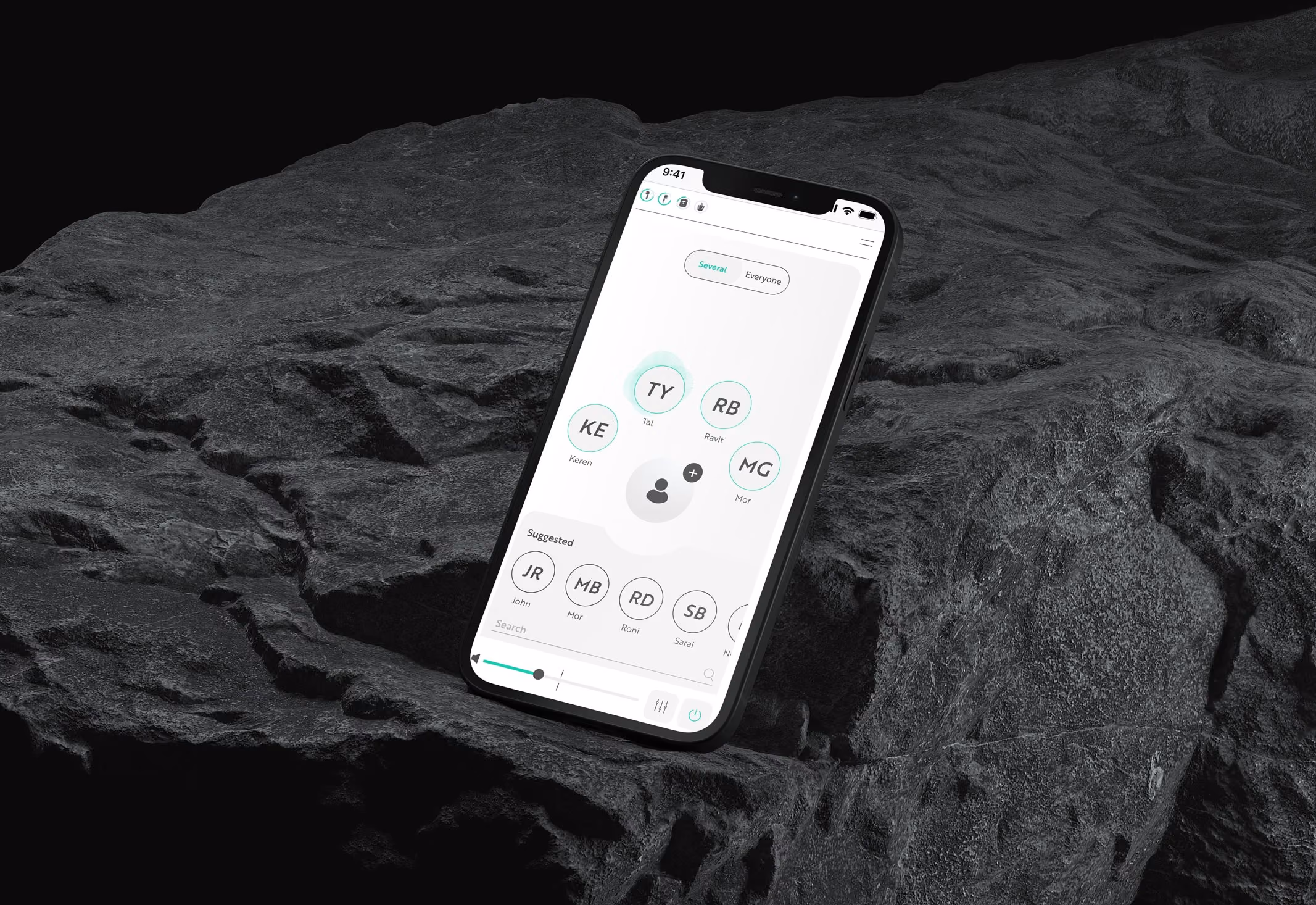
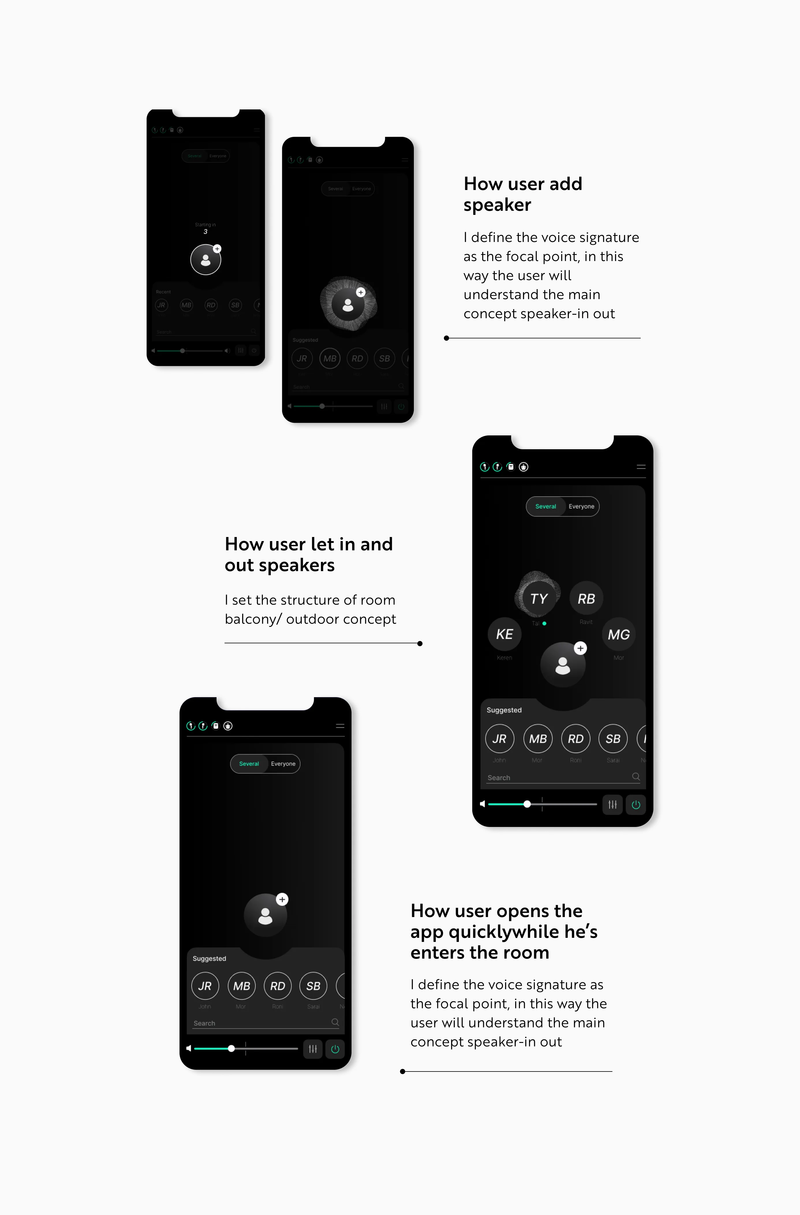
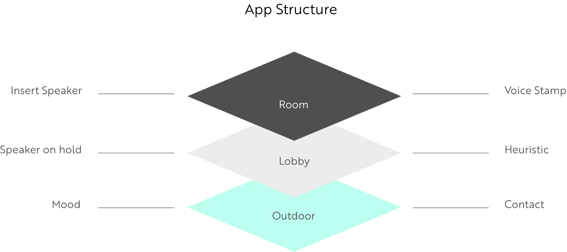
The idea was to let users place people in a visual representation of their actual space, and assign each one a hearing priority just by where they sat in that space. The person directly in front of you — in. The loud table behind you — out. A colleague joining the group — drag them in. It turned an abstract signal-processing operation into something that matched how people already mapped the room in their heads.
The mental model I anchored everything to was "speaker — in/out." That single concept did a lot of work. Instead of asking users to understand amplification levels and noise gates, I asked them to understand something they already knew intuitively: who's in my conversation, and who's just noise around it. The voice signature became the focal point of the whole interface.
I extended it with an indoor-outdoor idea — a room versus a balcony. Moving from inside to outside is one of the most disorienting transitions for someone with hearing difficulty, because the entire soundscape changes at once. So I wanted a single gesture that reconfigured for that shift without making the user consciously diagnose what had changed about their environment.The deeper principle was that the interface should disappear into the situation rather than sit on top of it.
Someone using OrCam Hear at dinner shouldn't feel like they're operating a piece of medical equipment. They should feel like they're having dinner — and the technology should be doing its work quietly underneath that.