Overview
LifestyleFeatures
May 2025
Typography as Direction: Choosing Fonts for Film & Web
UC4
y21
Company
orcam
Year
2021
Synopsis
Parents felt judged by performance metrics they couldn't act on, so I replaced them with effort analytics — because you can't tell a child to score higher, but you can tell them to practice fifteen minutes a day.
Background
Alongside the OrCam Learn school dashboard, the same reading device needed a companion mobile app aimed at parents of children with ADHD and dyslexia using it at home. I was the UX designer responsible for research, information architecture, and wireframes. I joined because the device produced clinically meaningful data, and the open question was what that data should become when the person holding the phone was a parent rather than a trained educator.
Deliverable
User interviews
Information Architecture
Wirframes and design
Design System
Front-end develpment for usability
Concept exploration
Credits
Noa Elbaz: Product design
Michael Druker: Product Manager
Typography as Direction: Choosing Fonts for Film & Web

About
Tags
Saas B2B
Position
Design, Research
Year
2025
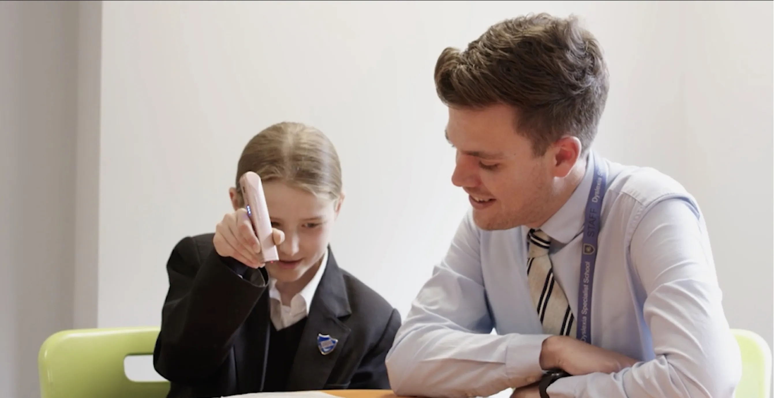
The OrCam Learn device read text aloud, asked children comprehension questions, and quietly measured how they engaged with written material over time. For a teacher, that data was a professional instrument. But the same device sat in living rooms, and the same numbers landed in the hands of parents who loved their children and had no idea what a comprehension score meant. This is the story of designing for that gap — and of learning that giving someone less can be the most respectful thing a product does.
Two Apps, One Device
When the Data Had the Wrong Audience
Let's start with the setup. Why did the same device need a separate app for parents at all?
The OrCam Learn device was used in two completely different settings. In schools, teachers used it as part of structured learning, and they had a web dashboard built around professional interpretation. But the device also went home with families — children with ADHD and dyslexia using it for reading practice outside the classroom. And parents needed something too.
The instinct early on was that this was basically the same product with a friendlier coat of paint. Same device, same data, just make the parent version a little simpler. Take the teacher dashboard, soften it, ship it. That was the assumption I started with, and it was wrong in a way that took research to see.
My role was research, information architecture, and wireframes — figuring out what the parent app actually needed to be. And the first real question wasn't visual at all. It was: what does a parent genuinely need from this device, and is it the same thing a teacher needs? Because if it's the same thing, you build one product. If it's not, you've got two.
It turned out to be two. Not because parents are less capable than teachers, but because they stand in a completely different relationship to the same information. And that relationship — not the data — is what I had to design for.
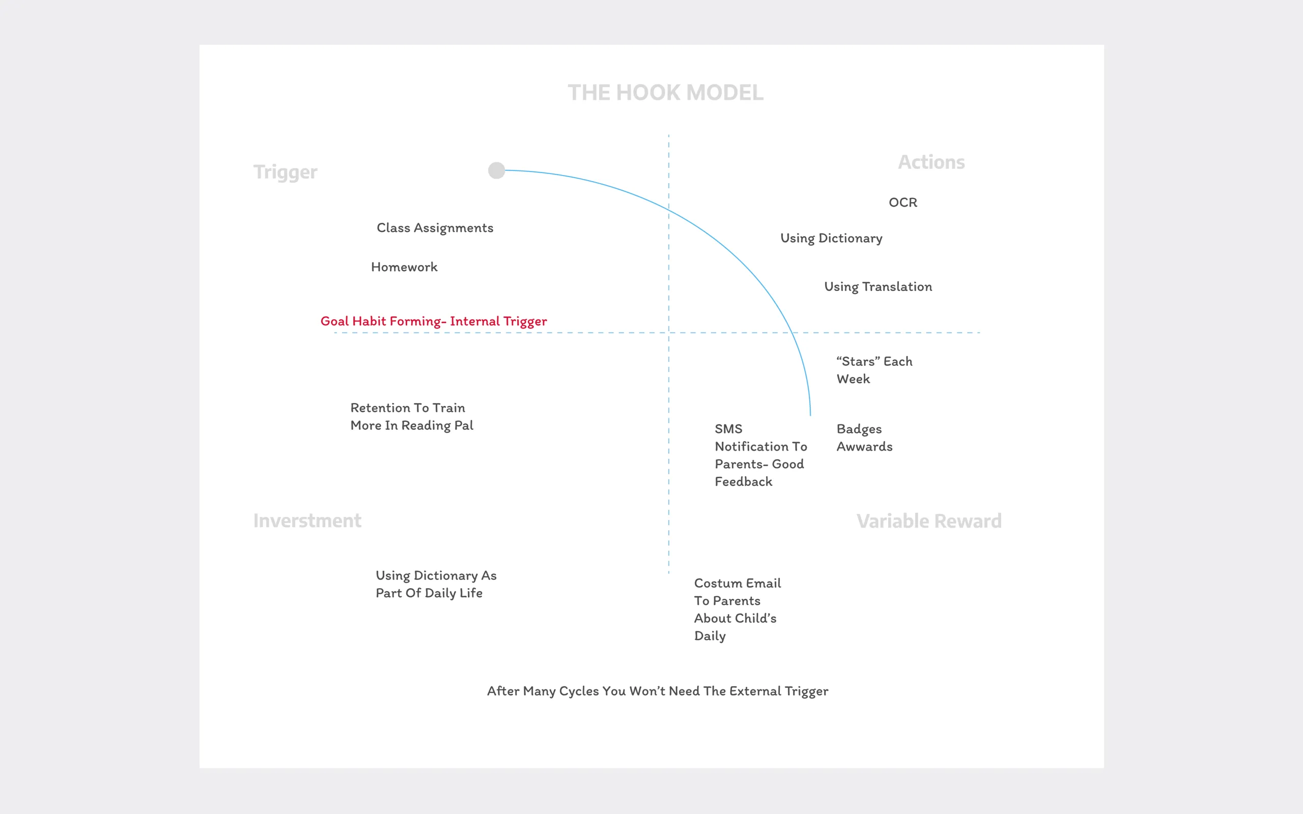
"You can't tell a child to score higher. But you can tell them to practice fifteen minutes today. Effort is within a family's control. Performance isn't."
The Conceptual Problem Before the Design Problem
You've said you started this project conceptually, before touching any screens. What were you thinking about?
Before I designed anything, I sat with what this device actually does, philosophically. OrCam Learn lets a child hear text instead of decoding it themselves. And that raises a real tension that I didn't want to gloss over — the question of functional independence.
Any assistive technology carries this conflict: you're helping someone accomplish a task, but you might also be replacing the very skill you're supposed to be building.
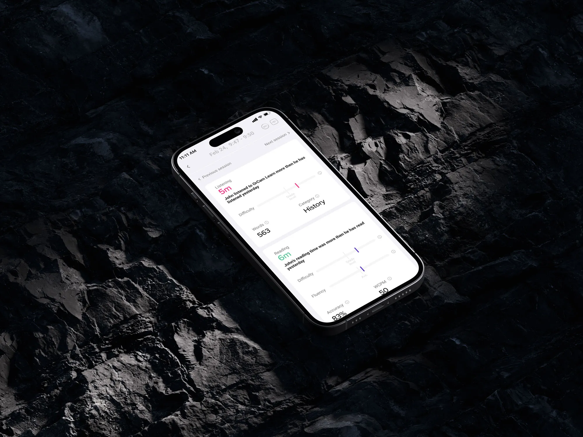
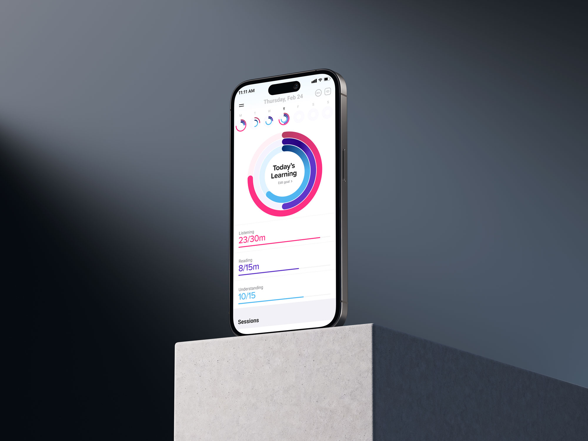
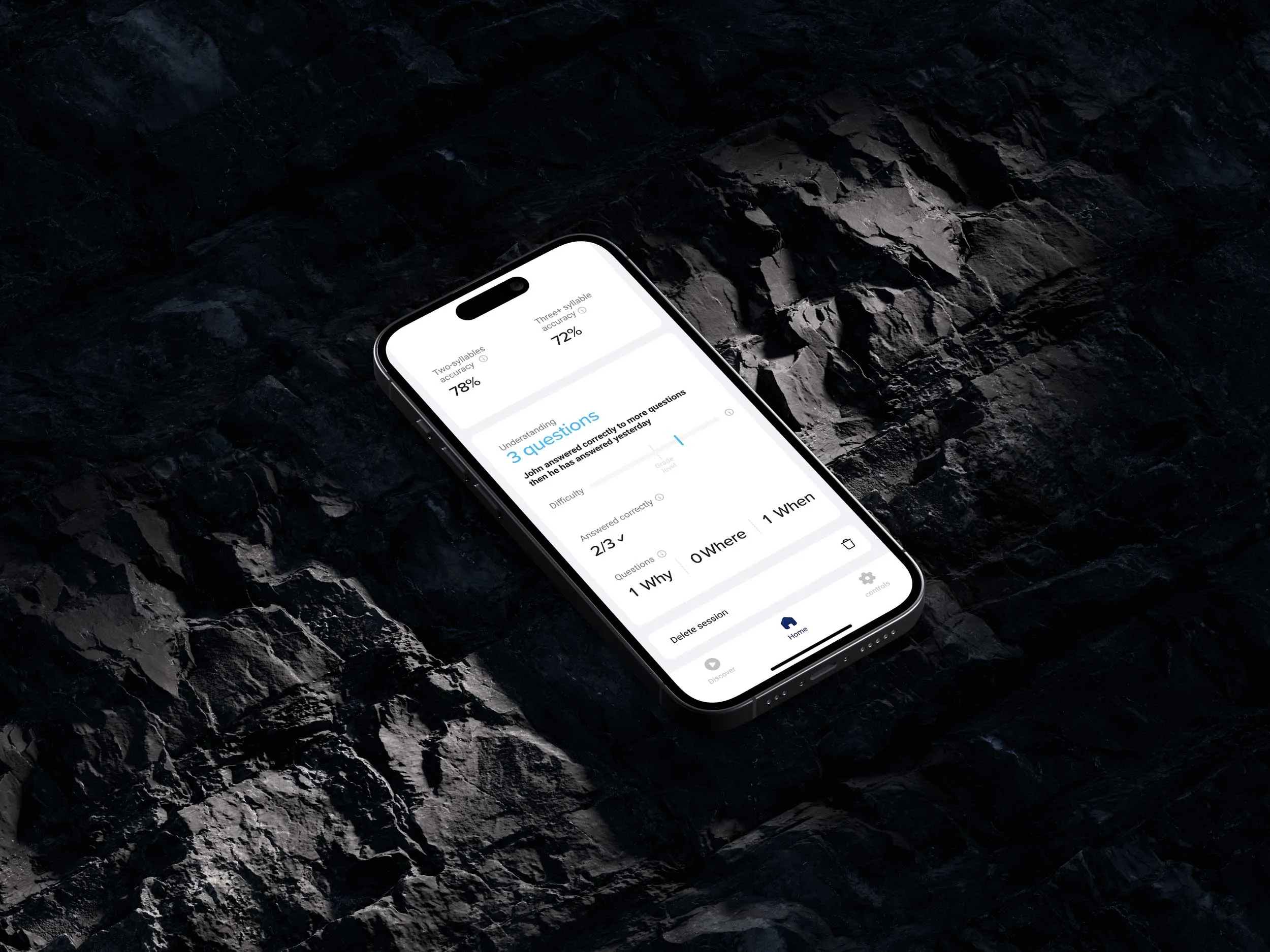
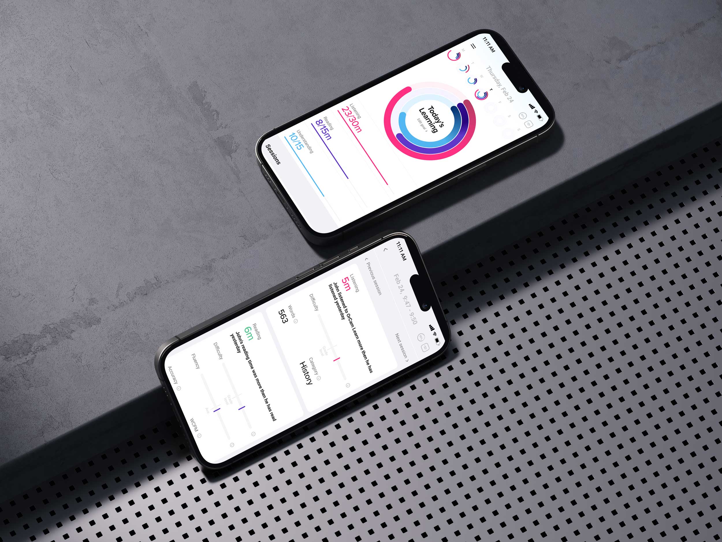
I mapped the child's activity with the device into passive and active modes, and as I did, I realized there were three levels of learning happening: listening, reading, and understanding. Understanding was the real output — the thing that actually mattered. Listening and reading were the means. And understanding is what links passive consumption to active learning.
That mattered because it told me what the product's core value actually was. It wasn't "the device read a page." It was "did the child understand it, and are they building toward doing it themselves." Any design that celebrated mere usage — look how many pages were read aloud — would be measuring the wrong thing and possibly encouraging dependency.
So before I drew a single screen, I had a thesis about what success meant for this product. And it pointed away from raw performance numbers and toward something more like effort and growth. That conceptual groundwork is what made the later design decisions obvious instead of arbitrary.
"Data a parent can't act on isn't neutral. It's not just unhelpful — it generates worry every single time they open the app."
What Parents Actually Wanted
Then came the research. What did parents tell you?
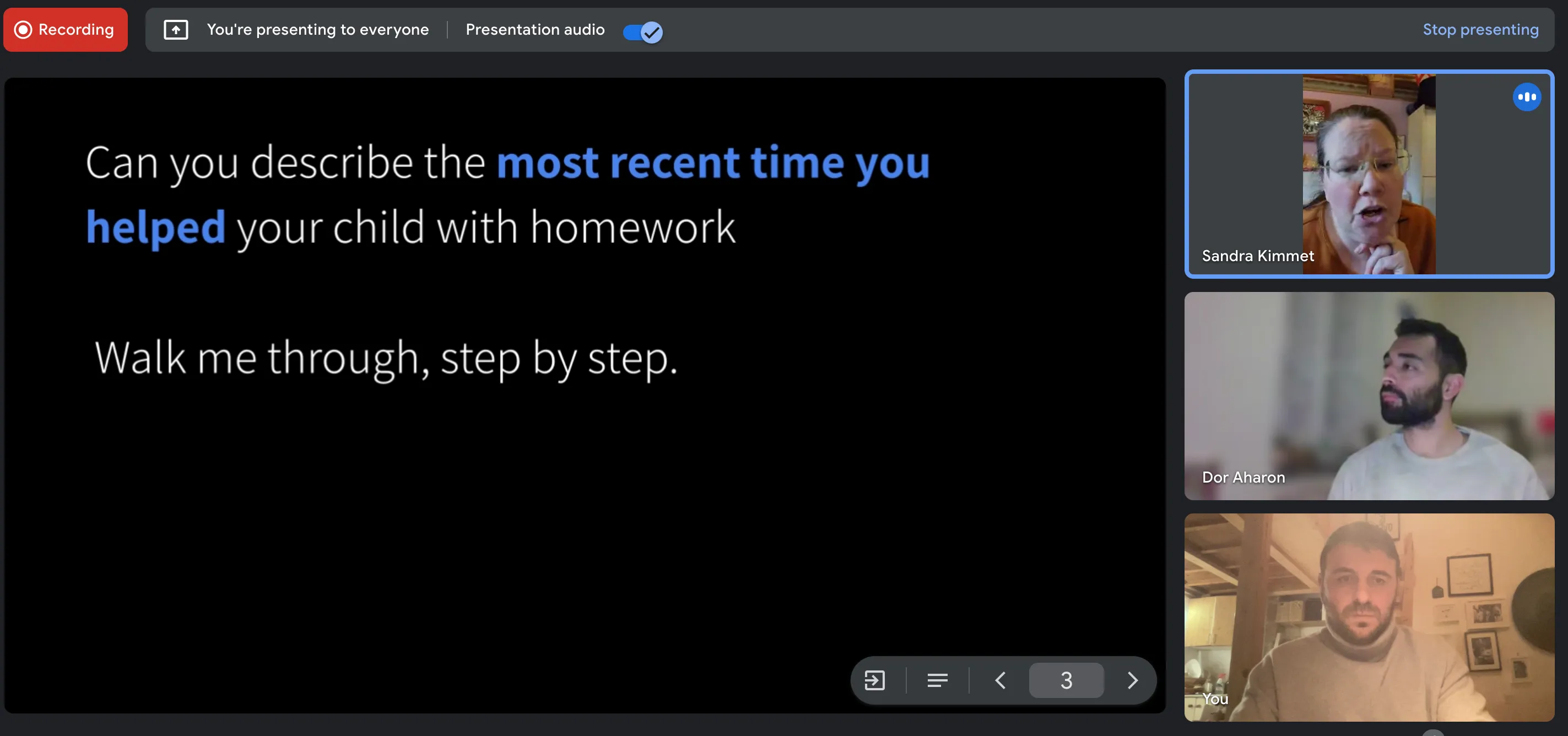
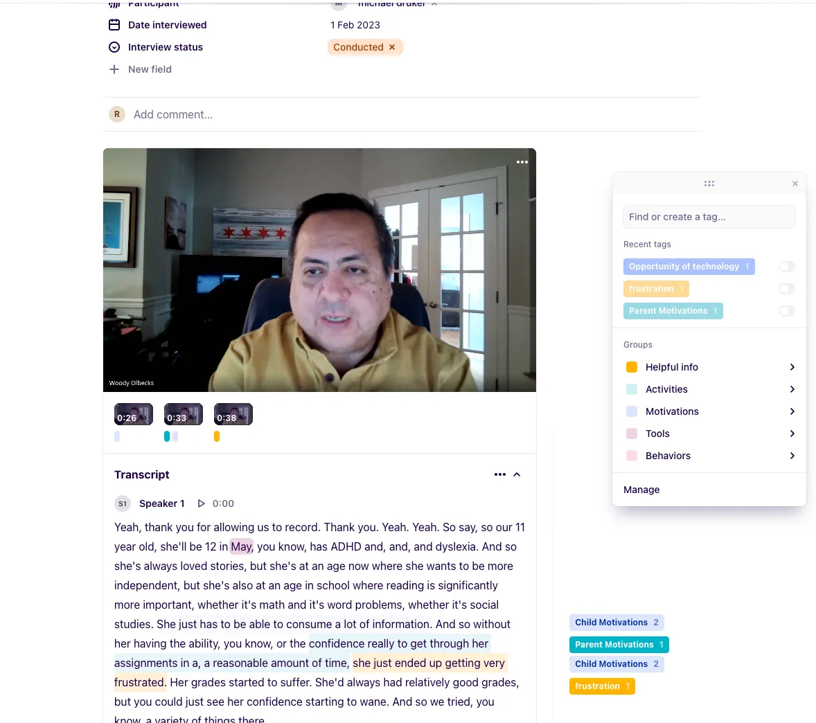
The product manager and I interviewed parents of children with ADHD and dyslexia, and I also talked to teachers to understand the contrast. I wrote the scripts and questions; the PM ran most of the sessions. And the findings were strikingly consistent — almost uncomfortably so, because they contradicted the data-rich direction we'd assumed.
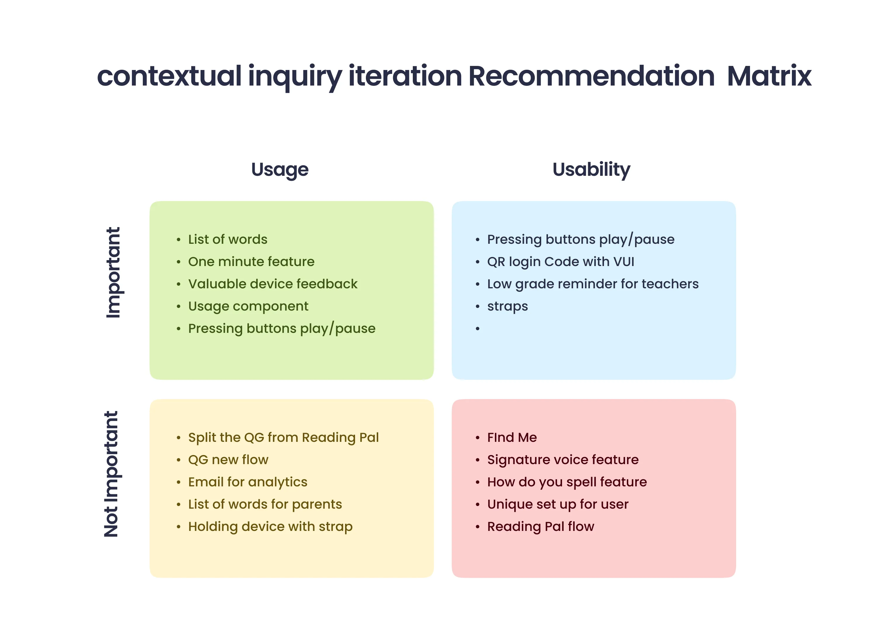
Parents wanted three things. Is my child actually using the device? Is there improvement compared to before? And what can I do to help at home? That was essentially the entire emotional and practical universe of a parent looking at this app. Three questions.
Everything else — the detailed reading-fluency scores, the comprehension breakdowns by text type, the session-by-session difficulty curves that teachers found so valuable — produced the opposite of what we intended. It didn't inform parents. It made them anxious.
They'd look at a complex metric and feel implicated by it, like they were being shown evidence of a problem without being handed any way to fix it.The core conclusion was almost a sentence: a parent cannot deal with complex analytics, because they don't know how to turn them into action. And data you can't act on isn't neutral. It's not just unhelpful — it actively generates worry. That reframed the whole product for me.
"I was sure the interface was intuitive. Then I watched real parents use it, and the gap between what I'd planned and what happened on screen was the whole value of the test."
From Performance to Effort
That led to your central design decision — replacing performance analytics with effort analytics. Unpack that.
This is the heart of the project. Performance analytics tell you what a child achieved — a score, a level, a measurement against some benchmark. Effort analytics tell you what a child did — how many sessions, how consistently, how much time they spent engaged. For a teacher, performance is actionable. For a parent, it's mostly a source of helplessness.
The reason is simple and a little bit profound: you can't tell a child to score higher. That's not a thing a parent can do anything with. But you can absolutely tell a child to practice for fifteen minutes today. Effort is within a family's control. Performance isn't, at least not directly. So designing around effort meant designing around the things a parent could actually influence.
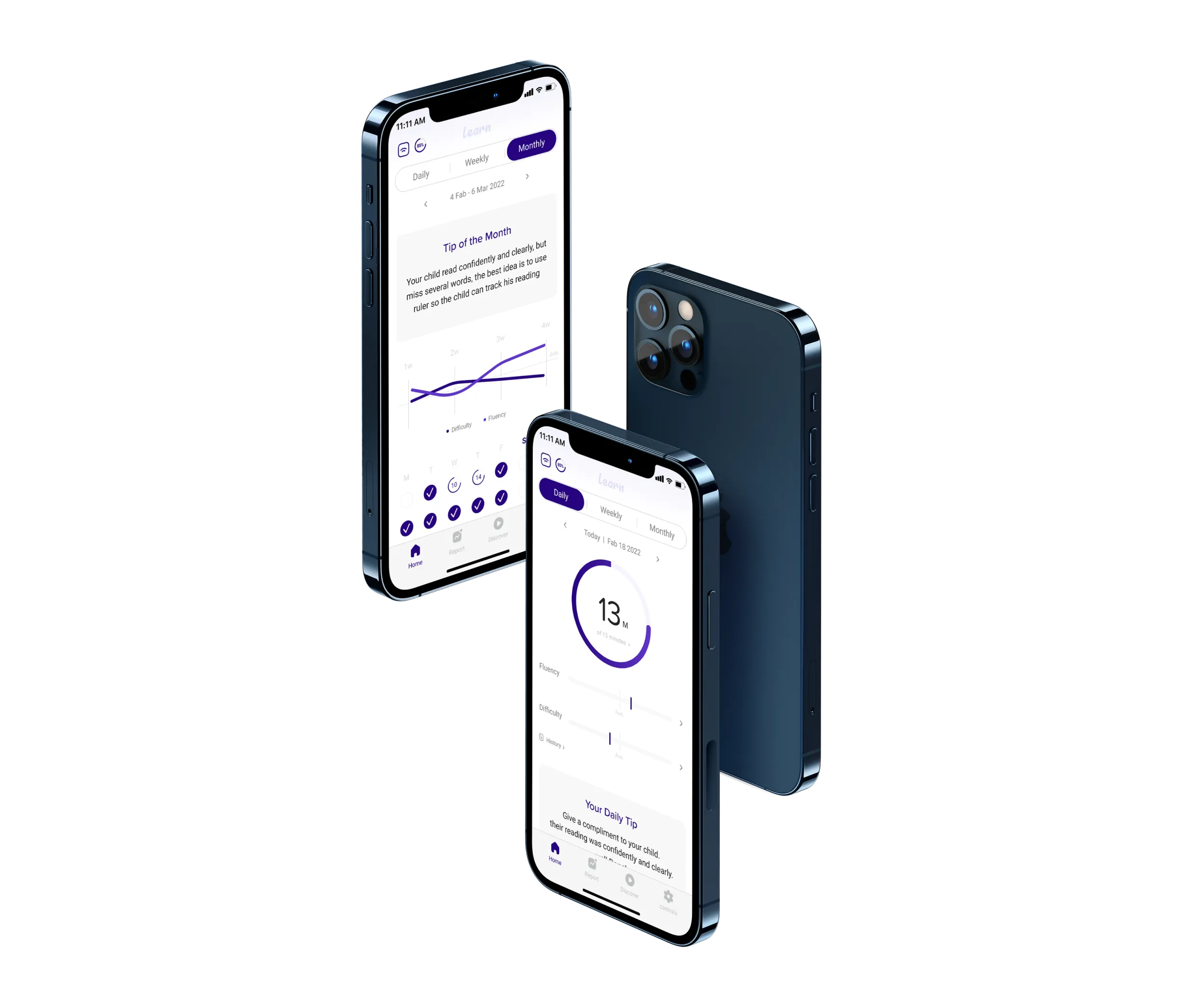
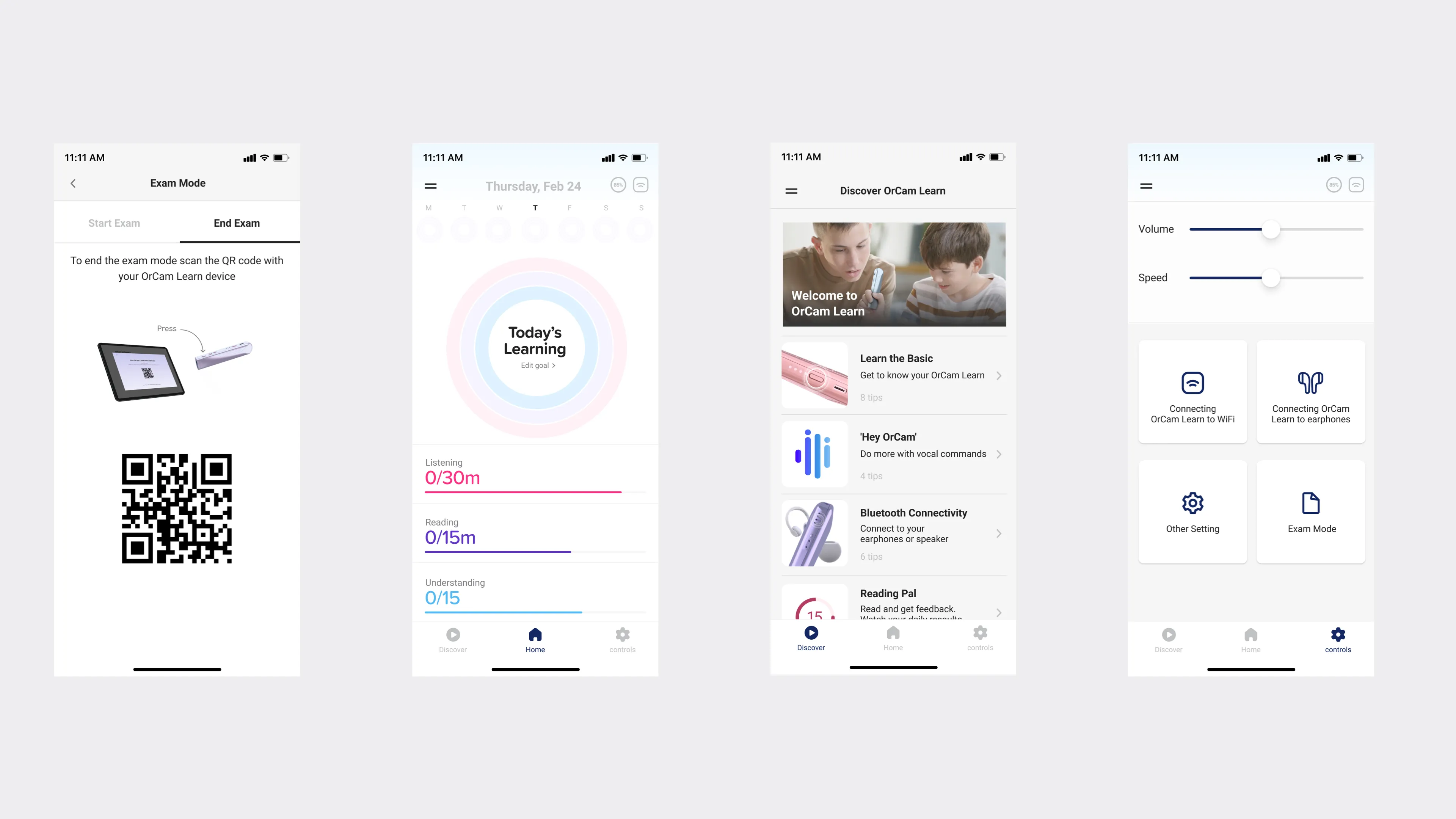
Concretely, I restructured the hierarchy. The three primary operations — tied to that listening-reading-understanding model — went to the top of the main screen, front and center. The performance analytics that teachers prioritize, like difficulty level and reading fluency, got moved to a secondary layer.
Still there, still accessible for the parent who really wanted to dig — but not the first thing you hit, and not something you had to understand to feel oriented.We also gave parents three concrete goals for the child to accomplish, rather than a wall of metrics. Goals are effort framed as action. Instead of "here is your child's comprehension percentile," it became "here are three things, and here's how practice moves you toward them." That's the difference between a report card and a path forward.
"The metrics you choose to elevate are a statement about what you think success is. I wanted success to mean growth, not reliance on the device."
When the Interface Met Real Parents
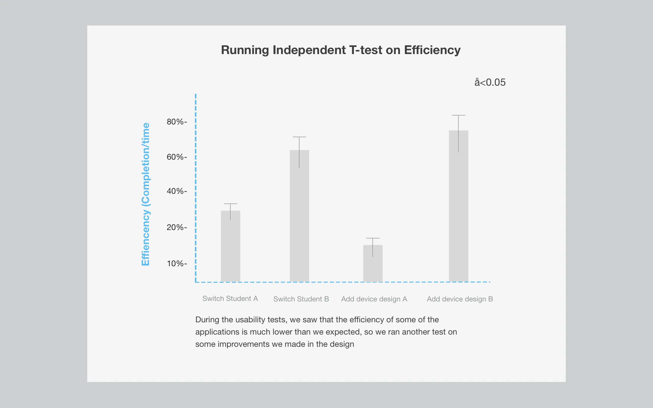
You ran usability testing on this. What happened?
The usability process covered the whole onboarding flow and tested whether parents understood the features. And it was humbling in the way good usability testing always is. I genuinely believed the interface I'd built was intuitive — clear, simple, obviously legible. Then I watched real parents use it, and there was a significant gap between what I'd planned and what actually happened on the screen.That gap is the whole value of testing. It doesn't matter how clear something is to the person who designed it — you've been staring at it for weeks, of course it's clear to you.
What matters is the parent who opens it for the first time at their kitchen table, tired, a little anxious about their kid, with no design context whatsoever. That's the real test, and the prototype failed parts of it.
So I went back and analyzed the sessions, coded the recurring behaviors, and looked for patterns in where people got confused or stuck. The findings reinforced the core direction — parents didn't want interpretive burden, they wanted clarity and a sense of progress — but they also showed me specific places where even my simplified design was asking too much.
We rebuilt significant parts of the main screen before launch based on that. Not a cosmetic polish — a structural response to watching the gap between intention and reality. That willingness to be wrong about your own clarity is, I think, the difference between designing for yourself and designing for the actual person.
"Showing less wasn't dumbing it down. For an already-worried parent, restraint was a duty of care."
Heading
There's an ethical thread running through this — about dependency, about anxiety. Was that deliberate?
It was, and it's the part of this project I think about most. There's a quiet ethical question underneath an assistive learning device: are you building a crutch or building a capability? If the app celebrated raw usage, it would subtly encourage dependency — more device, more reading-aloud, more numbers going up. That's the easy product to build, and it's the wrong one.
By anchoring the design to understanding and to effort rather than to consumption, I was trying to keep the product pointed at the right goal — the child actually learning, actually growing toward independence, not just using the device more. The metrics you choose to elevate are a statement about what you think success is. I wanted success to mean growth, not reliance.
And the anxiety question is its own quiet ethic. A product aimed at parents of struggling children has a real responsibility not to make those parents feel worse. Handing an already-worried parent a dashboard of clinical metrics they can't interpret isn't neutral — it's a small harm, repeated every time they open the app.
Designing for reassurance and action wasn't softness. It was a duty of care.So the restraint in this product — showing less, hiding the clinical layer, leading with effort and goals — wasn't about dumbing things down. It was an ethical position about what this specific product owed the specific people using it. Restraint as respect.