Menu
Designing for a disability people hide
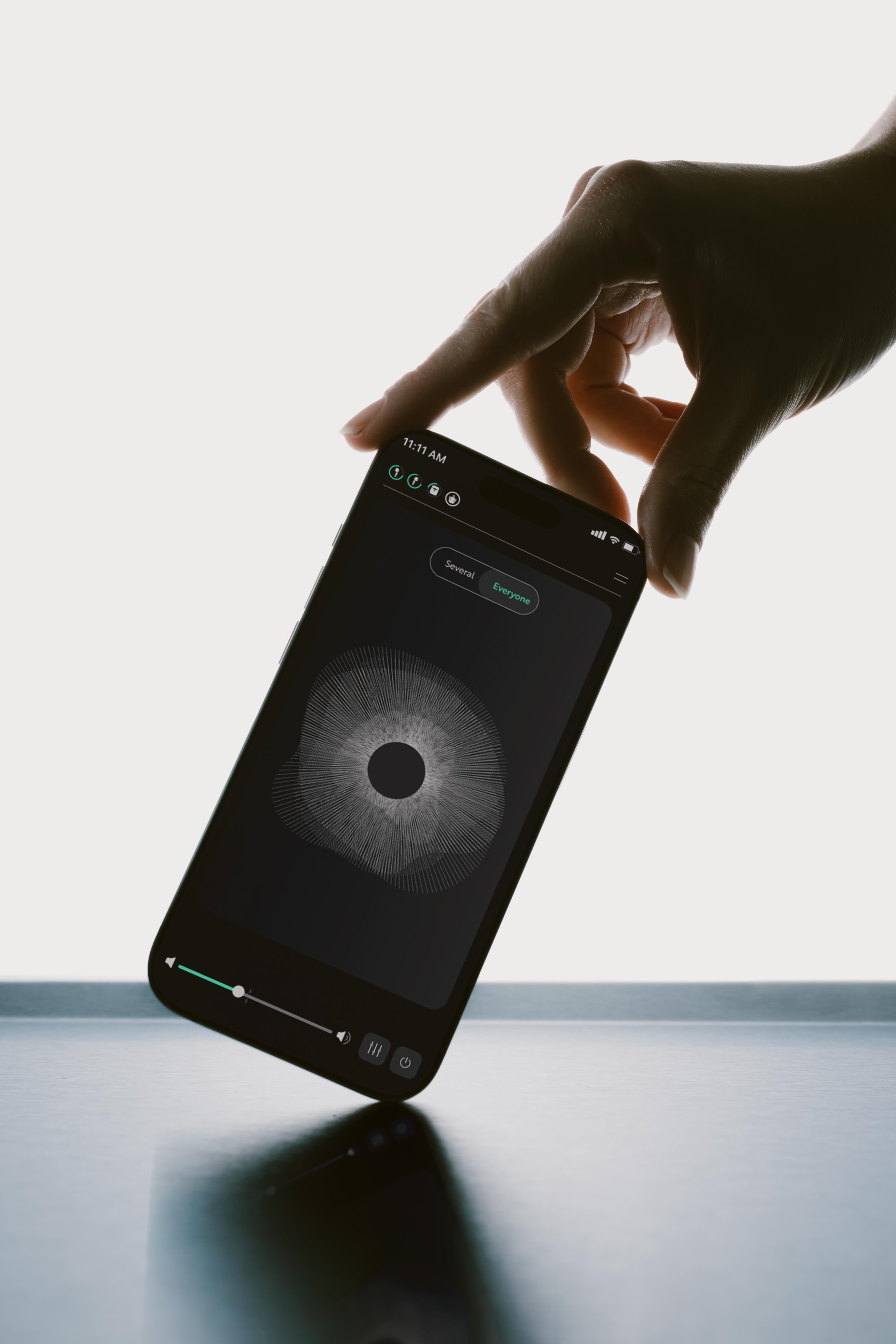
OrCam Hear used AI earbuds to isolate a single voice and suppress background noise in real time. The design problem wasn't acoustic, it was social. People used it at restaurants and family dinners, where being seen managing a hearing problem cost more than mishearing. I designed an interface built on who you actually talk to. The same few people, most of the time. So that in the moment there is nothing to capture, nothing to look at, and nothing to explain.
One product, three problems that didn't agree
Company — OrCam Technologies ·
Year — 2023
Role — UX Lead: research, information architecture, interaction model
Team — Sarai Beris, UX/UI design & component library. Dor Aaron PM.
Deliverables — User interviews · Information architecture · Wireframes & components · Usability testing · Concept exploration
The hardware could pull one speaker out of chaos: competing conversations, ambient restaurant noise, background music. My brief was the mobile app that gave people control over that capability. On paper, an audio problem with a UI wrapped around it.
The catch was in the third line. For the model to isolate a voice it needs a clean sample of that voice, a signature. Somebody has to capture it. And the somebody is sitting at a dinner table, trying not to be noticed.
The problem wasn't "can't hear." It was "can't hear, and doesn't want anyone at the table to know."
Nobody was using Hear alone in a quiet room. They used it in the hardest places: family dinners, restaurants, shopping. Crowded, unpredictable, several people talking at once.
The second thing reframed everything. These were people with mild hearing loss who had refused a hearing aid, and they had spent years building invisible workarounds: sitting where the good ear faces the table, reading lips, asking for a repeat while pretending to be distracted. The struggle is real. The performance of not-struggling is just as real.
If I had designed for the first version of the problem, I would have shipped something technically correct and socially unusable. The project stopped being about audio controls and became a problem about dignity: giving someone power over their hearing without making them announce, in front of others, that they need it.
People will choose to keep struggling silently over being visibly accommodated. That's not irrational. It's social cost weighed against functional benefit.
Two findings, and one of them was structural
We ran the study in-house: interviews and questionnaires with people with hearing loss, and for the part that mattered, the noisy social moment, a simulated restaurant built inside the OrCam lab. Overlapping conversations, background music, a table, people to talk to.
Three things, then: where (noisy, social places), who (the same people, most of the time), and how (while talking to them). The second one decided the architecture.
Eight conversations in ten are with someone you already know. That number decided the architecture.
Four moments, one constraint, and a ladder of cognitive load
I mapped the journey as social conflict points: every moment where the device collided with the conversation. Then I rated the cognitive load of each one while talking:
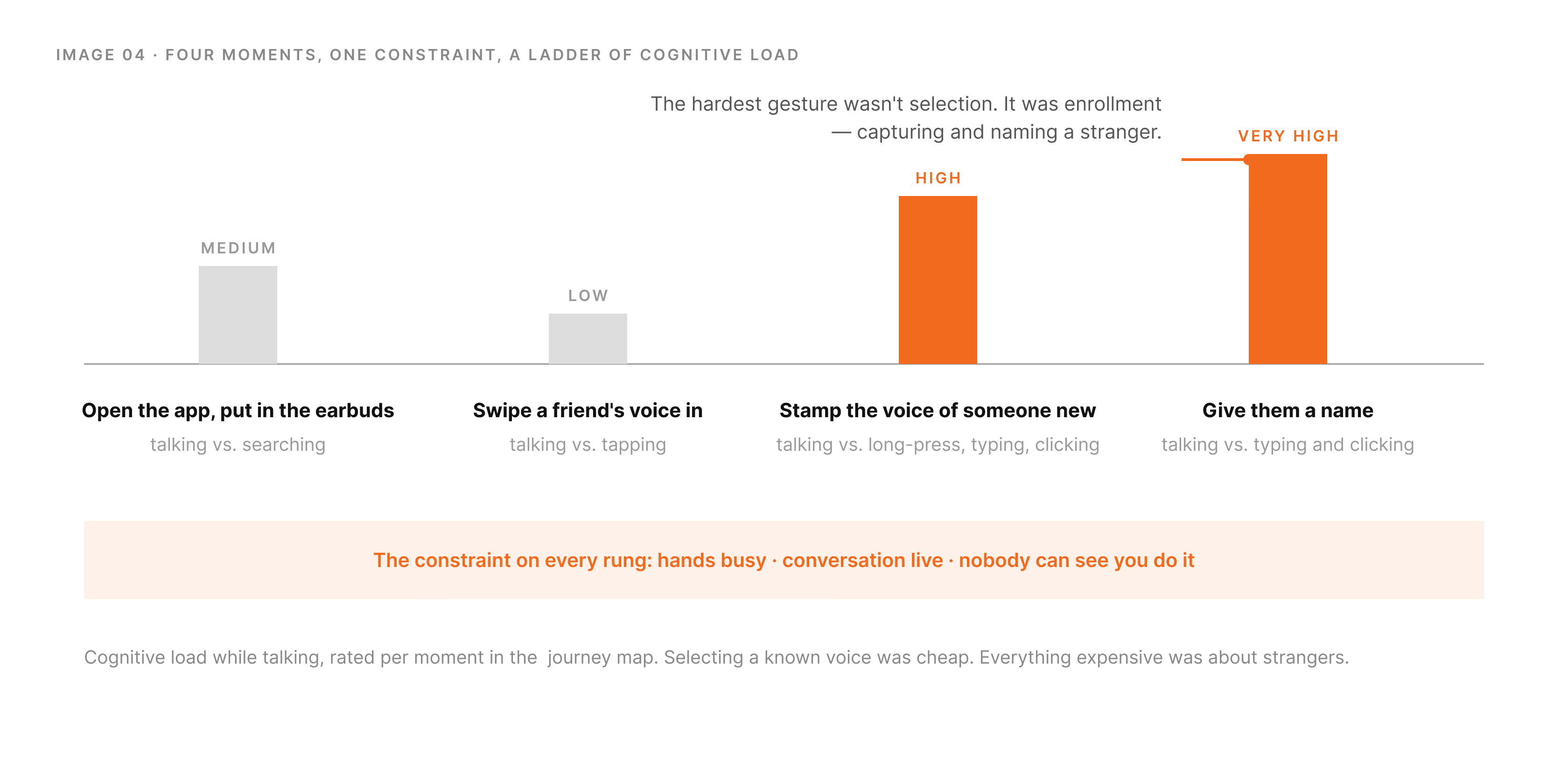
The governing constraint across all four was the same: the user's hands are busy, the conversation is happening now, and they cannot be seen managing a device. Anything that meant opening a menu, reading options and making a careful selection was dead on arrival.
The ladder said something I hadn't expected. Choosing a known voice was cheap. Everything expensive was about strangers, capturing them, naming them. The hardest gesture in the product wasn't selection. It was enrollment.
Capture a stranger's voice, without asking and without being seen
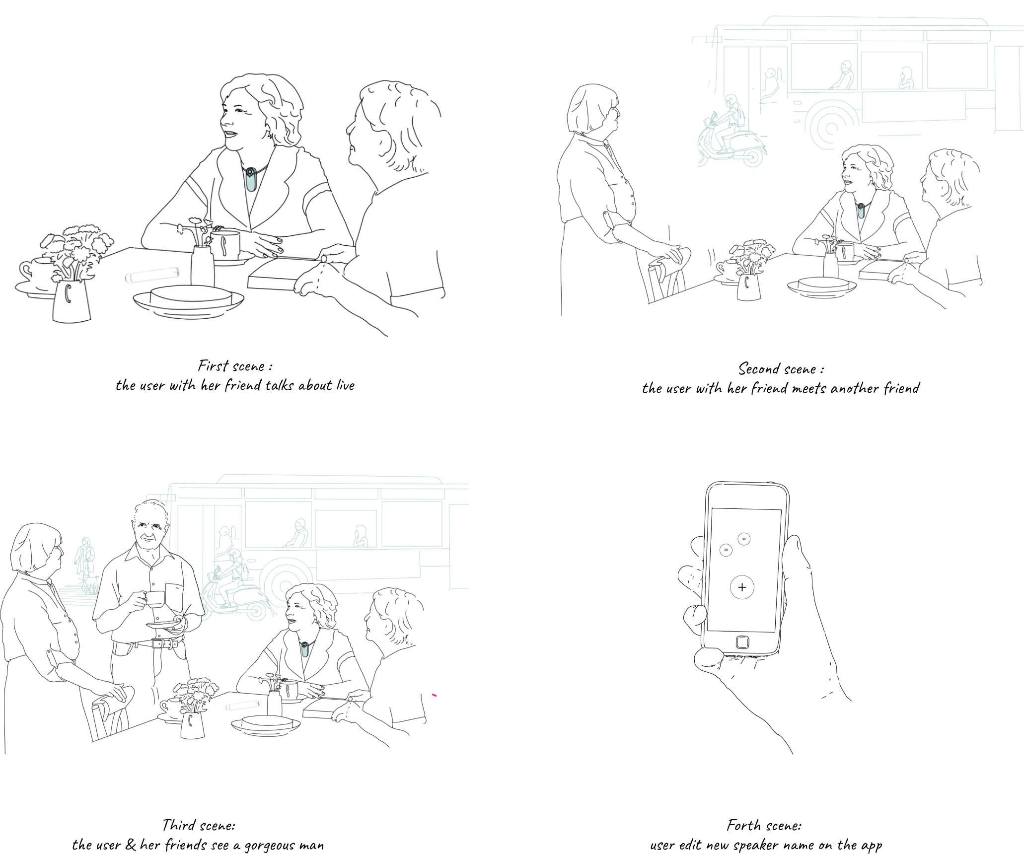
The model needs several seconds of clean speech from the person you want to hear. So someone at the table has to hold a phone toward a stranger, keep a button pressed, wait, and then type a name, while pretending to listen. Every step is visible. Every step announces the device.
In the storyboard we wrote from the research, she's at a restaurant with two people she doesn't know. She wants to hear them. She won't ask. She waits for the right moment to stamp their voices "without being noticed." There is no such moment.
The R&D problem and the social problem wanted opposite things.
One needed a clean sample of every voice. The other needed nobody to notice.
Stage 1 was built for everyone. Stage 2 was built for the eighty percent.
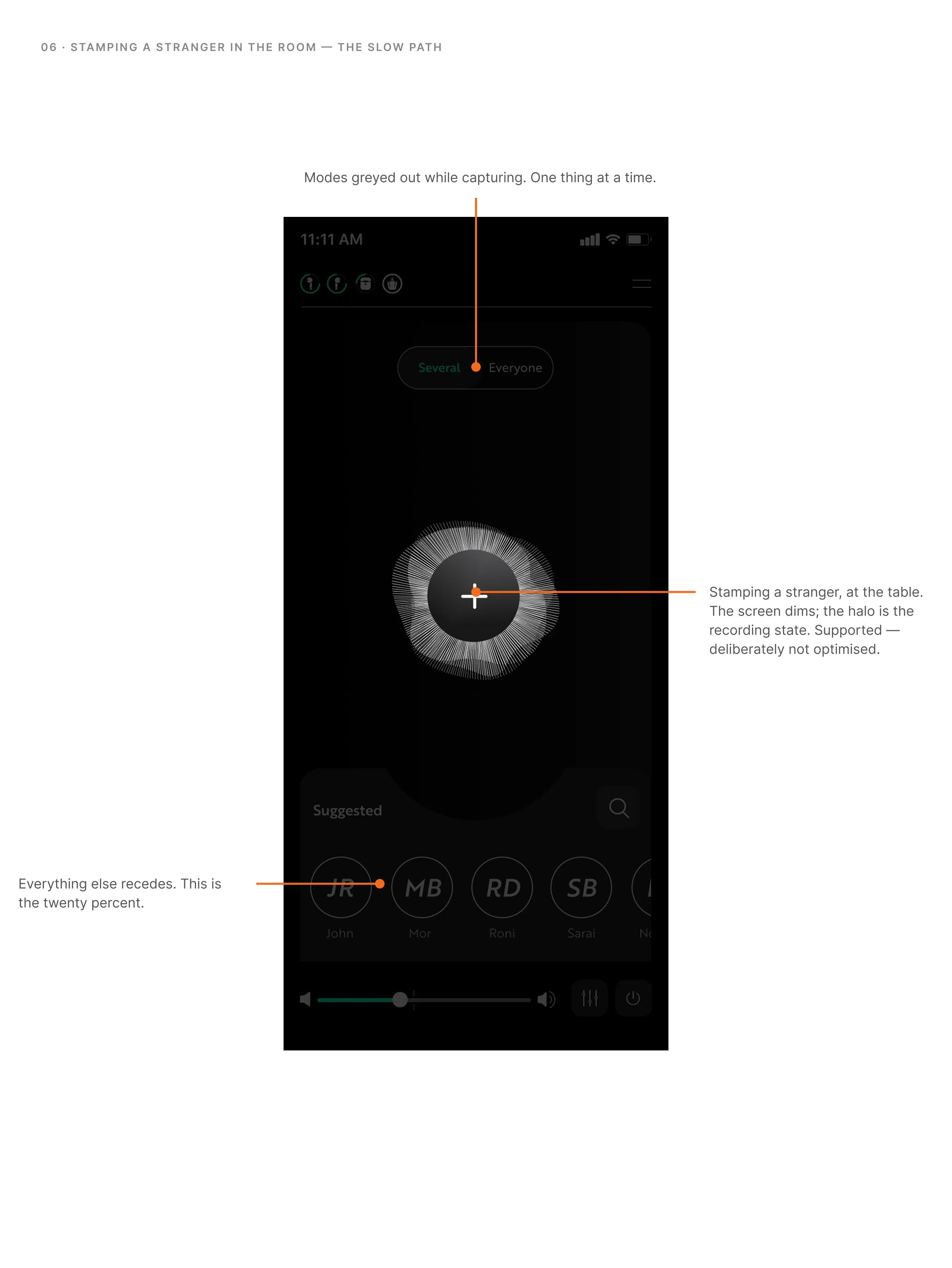
Stage 1 · Anyone can be stamped
Anyone at the table could be enrolled on the spot: friends, strangers, the waitress. Complete, faithful to the R&D brief, and unusable. Enrollment mid-conversation was the top rung of the ladder, and the person you'd most need it for was the one you'd be most embarrassed to point a phone at.
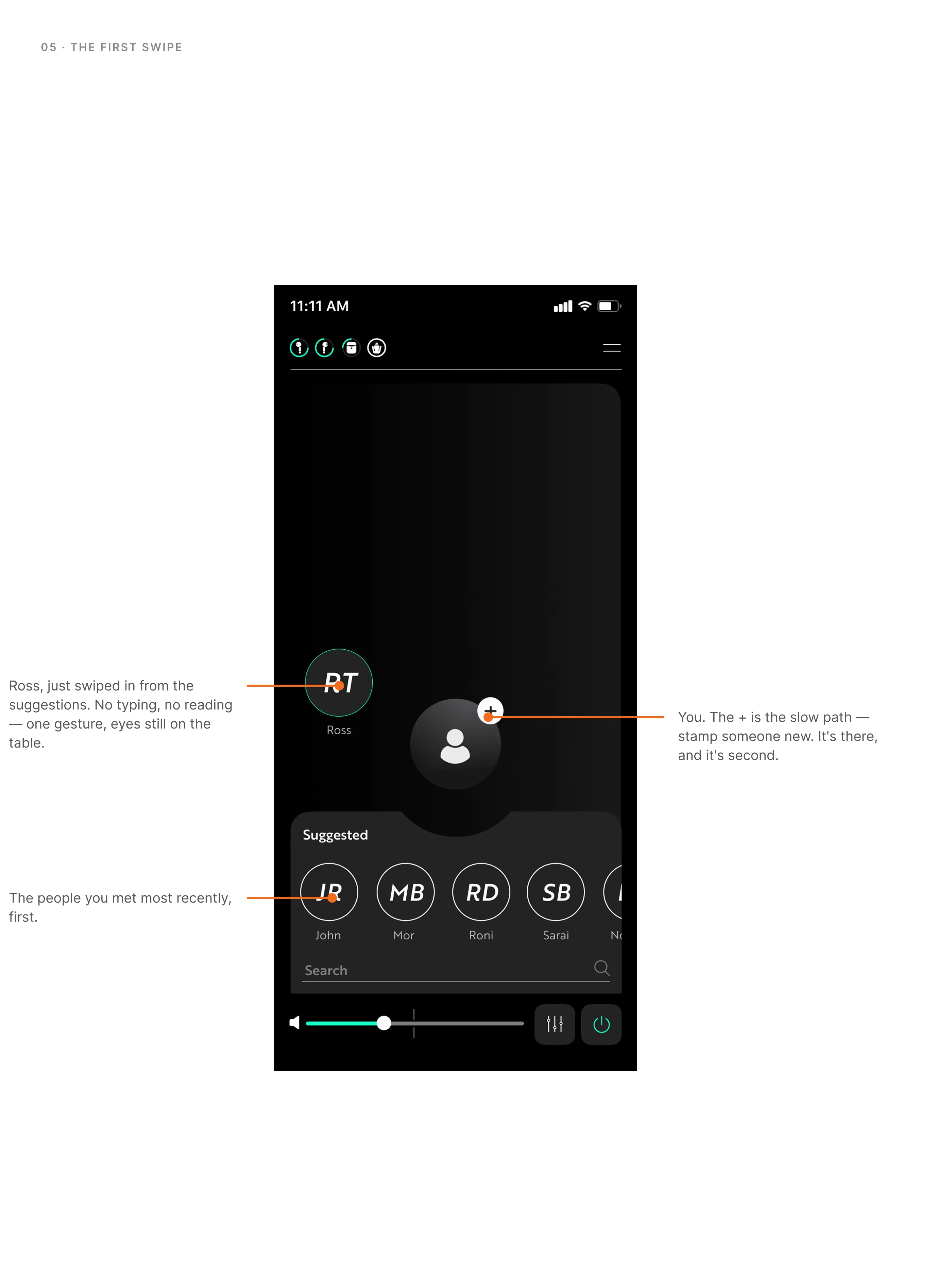
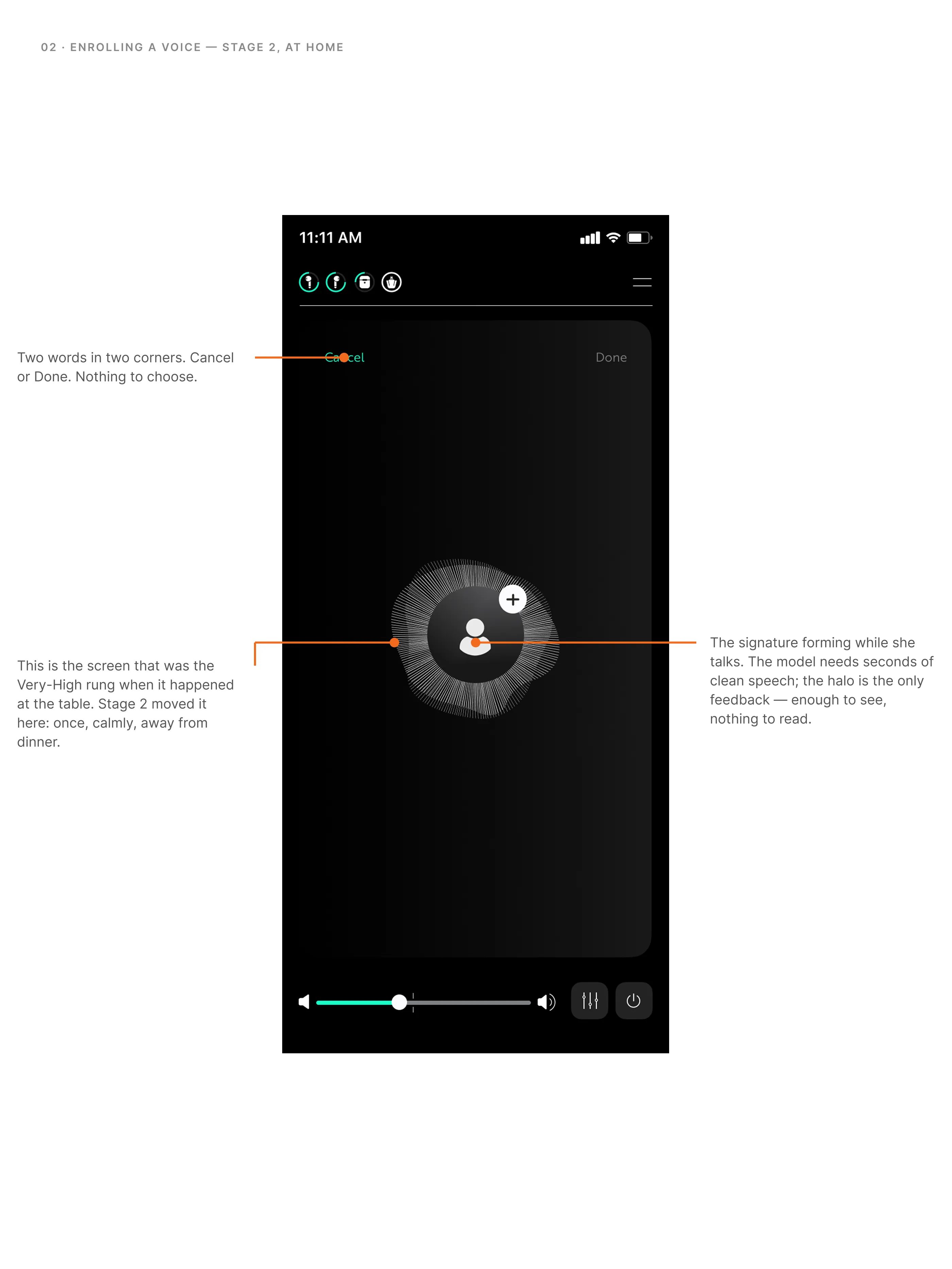
Stage 2 · Enroll once, at home. Choose in the moment.
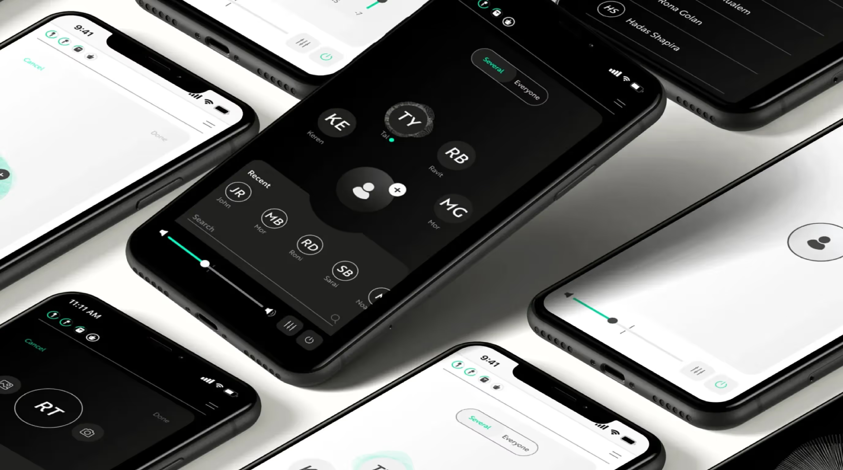
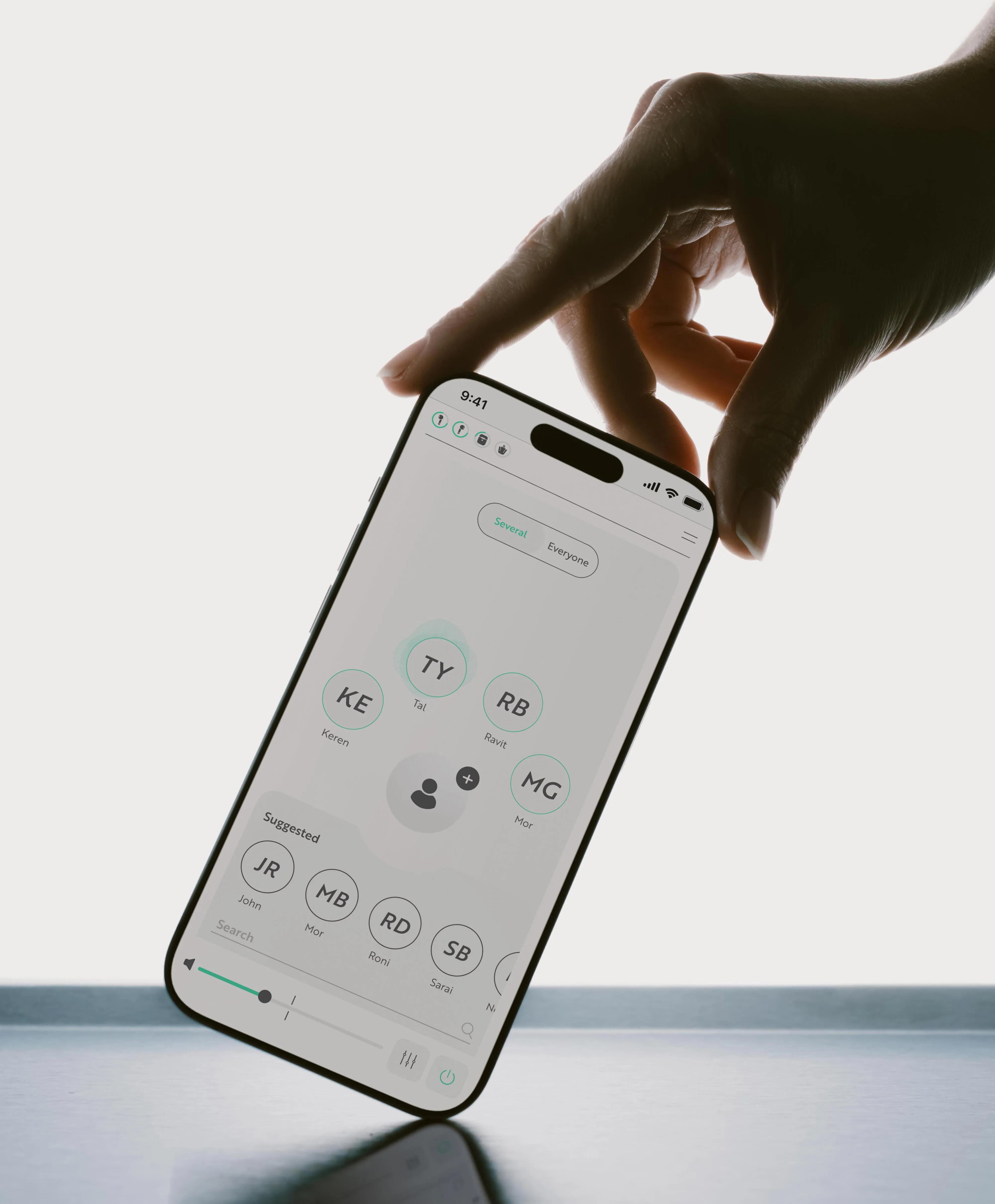
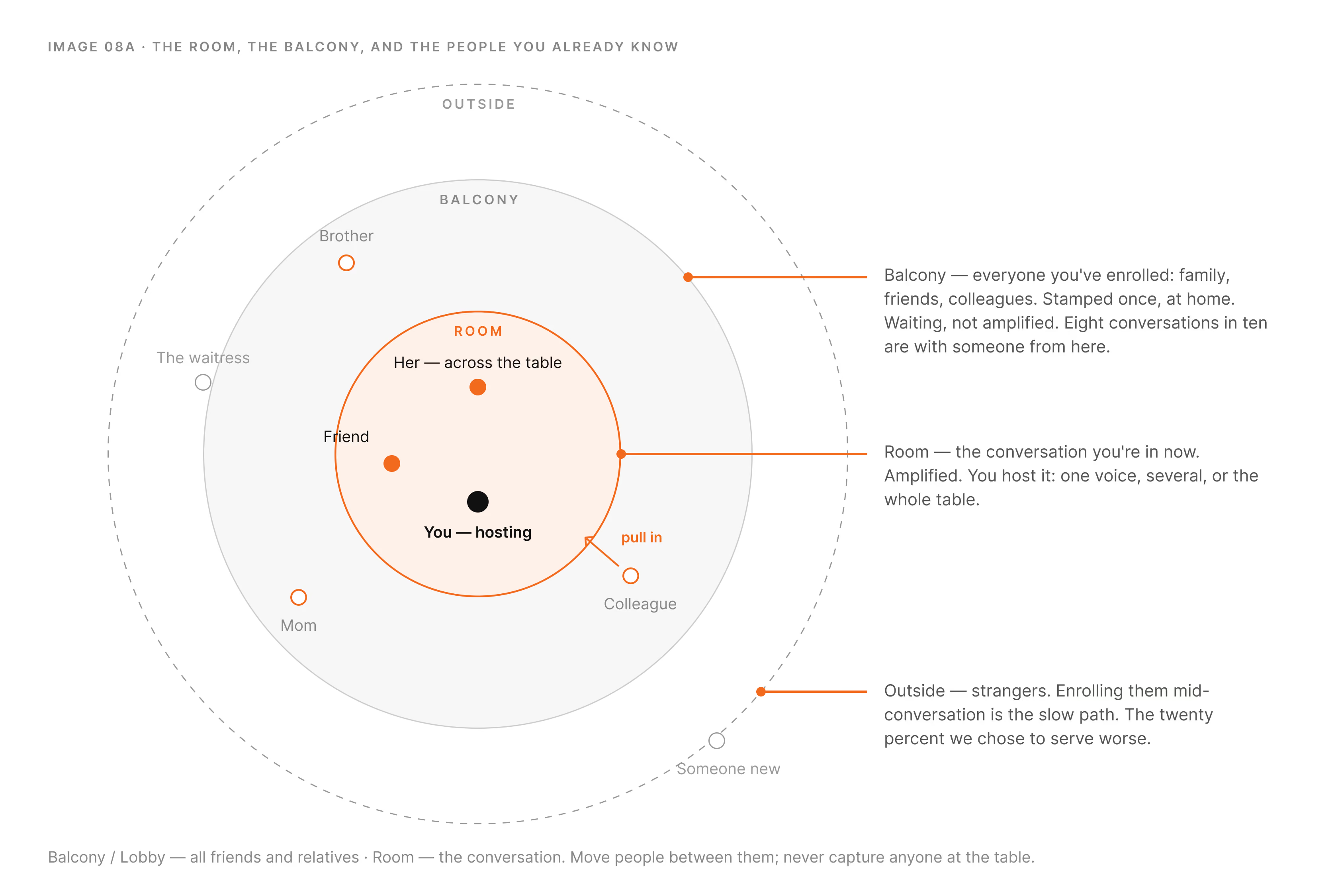
Close people get stamped once, calmly, away from the table, and become your contacts, your favorites. At dinner there is nothing to capture: your people are already there. You move them into the conversation or out of it. Strangers became the twenty percent we chose to serve worse.
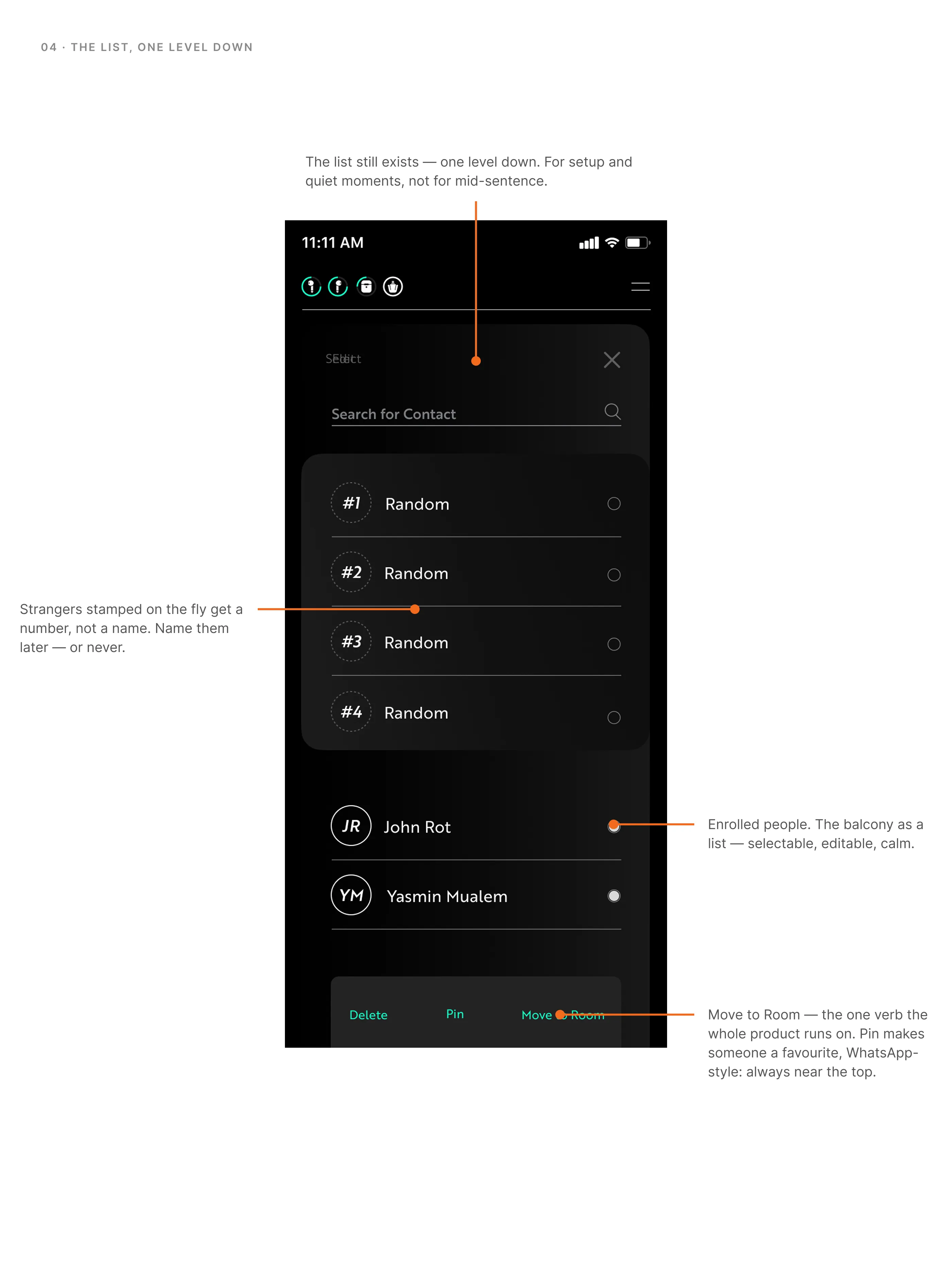
Choosing, once the people are there
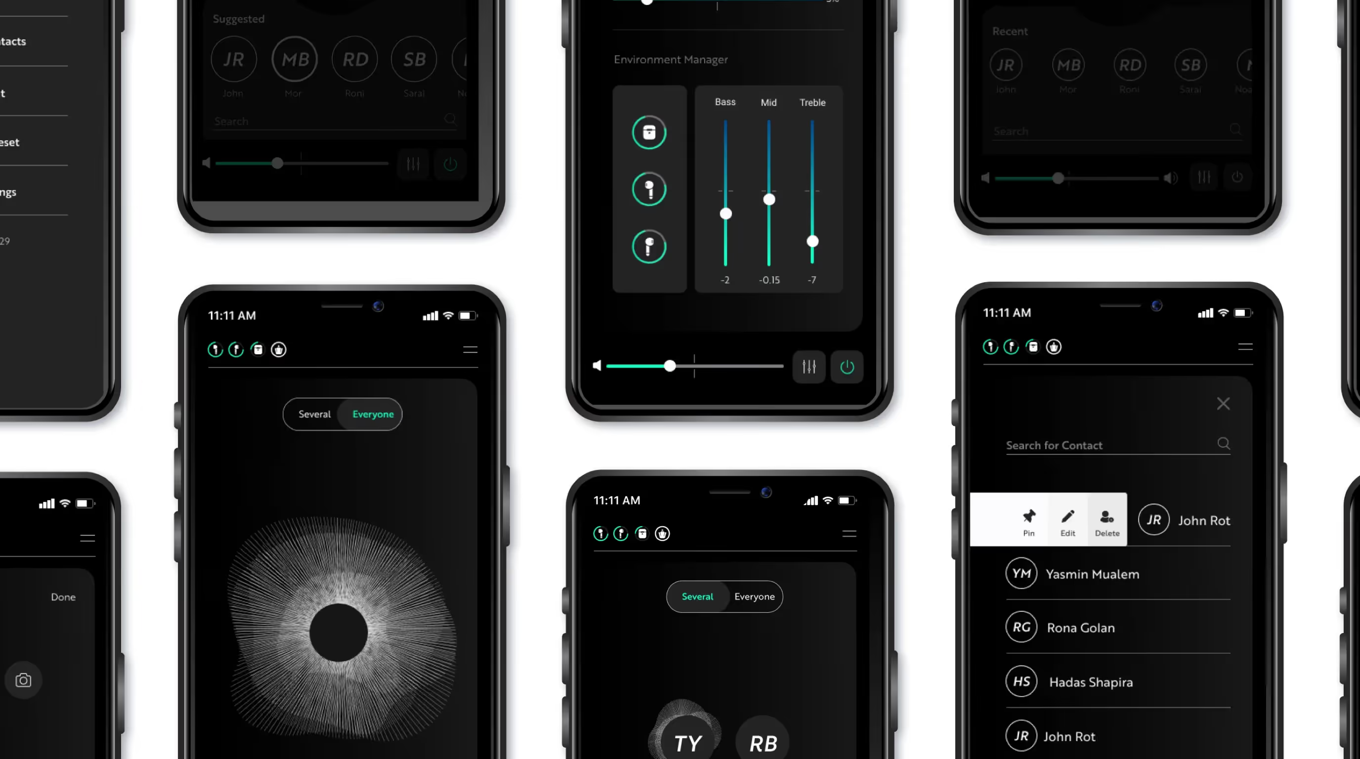
For the in-the-moment choice we kept a list one level down, for setup and quiet moments. A gesture on the earbud was rejected: a hand at your ear is the most visible thing you can do at a table.
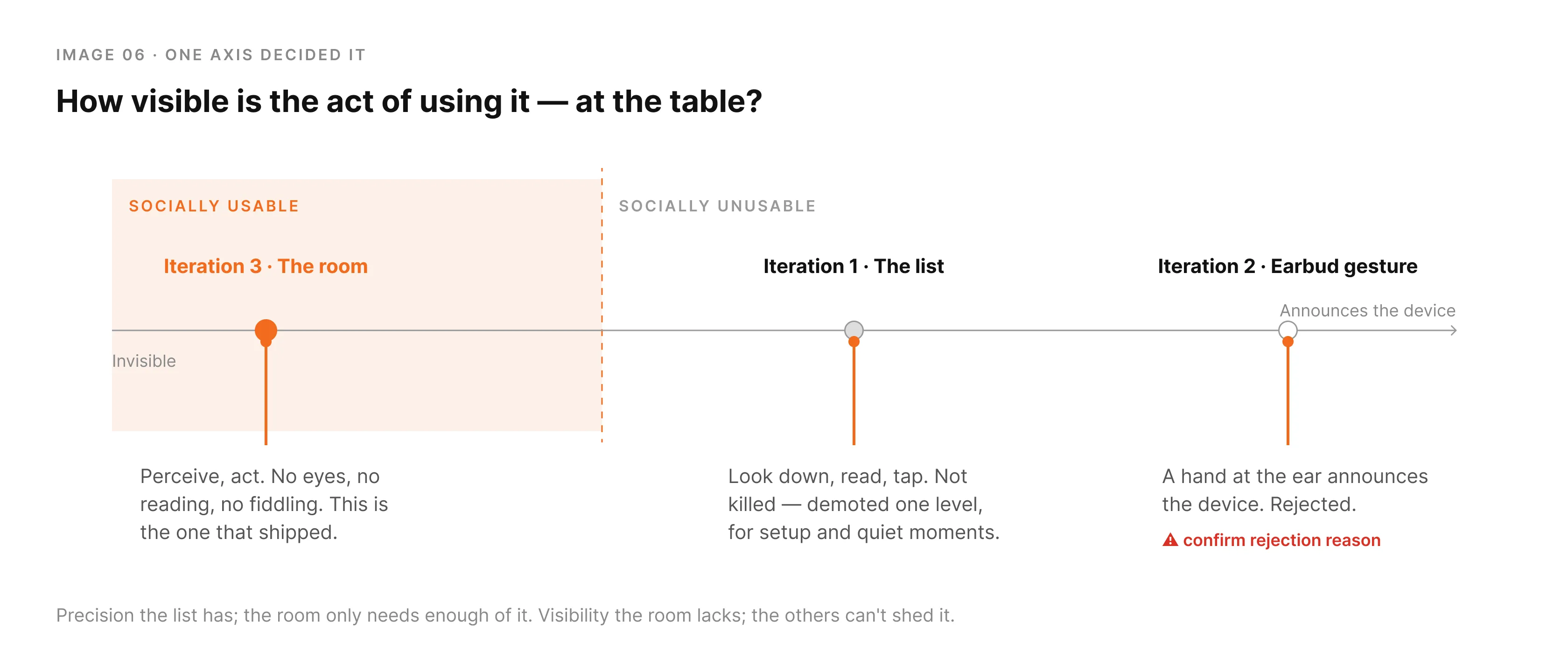
We traded an architecture that could enroll anyone for an experience that needed nothing in the moment. The questionnaires made that a decision instead of a guess.
From a mental model to an environment
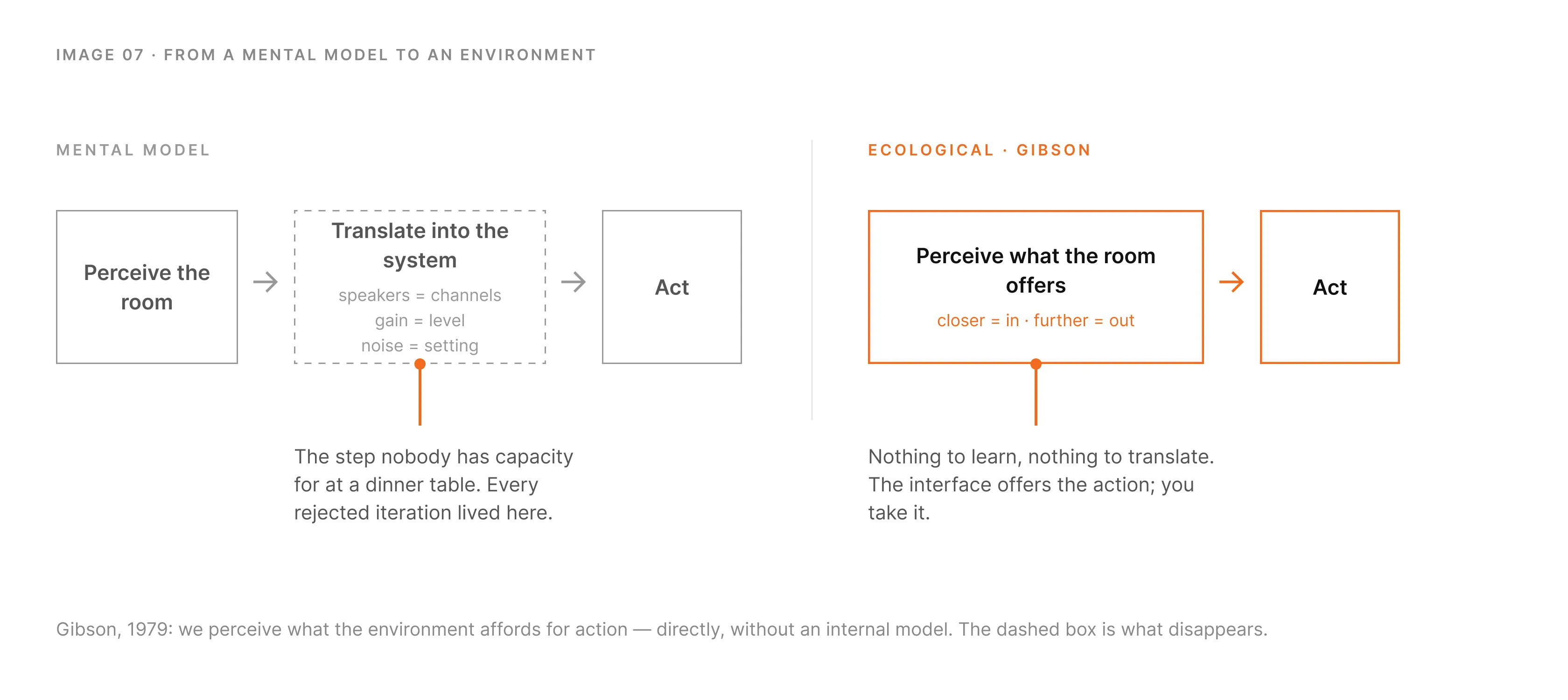
The ladder had a pattern. Every expensive rung asked the user to hold a model of the system in their head: speakers as channels, signatures as records, gain as a level. Then translate the room into that model before acting. Under load, at a table, that translation is exactly what nobody has capacity for.
The framing that unlocked it came from outside interaction design. James Gibson's ecological approach to perception argues that we don't build an internal representation of the world and then reason about it. We perceive what the environment offers for action, directly. A chair affords sitting; you don't infer it. Norman borrowed the word "affordance" for design but kept the mental model underneath. Gibson's version is simpler, and for this problem it was the right one.
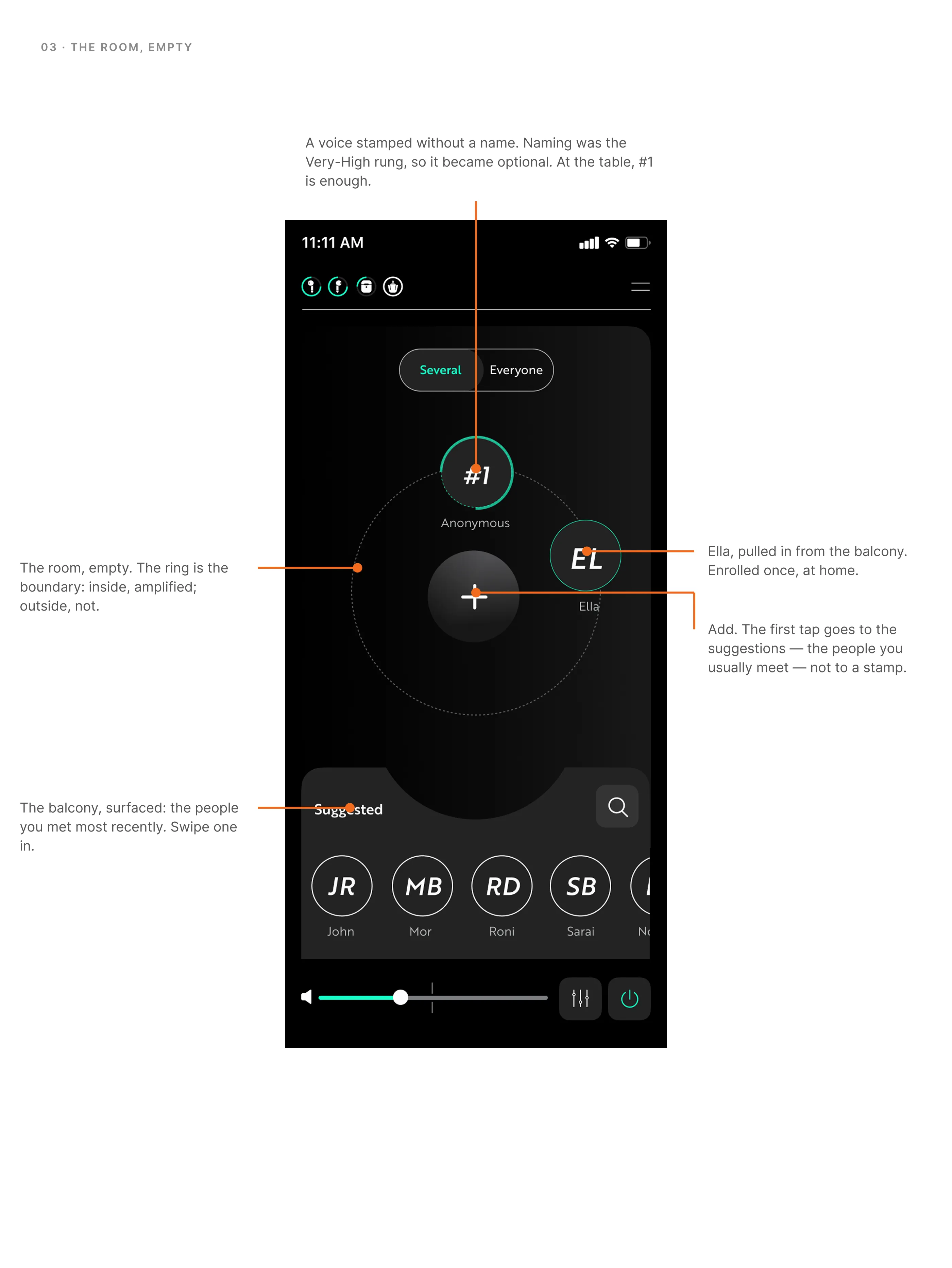
So instead of designing a system users would learn a model of, I designed an environment they would perceive. The people around you, laid out as they are around you. Closer means in the conversation; further means out. Pull someone in. Push the loud table away. Nothing to learn and nothing to translate: the interface offers the action, and you take it.
Gibson was brilliant in his simplicity
When there's no capacity for cognition, don't ask for it. Let the environment carry it.
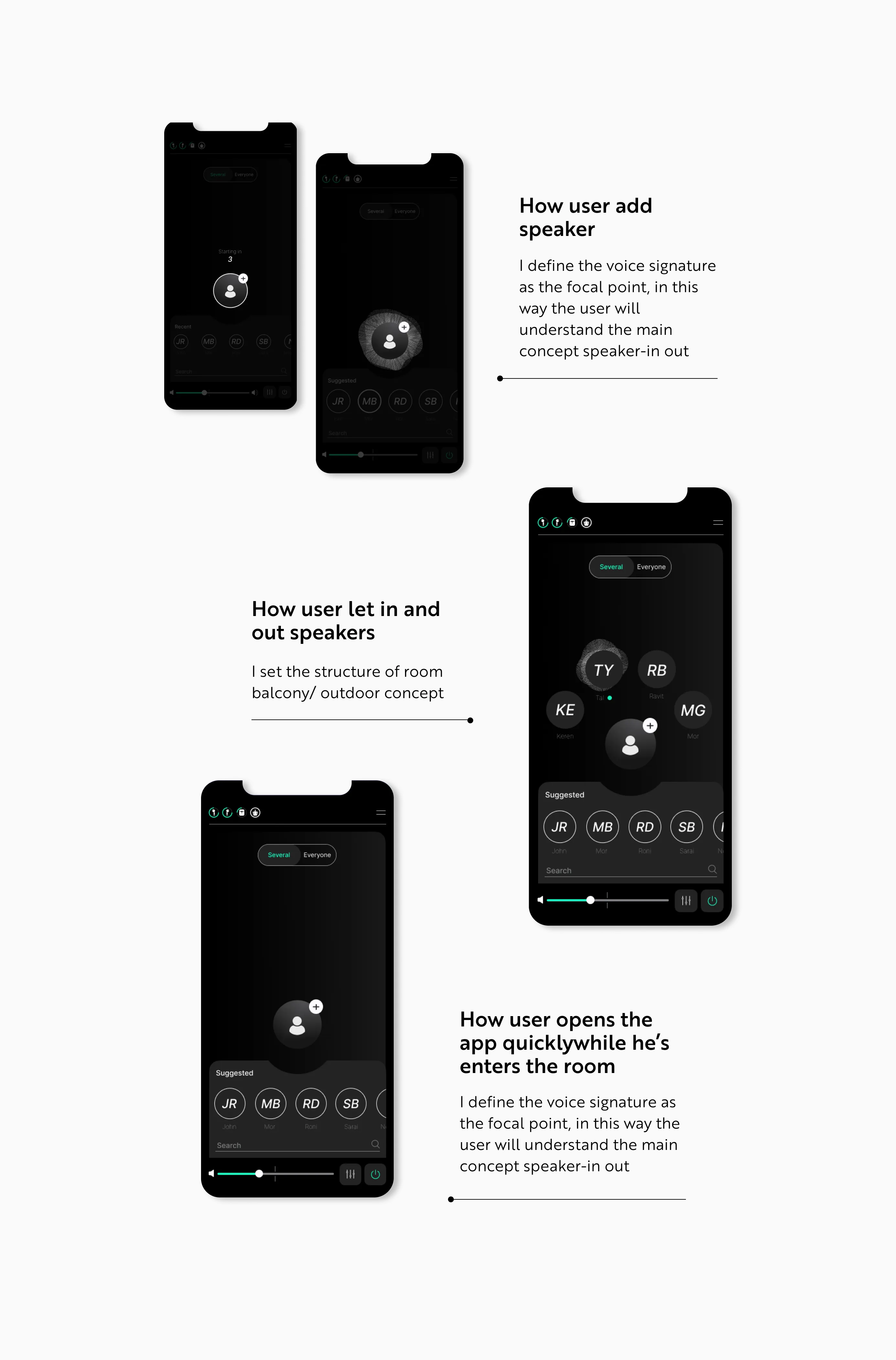
The room, the balcony, and the people you already know
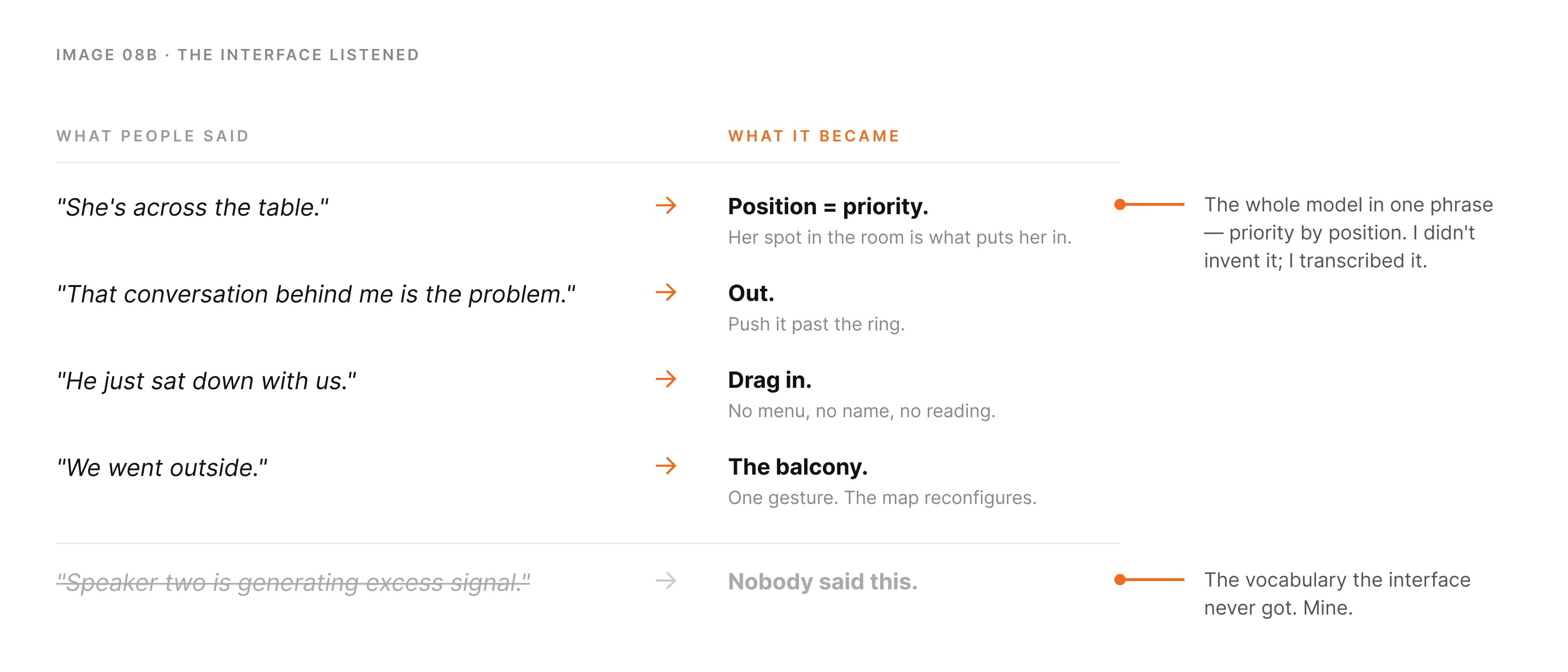
Users never described their problem in technical terms. Nobody says "speaker two is generating excess signal." They say "she's across the table" or "that conversation behind me is the problem." The spatial language was already there, fully formed. The interface just had to listen to it.
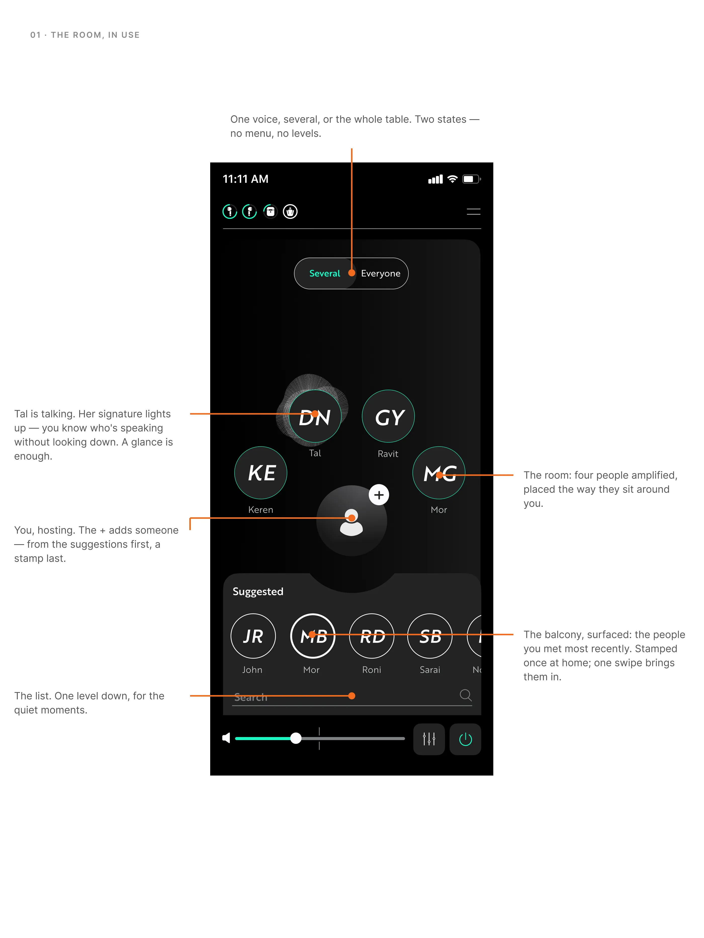
The architecture has two places. The balcony is everyone you've enrolled: family, friends, colleagues, waiting, not amplified. The room is the conversation you're in now, and you host it. Pull someone in from the balcony and they're amplified; push them out and they're not. One voice, several, or everyone at the table when you just want the whole table.
Strangers stay outside both. Enrolling them is the slow path, and we said so. That was the trade: an easy room for the eighty percent, an honest limit for the rest.
The deeper principle: the interface should disappear into the situation, not sit on top of it. Someone at dinner shouldn't feel like they're operating medical equipment. They should feel like they're having dinner.
Nobody says "speaker two is generating excess signal."
They say "she's across the table." The interface just had to listen.
Back to the fake restaurant
We took Stage 2 back into the simulated restaurant. The test wasn't "can you select a speaker." It was "can you get the people you came with into the room while one of them is talking to you without them noticing."
All of it
The room, the balcony, in/out, favorites, the list one level down, everything in Stage 2 was developed and shipped. Sarai designed the UI; we built the component library together. It was a winning team, and the product shows it.
The best decision was a subtraction
The stated problem was audio: isolate a voice, reduce noise. The real one was human: let someone do that without surrendering their dignity. Taken at face value, the brief would have produced something that worked in a lab and failed at a dinner table.
The best decision in the project wasn't a feature. It was giving up one, enrollment of strangers in the moment. Because a number from a questionnaire said we could. Knowing what you're allowed to give up, and being able to show why, is most of the job inside a company that builds hard technology.
And it changed what I think an interface is. Before Hear I designed systems and hoped users would build the right model of them. After Hear I design environments and try to make the model unnecessary.
Embarrassment was a design material, as real as the audio signal.
The user is already telling you the structure of the solution
"She's across the table" wasn't casual phrasing. It was the entire interface, handed to me by a user who didn't know she was designing it. My job was to not override it with my own vocabulary.
That instinct listen to the exact language people use about their own experience, and build the structure from it runs from here through everything I did later. At OrCam Hear it was spatial language. At brain.space it became information architecture for how researchers actually name their work.