Overview
LifestyleFeatures
May 2025
Typography as Direction: Choosing Fonts for Film & Web
UC1
y25
Company
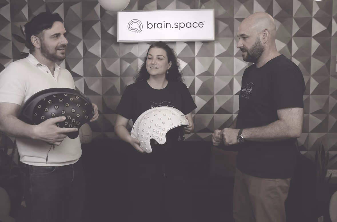
brain.space
Year
2024-2025
Synopsis
This is the story of how a routine design brief became an argument about what the product actually was — and how a single moment on a Zoom call dismantled months of careful work.

Background
I spent two years as a senior product designer at brain.space, a company building software for neuroscience research
Deliverable
User interviews
Information Architecture
Wirframes and design
Design System
Front-end develpment for usability
Concept exploration
Credits
Amir Shapira: Product Manager
Yony Aibshitz: VP Product
Guy perera: PM
Typography as Direction: Choosing Fonts for Film & Web

About
Tags
Saas B2B
Position
Design, Research
Year
2025
The product was meant to be straightforward — a platform for collecting and organizing brain data, structured into a clean hierarchy of projects, flows, runs, and sessions. By the time the project reached its turning point, that hierarchy had quietly stopped being the point.
When Management Won't Choose
When the Data Had the Wrong Audience
Let's start at the beginning. What was brain.space, and how did this project come to exist?
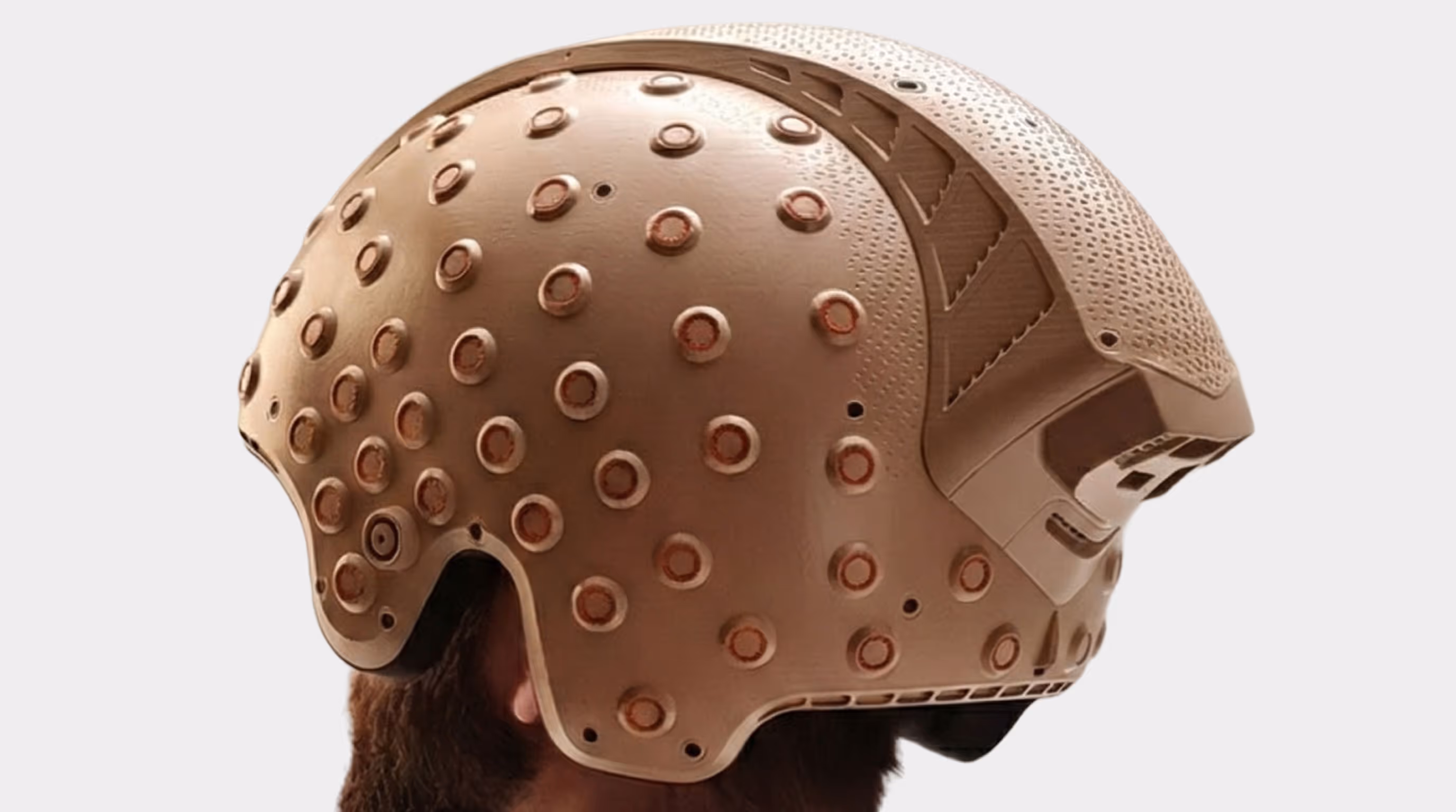
brain.space started as a focused idea: build a platform that lets research labs collect and manage neural data. EEG signals, cognitive task results, physiological measurements. The kind of data that previously lived in spreadsheets, on local hard drives, in proprietary lab software that hadn't been updated in a decade. There was a real gap — neuroscience research had gotten sophisticated, but the infrastructure for managing the data hadn't kept up.
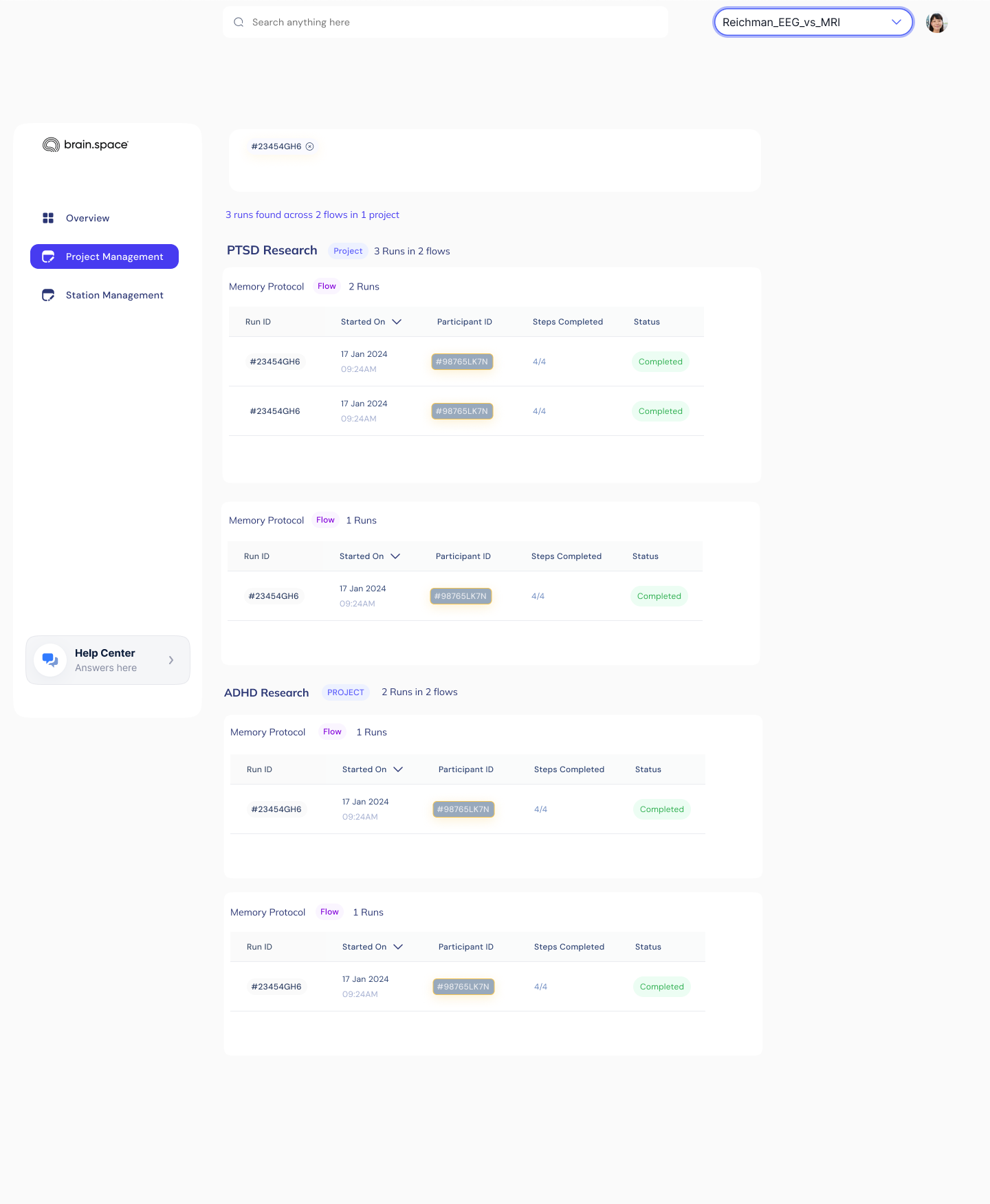
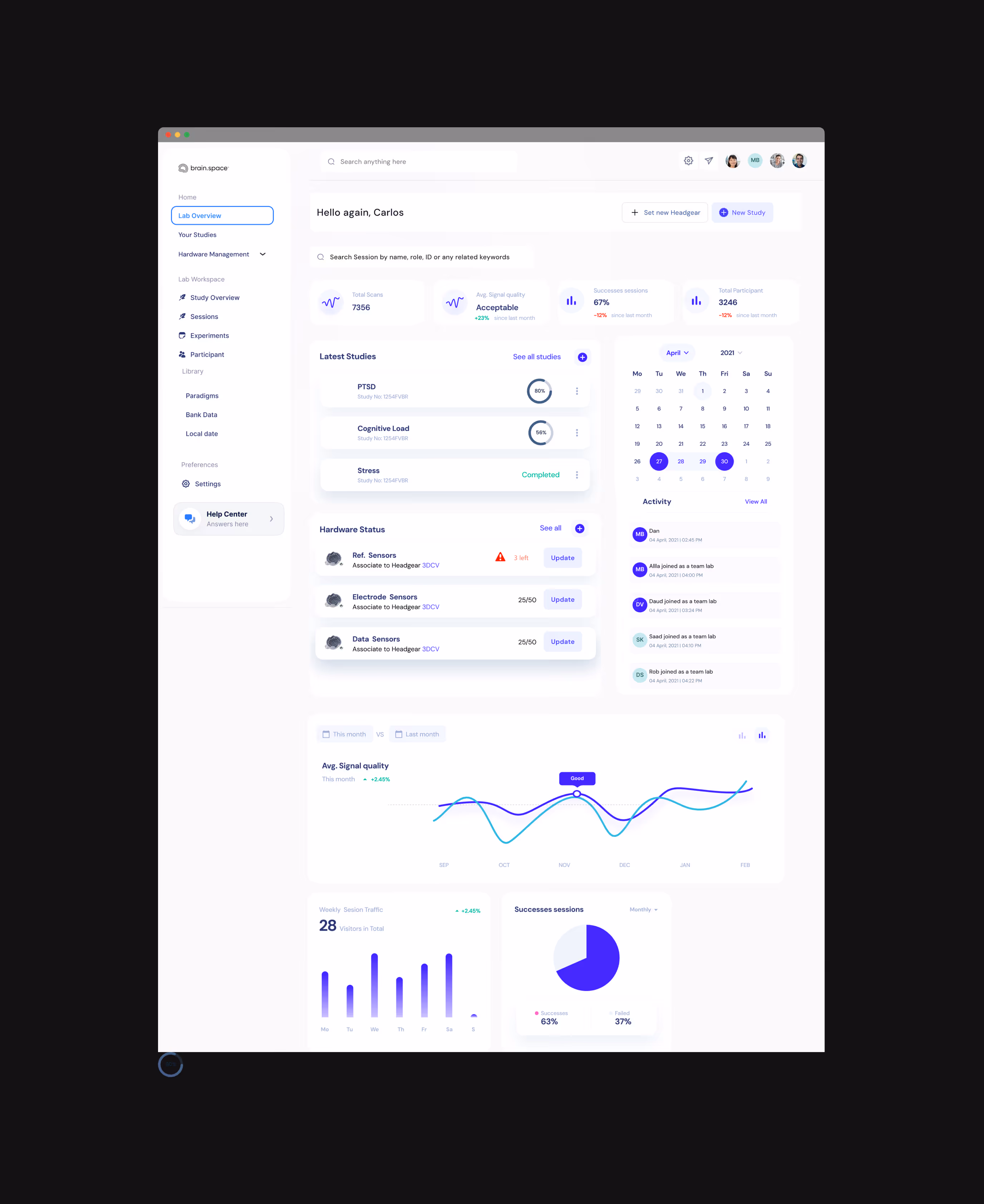
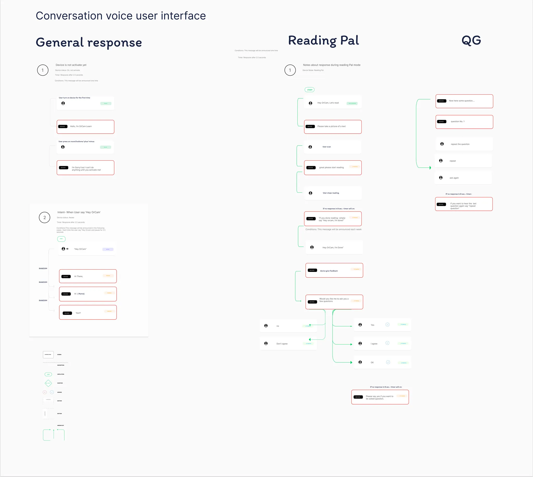
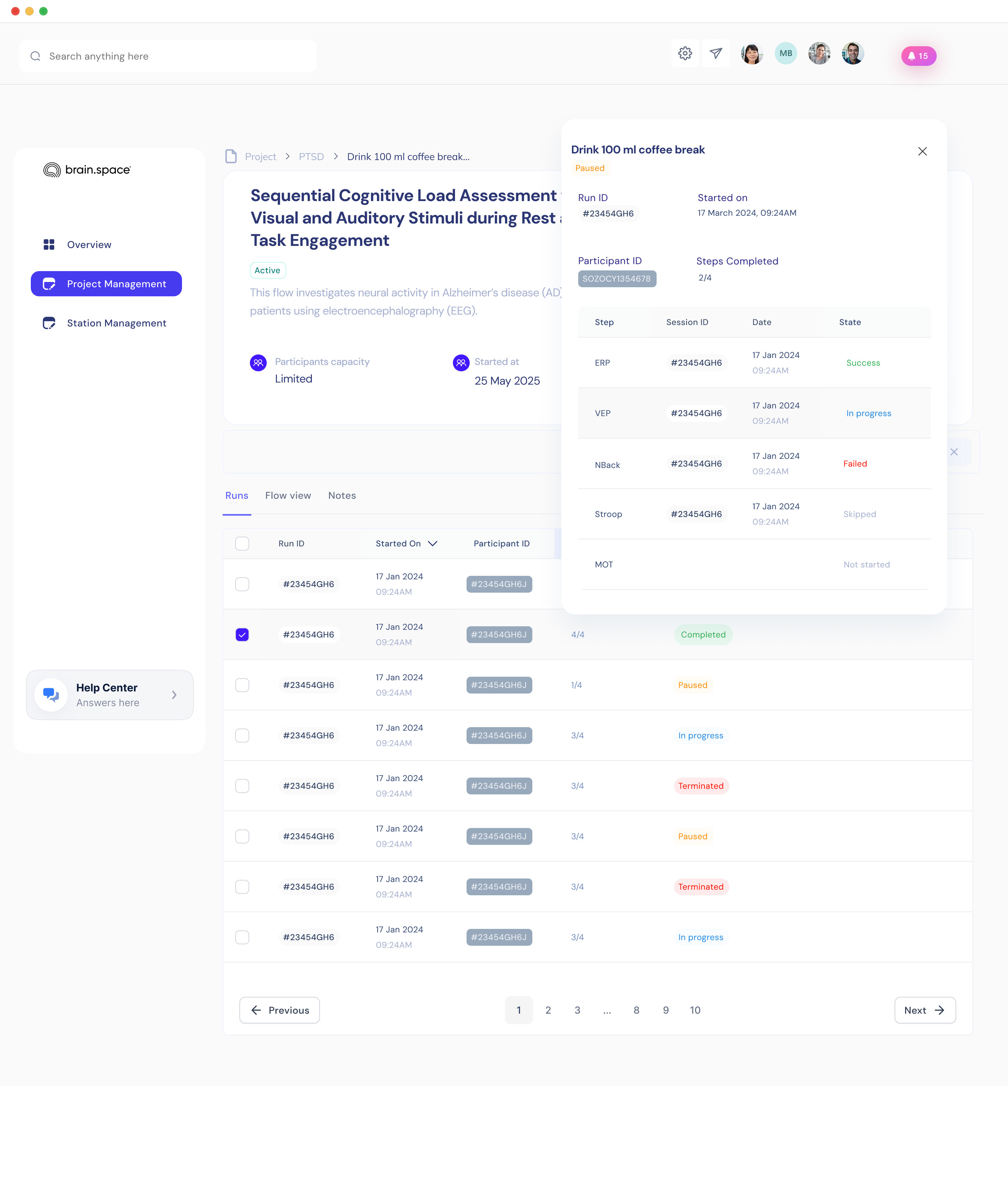
By the time I joined, the product had a working structure. Projects contained Flows — experimental protocols. Flows contained Runs, individual executions with a participant. Runs contained Sessions, the granular recordings. A clean hierarchy, a dashboard with completion rates and signal quality. The kind of thing you can explain in three bullet points in a pitch deck.
My closest collaborator was the product manager. We built the information architecture together, though he owned it. I remember arguing with him for days about whether Runs needed to be a separate entity from Flows — I thought it was over-engineered. He was right that they did. That kind of negotiation defined how the product got built.
The complication came from the customers. Labs weren't the only ones interested. Neurologists running experimental treatments saw the platform as a way to track patients over time. And a researcher and a clinician use the same data in completely different ways. That tension is where the design problem really began.
"Management wouldn't choose a user, and I finally understood they were right — telling a small startup to drop half its market is telling it to die a little. So I stopped asking them to choose and asked what I was allowed to give up instead."

Four Seconds That Broke the Map
The turning point involved user research — and a budget fight. Tell me about that.
I pushed for user research, and I had to fight for it. Twenty-five hundred dollars. That sounds trivial, but in a small startup, asking for budget to validate something everyone assumed they already understood was a hard sell.
The pushback was essentially: we know our users, why are we paying to confirm it.Then I made a decision I think mattered more than the budget itself. I refused to run the research on Figma mockups. Static screens tell you what people think they'll do. They don't tell you what people actually do. So I spent two weeks building a working prototype in Lovable — real data, real interactions, the whole thing clickable and live.
That distinction — between what people say and what people do — turned out to be the entire project. If I'd tested mockups, I'd have shown users a picture of the hierarchy and they'd have nodded and said yes, that makes sense, I'd click here.
And I'd have learned nothing. The prototype was the only thing that could have caught what happened next.I want to be honest that this wasn't pure methodological wisdom. Part of it was instinct, part of it was stubbornness. But it's the decision the whole story hinges on. You don't get the four-second moment if you're showing someone a screenshot.
"I refused to test on Figma mockups. A screenshot tells you what someone thinks they'll do. You only get the four-second moment if the prototype is in real environment ."
Personas Lie, Intent Doesn't
What did you actually see when you compared how the two users worked?
Once I stopped defending the hierarchy and started watching, the difference between the two users became sharp. They were both ignoring the structure, but they were ignoring it in opposite directions.Gil is building a dataset from scratch.
There's no prior research on what he's investigating — he's generating the evidence. When he opens the system, he wants to slice across everything: give me all sessions where the paradigm is Stroop, the age is 25 to 45, the signal quality is acceptable. He doesn't know what he's looking for yet. The slicing is the research.
The clinician in Cyprus, Dr. Mavridou, is tracking individual patients through experimental treatment. Each patient comes in every few weeks. She wants one person's story — is this patient's P300 amplitude improving session over session, is the treatment working for them specifically.
She wants depth on one individual, not breadth across thousands.So I started thinking about it geometrically. Gil takes a horizontal cut — one slice across thousands of sessions. Mavridou takes a vertical cut — one person followed down through time. The researcher sees a catalog. The clinician sees a story. Same data, same system, two completely different modes of time. And critically, the same underlying action — both of them are slicing. Just along different axes.
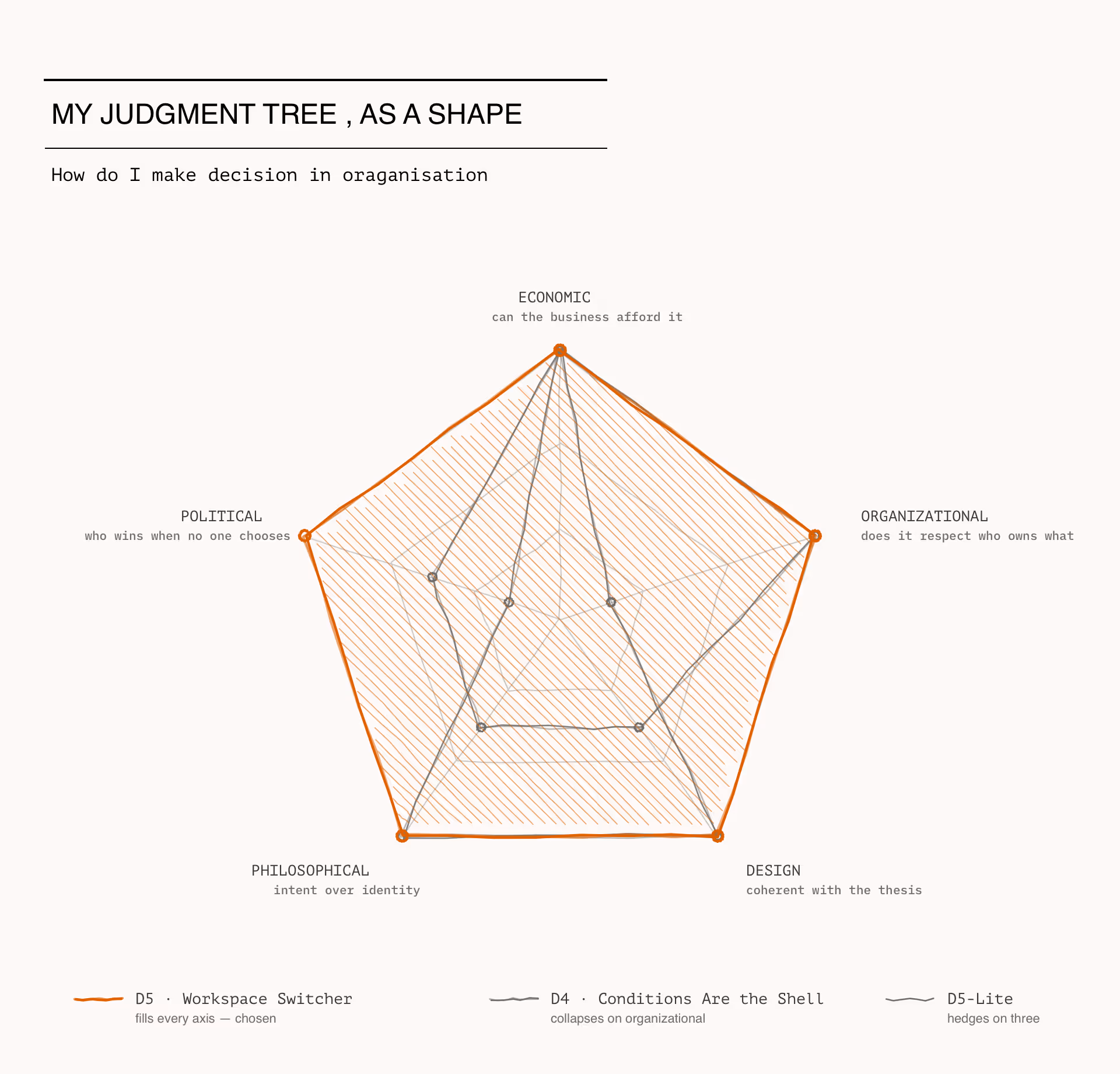
"As personas, Gil and Mavridou are irreconcilable — pick one. As intents, they're almost identical: both are slicing, just along different axes. That reframe is the entire reason brain.space needed one product instead of two."

Sketching My Way Past the Wall
Underneath the design problem was an organizational one — management wouldn't pick a user to optimize for. How did you navigate that?
That was the real constraint, and for a while I treated it as an obstacle. I went to management and said we have to choose — are we a research tool or a clinical tool. They said no. We need every customer, we're a startup, we can't afford to lose either market. I read that as cowardice at first.
Refusing to make a hard call.But the more I sat with it, the more I realized they weren't wrong. They genuinely couldn't afford to lose either customer. Telling a small startup to abandon half its market is telling it to die a little. The constraint was real, not lazy. So the question shifted from "how do I make them choose" to "how do I honor both without compromising either."
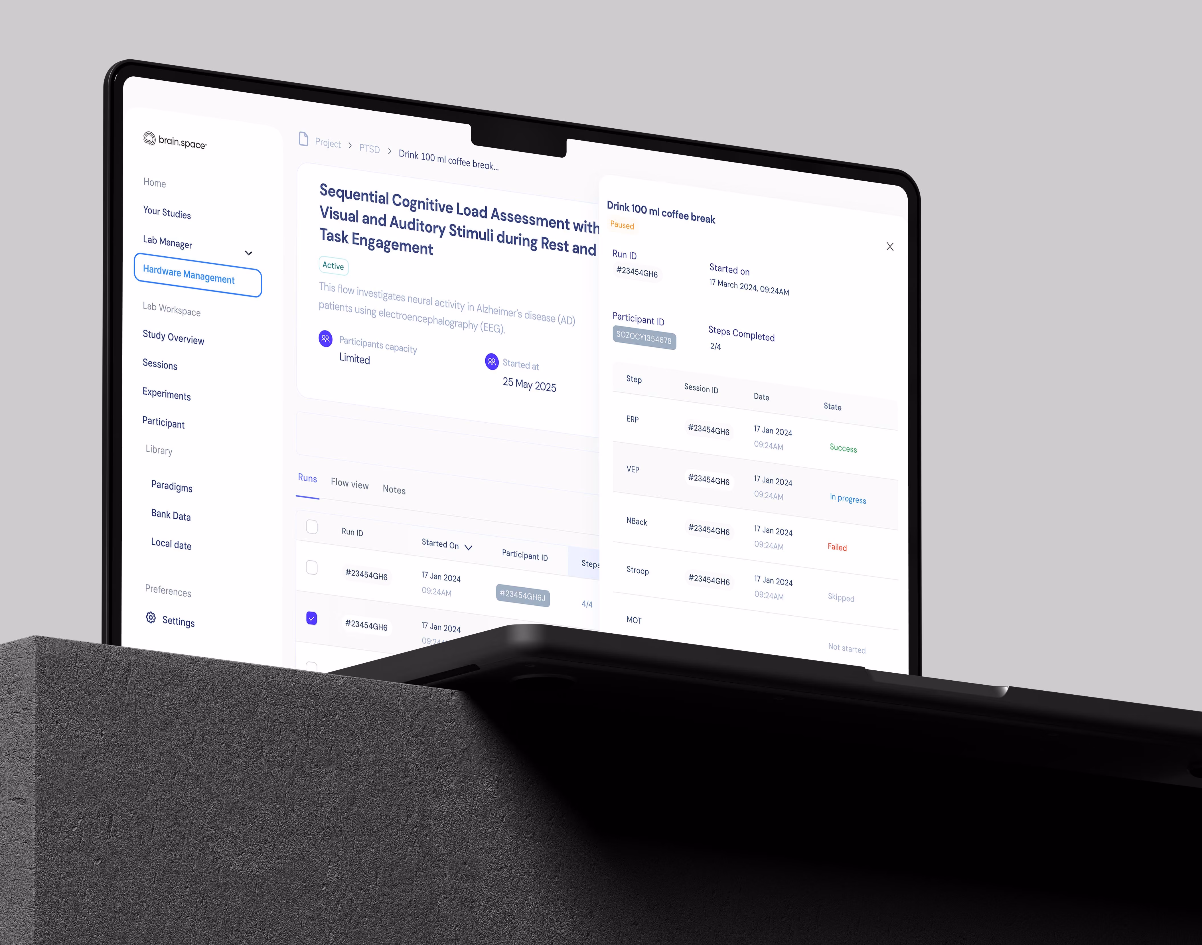
That forced me to be precise about what was actually non-negotiable. Two things. The first was user research — that's your eyes, you don't give those up. The second was the information architecture. Once the data layer is built, it's built. You can't ask the dev team to rebuild the database every time the UI shifts, and that schema wasn't even mine to trade away. It was the product manager's.
So I drew a line. I wouldn't compromise on research, and I wouldn't compromise the architecture. But the UI layer — the surface, the navigation, the affordances — that was flexible. That's where I had room to move. Knowing exactly what you're allowed to give up is, I think, half of working inside an organization.
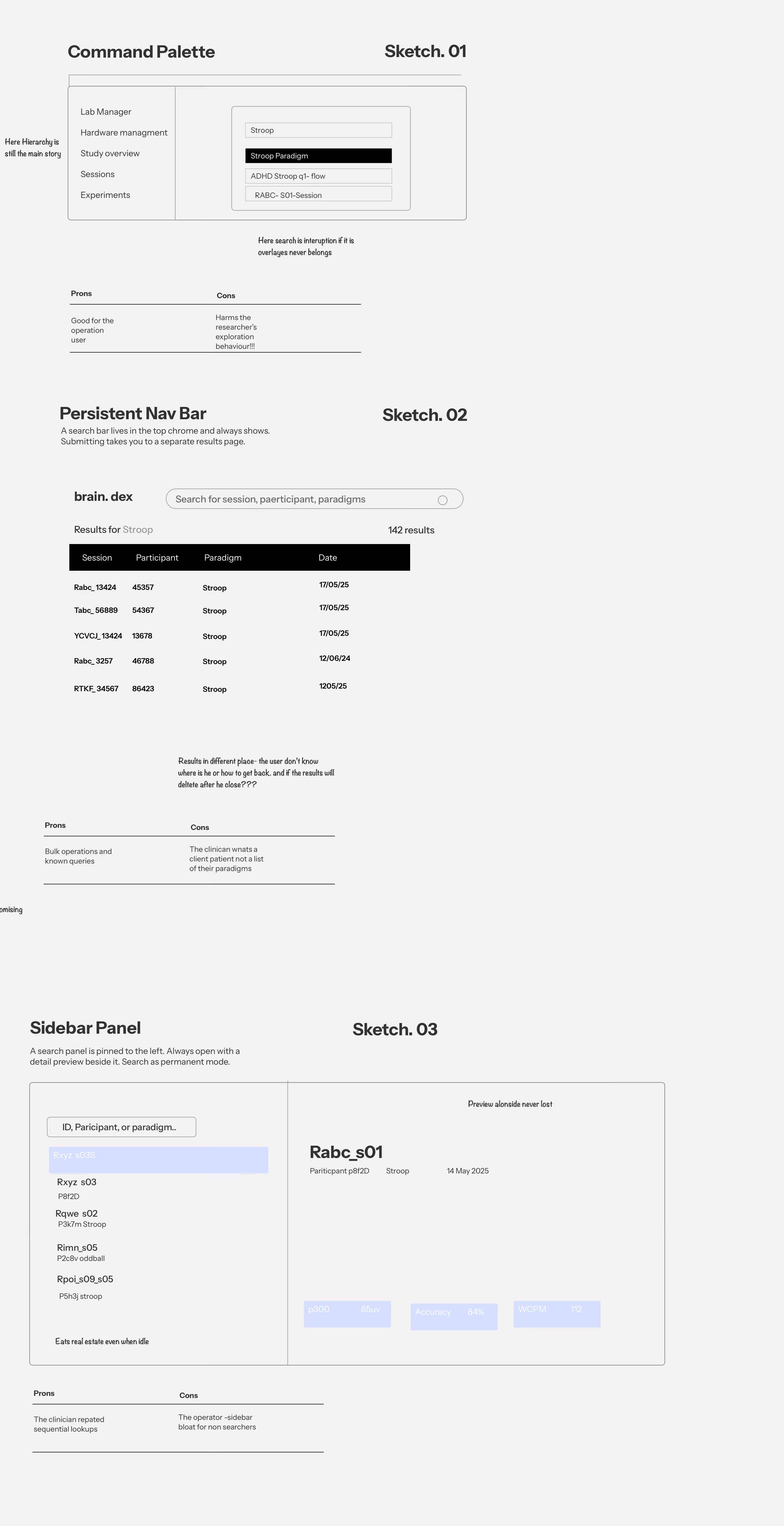

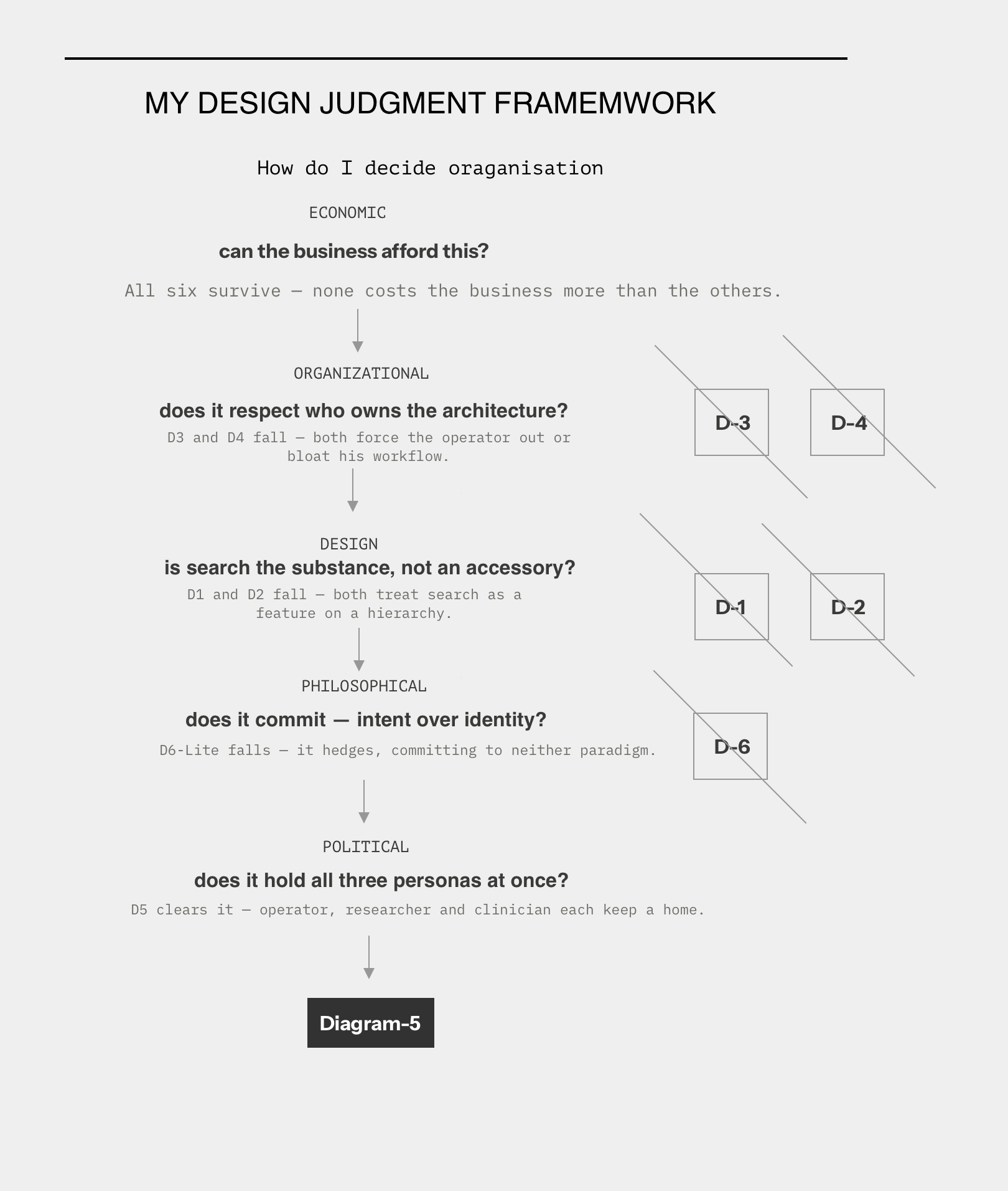
You went through six sketches before the solution appeared. What did the act of sketching reveal that thinking couldn't?
I started where everyone starts — three standard patterns. A command palette like Linear. A persistent search bar leading to a results page like GitHub. A sidebar panel like VS Code. I sat with those three for two days and felt increasingly uneasy, like I was being asked to pick the color of a wall when the real question was where to build the house.What all three had in common was the assumption that search is a component inside a product. Something you add on top of the hierarchy. They disagreed about where to put it, but they agreed it was an accessory. And that didn't match what Gil had shown me. He didn't want search that helped him use the product. For him, search was the product.?
"He took control of my screen, typed three characters, and in four seconds cut straight across the hierarchy I'd spent months building!!! I could have called him an edge case. Two users doing the same thing isn't an edge case — it's a signal."
The User I Almost Broke
There's a conceptual shift in here — moving from personas to something you call intent. What changed in your thinking?
The breakthrough was realizing I'd been asking "which persona matters more" when the question should have been "what action are they actually doing." Personas describe people — Gil is 38, has a beard, bikes to work, drinks too much coffee. None of that tells me what he needs when he opens the system at nine in the morning.
What tells me something is the sequence of actions he takes in the first thirty seconds. That sequence is repeatable. It's measurable. And crucially, it's portable — the intent "discover a pattern in unstructured data" applies to Gil, but also to any researcher doing that kind of work. The persona is locked to one person. The intent travels.
This is the difference that decided whether brain.space needed one product or two. As personas, Gil and Mavridou are irreconcilable — different people, different goals, pick one. As intents, they're almost the same. Both are slicing.
They just slice along different axes. That reframe is what made the whole thing designable.It also changed what I could measure. You can't put "is Gil satisfied" into analytics. But you can track whether someone completed a slicing operation, where they got stuck, how often they came back to a saved query. Personas are stories you tell yourself in a workshop. Intents are things you can actually build for and instrument.
"The fifth sketch killed the results screen. The chips became the question, the table became the answer, and they lived on the same page. That's when I knew search wasn't a feature inside the product — it was the product."
Heading
The solution — Direction 5 — almost broke a third user you'd nearly forgotten. How did that resolve?
Right when I thought I had it, I remembered the student. I'd seen her in a video Mavridou sent — the operator who actually runs the equipment in the lab. She's not a researcher and not a clinician. She opens a new run, picks a protocol, enters a participant ID.
Linear, step by step. She doesn't want chips. She wants a wizard.The conditions-first design I'd just fallen in love with would have fixed Gil and Mavridou and completely broken her. And she's not even the paying customer — the labs are — but if she can't operate the equipment, nothing works. So I couldn't just optimize for the two users who'd shown me the insight. I had to hold all three.
The answer came from Slack, of all places — the workspace switcher. Not switching between organizations, but between ways of working inside the same one. So: two modes. Build mode looks almost exactly like the existing system — the hierarchy, linear navigation, creation, execution. Nothing breaks for the student.
Explore mode is the conditions shell — chip strip, saved views, the data table. Inside Explore, a view toggle renders the same conditions three ways: Sessions for Gil's catalog, Patient for Mavridou's single-person story, Cohort for when she wants to see a trend across all her patients.And here's the part that mattered organizationally: none of this touched the data layer. The schema stayed exactly as the product manager built it. He didn't have to violate a single thing he owned. He built a house. I added a door. I'll also be honest that the Cohort view was a hypothesis, not a research finding — Mavridou never asked for it. I designed it from understanding her role, and I think that distinction matters enough to say out loud.
“Skyspaces are among Turrell’s most recognizable works: enclosed chambers that frame an opening to the sky (often called an oculus), paired with carefully calibrated lighting that changes how the eye reads color, depth, and distance. At ARoS, the approach is deliberately staged?”
What Two Years of Being Wrong Taught Me
Last question. What did this project leave you with?
The honest answer is uncomfortable, because it's really about how little we actually listen. Designers love to say we listen to users. Mostly we don't. We listen to the loudest stakeholder, to the deadline, to our own assumptions about what we already know how to build.
Real listening is rarer than that.Real listening is watching someone use the thing you made and letting yourself be wrong about it. Gil took control of that prototype, went straight to search, and showed me in four seconds that the map I'd been handed was the wrong map. I could have defended it. The entire outcome of the project hinged on the fact that I didn't.
What I'd take from this — and I hold it loosely, because I might be wrong — is that the era of hierarchical software might be quietly ending. Users never navigated the way we designed them to. They always cut across.
And now, with AI agents that receive an intent and return a result, the hierarchy is becoming invisible to the thing using it. The intent is everything.The cleanest way I can say it is this: the best design decisions I've made all came after I was wrong about something. The worst ones came when I was sure. brain.space was two years of being usefully, productively wrong — and it taught me more than any project where I was right from the start.
“Skyspaces are among Turrell’s most recognizable works: enclosed chambers that frame an opening to the sky (often called an oculus), paired with carefully calibrated lighting that changes how the eye reads color, depth, and distance. At ARoS, the approach is deliberately staged?”