Overview
LifestyleFeatures
May 2025
Typography as Direction: Choosing Fonts for Film & Web
UC2
y22
Company
orcam
Year
2022-2023
Synopsis
orcam learn for school-
When the Data Had the Wrong Audience
Background
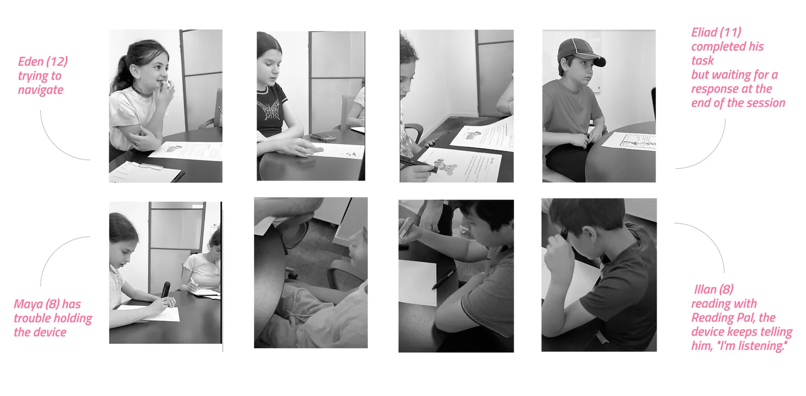
OrCam is an Israeli company building AI-powered assistive devices; in 2022 it released OrCam Learn, a device that reads text aloud and assesses reading comprehension for students with reading difficulties. I was the UX designer lead and led the team to buid the web app dashboard around it — responsible for research, information architecture, and interface design. I joined to solve a specific problem: the device generated rich data about how children read, and someone had to figure out how to turn that data into a tool the people supervising those children could actually use.
Deliverable
User interviews
Information Architecture
Wirframes, componets, layout
User flow
Concept exploration
usability testiong
analytics
Credits
Sarai Beris: Product Designer
Noa Elbaz:Product Designer
Michael Druker: Product Manager
Typography as Direction: Choosing Fonts for Film & Web

About
Tags
Saas B2B
Position
Design, Research
Year
2025
OrCam's flagship product was a small clip-on camera that read text aloud to students with reading difficulties. The device was technically remarkable. But the project Roni was handed wasn't about the device — it was about the dashboard built around it, and a question nobody had thought to ask: when a machine quietly measures how a child reads, who is that information actually for?
The Brief That Seemed Obvious
When the Data Had the Wrong Audience
Let's start at the beginning. What was brain.space, and how did this project come to exist?
OrCam Learn was a device that helped students with reading difficulties — it could read text aloud, ask comprehension questions, and quietly track how a child engaged with written material over time. The hardware was the headline.
My job was the software around it — specifically, a web dashboard for the people supervising the child's learning.The brief, as it came to me, seemed almost self-evident. Build an analytics dashboard. Show reading progress. Make the data the device collects visible and useful. There was an assumption baked into that brief, and at the start nobody questioned it, including me — the assumption that the dashboard was for parents.
It made sense on paper. Parents buy the device. Parents care about their child's progress. Parents are the emotional stakeholders. So of course you'd build the analytics for them. That was the starting position, and I began designing toward it without much doubt.
I want to be honest that at this stage I wasn't doing anything clever. I was executing a reasonable brief in a reasonable way. The interesting part of this project didn't come from my brilliance — it came from the moment the obvious assumption turned out to be wrong.
"Teachers didn't want to scroll a list. They wanted to cluster every child with the same problem and fix it together. So 'sort by specific problem' wasn't my idea — it was a transcription of how they already worked."
Four Seconds That Broke the Map
Let's start at the beginning. What was OrCam Learn for School, and what were you asked to design?
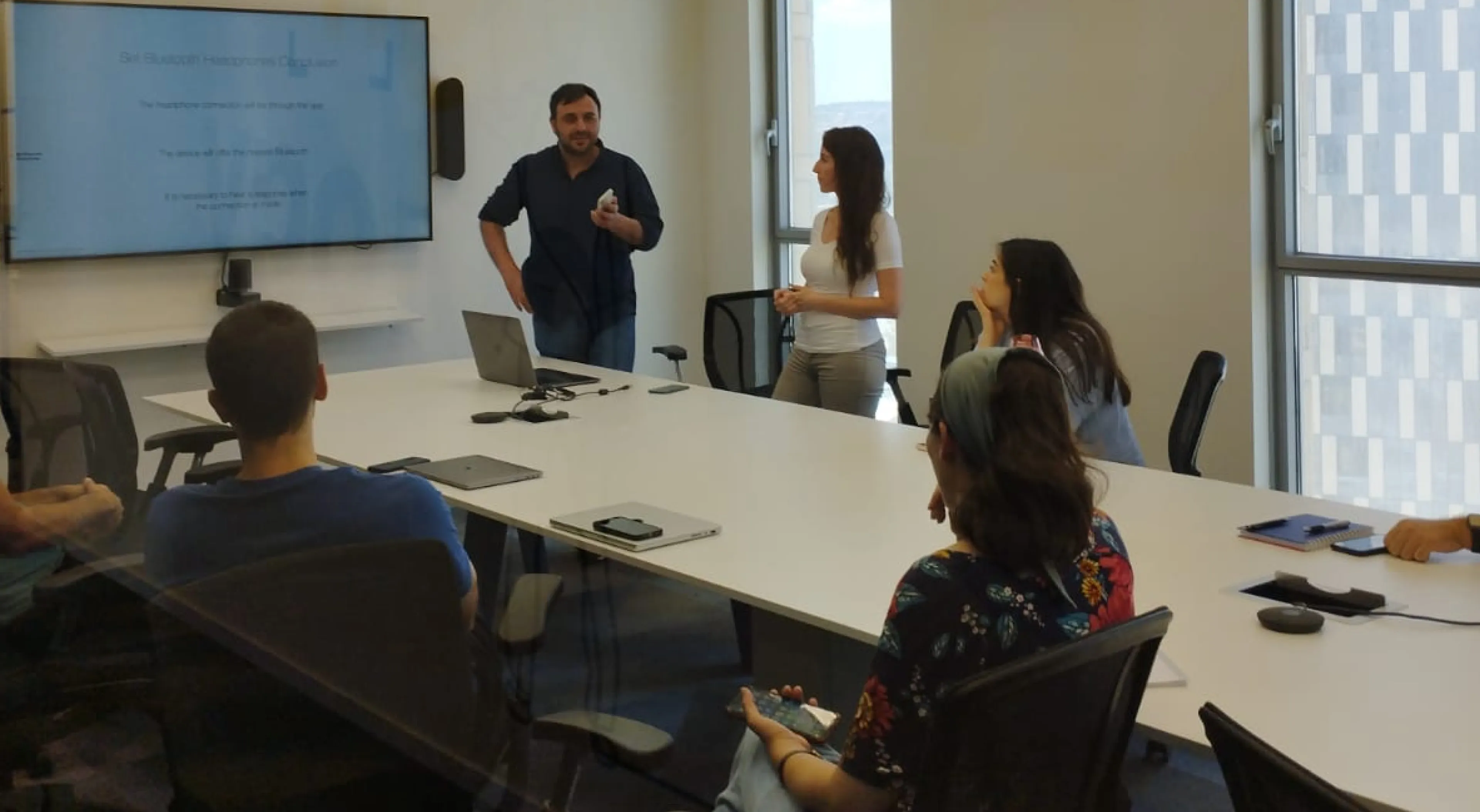
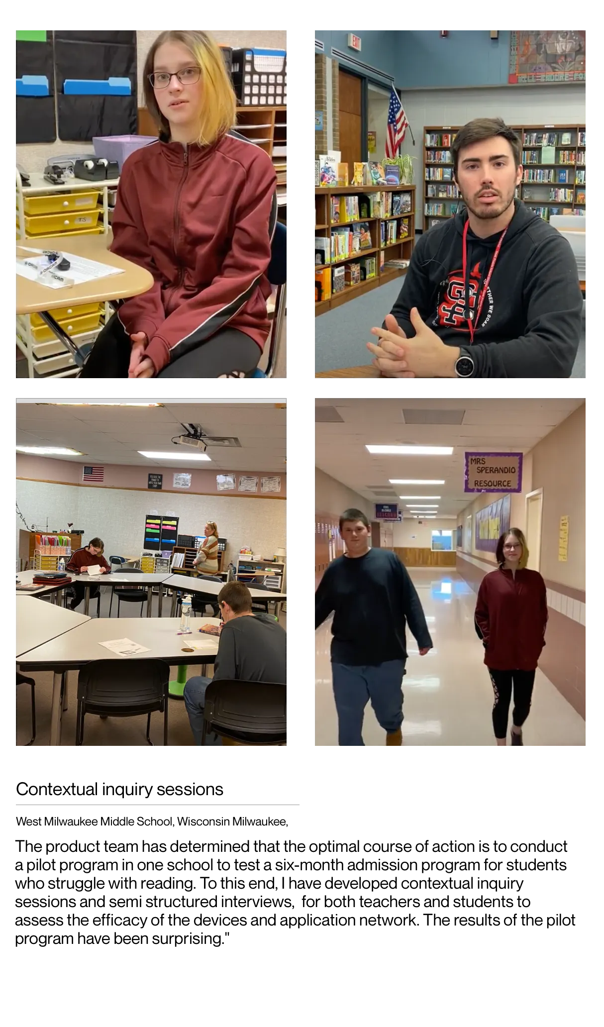
I pushed for user research, and I had to fight for it. Twenty-five hundred dollars. That sounds trivial, but in a small startup, asking for budget to validate something everyone assumed they already understood was a hard sell.
The pushback was essentially: we know our users, why are we paying to confirm it.Then I made a decision I think mattered more than the budget itself. I refused to run the research on Figma mockups. Static screens tell you what people think they'll do. They don't tell you what people actually do. So I spent two weeks building a working prototype in Lovable — real data, real interactions, the whole thing clickable and live.
That distinction — between what people say and what people do — turned out to be the entire project. If I'd tested mockups, I'd have shown users a picture of the hierarchy and they'd have nodded and said yes, that makes sense, I'd click here.
And I'd have learned nothing. The prototype was the only thing that could have caught what happened next.I want to be honest that this wasn't pure methodological wisdom. Part of it was instinct, part of it was stubbornness. But it's the decision the whole story hinges on. You don't get the four-second moment if you're showing someone a screenshot.
"I'd built one comprehension graph with everything on it. Teachers kept asking what it was telling them to do. So I split it in two — one signal each — and added nothing that required new learning."
A Crack in the Assumption
When did you start to suspect the assumption was off?
It started when I actually examined what the device was measuring. The data was genuinely sophisticated — reading fluency, comprehension rates, where a child hesitated, what kind of text tripped them up. And the more I looked at it, the more I had this quiet feeling: this is clinical data.
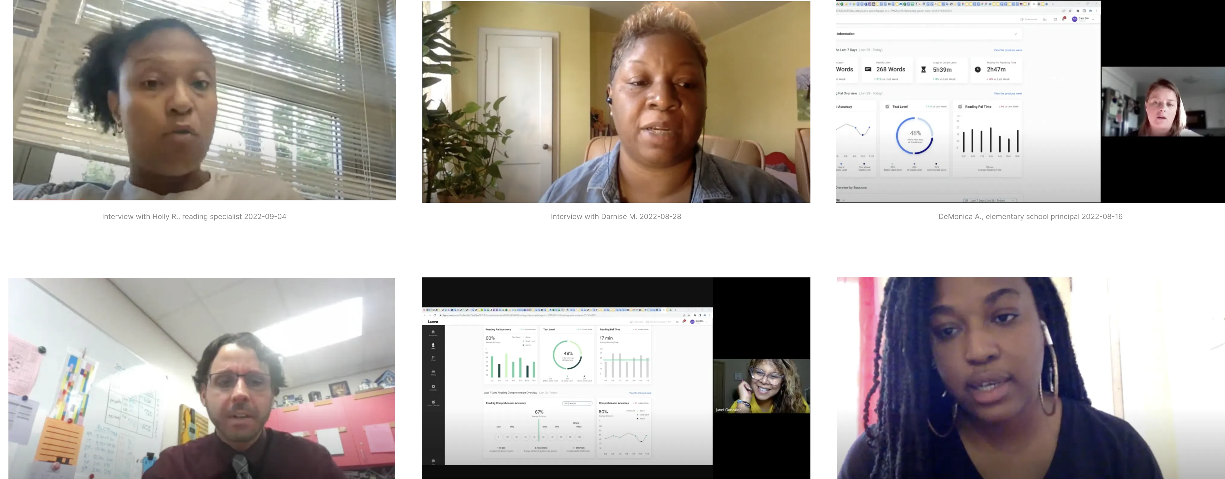
This is the kind of thing that takes training to interpret.So I asked the question that should have been asked at the start. Not "how do we show this to parents" but "can parents actually use this?" And to answer it honestly, I needed to talk to the people on both sides — parents and teachers. The product manager and I set up interviews. I wrote the scripts and questions, he ran most of the sessions.
What came back reframed the whole project. Teachers lit up at the data. They had a professional framework for it — they knew what a fluency score meant, they could distinguish a child compensating from a child improving, they could turn a number into an intervention by next week. The data was oxygen to them.Parents had the opposite reaction.
The same numbers made them anxious. They didn't know what a comprehension score of 62 meant or what to do about it. The information didn't empower them — it made them feel like they were failing a test they didn't know how to study for.
"A teacher has ninety seconds before a student walks in. A ranked list of scores is data. A prioritized list of who-needs-you-today is a decision. I wanted the dashboard to hand her a decision."
The Reframe
So the dashboard you'd been building for parents was actually a teacher's tool. What did you do with that?
I stopped treating it as one dashboard with one audience and started treating it as two fundamentally different relationships to the same data. That reframe is the spine of the whole project. The teachers needed depth and granularity. The parents needed something else entirely — reassurance and direction, not raw analytics.
For the school product specifically, that meant I could finally design for the right user. A teacher isn't a passive recipient of data. She's a professional managing twenty or thirty students, already triaging in her head — who's urgent, who's hiding it, who needs me today. The dashboard had to match the way she already thinks, not impose a new structure on her.
That was liberating, because it freed me from designing for the lowest common denominator. I didn't have to dumb the data down for a parent who'd be overwhelmed by it. I could build a genuine professional instrument — dense where density helped, prioritized the way a teacher prioritizes.
The deeper lesson, which I only fully understood later, was that the same information presented to two different people is essentially two different pieces of information. The data that empowered the teacher was the data that paralyzed the parent. Identical numbers. Opposite effect.
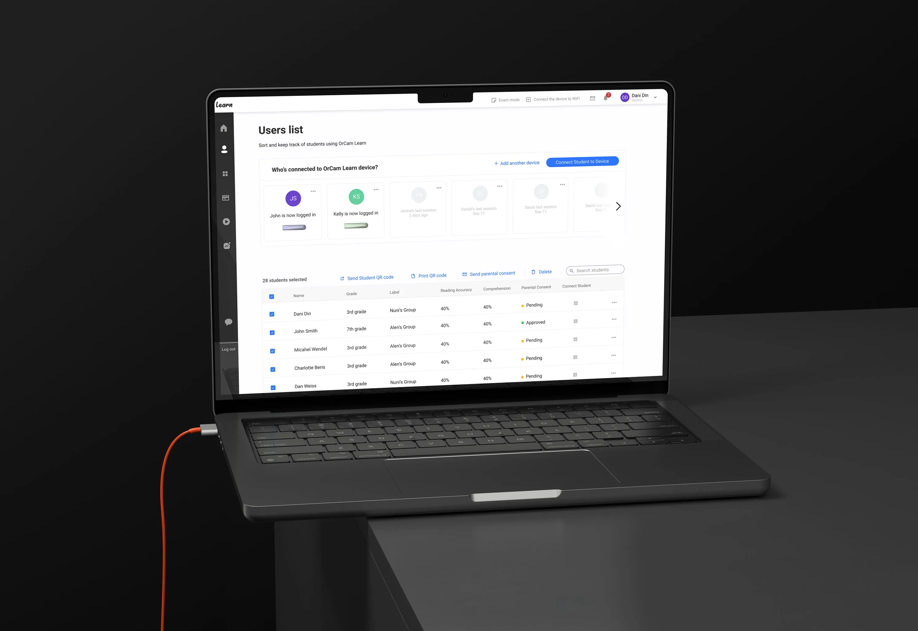
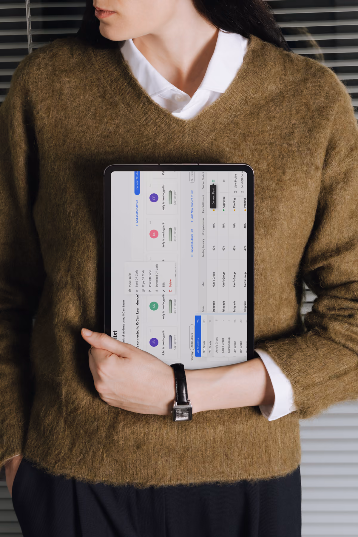
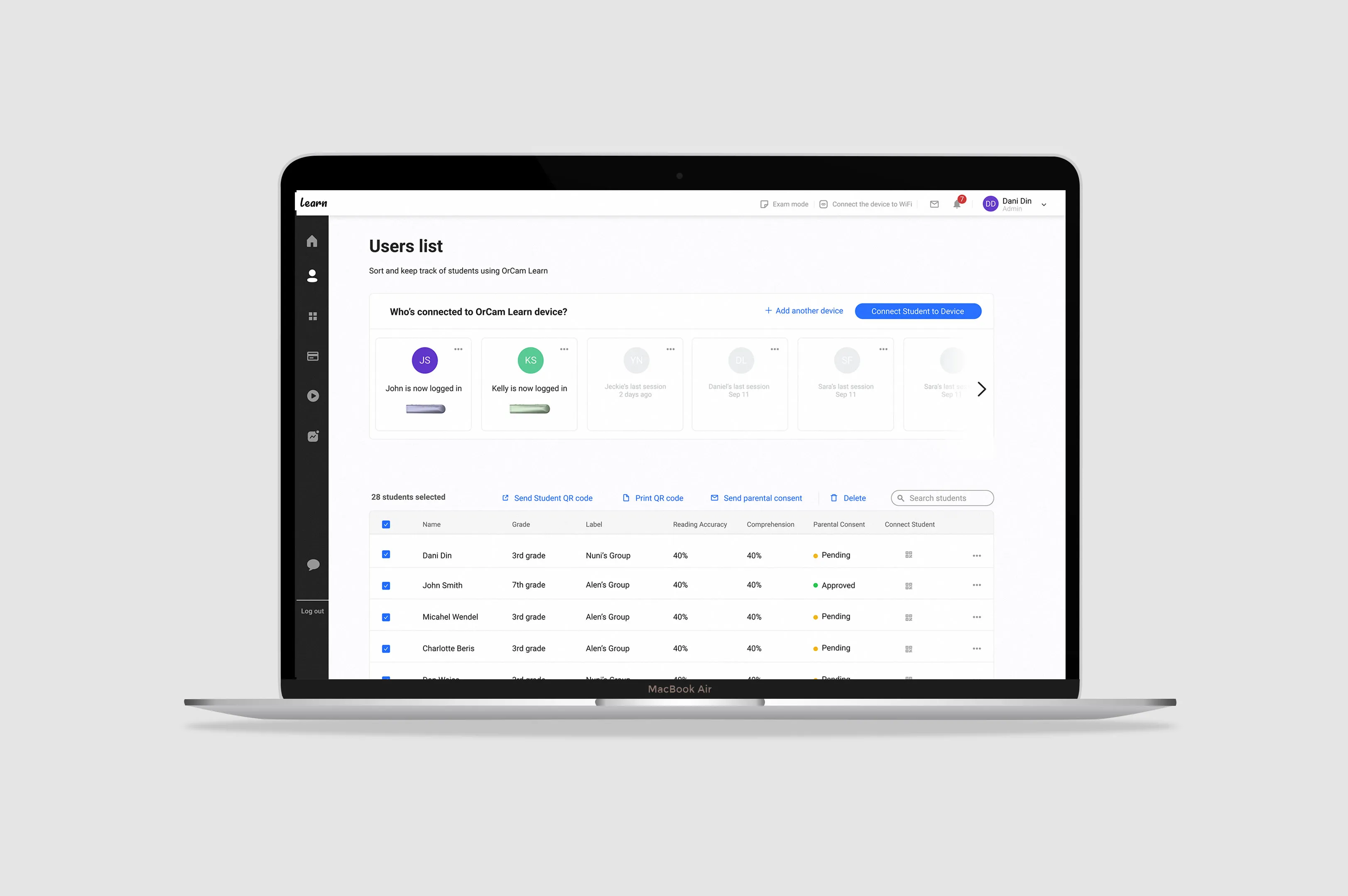
Design Decisions — The Teacher Dashboard
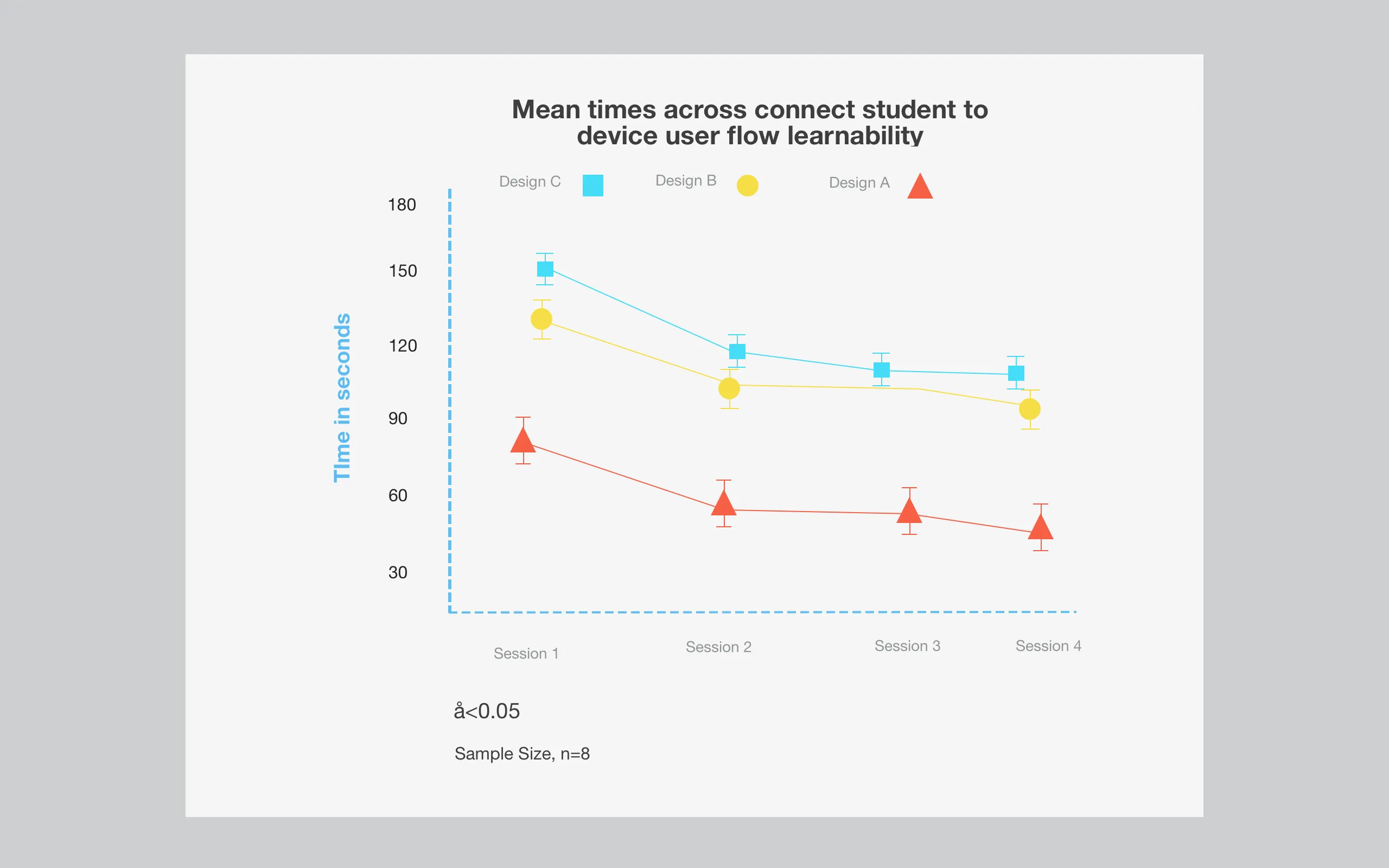
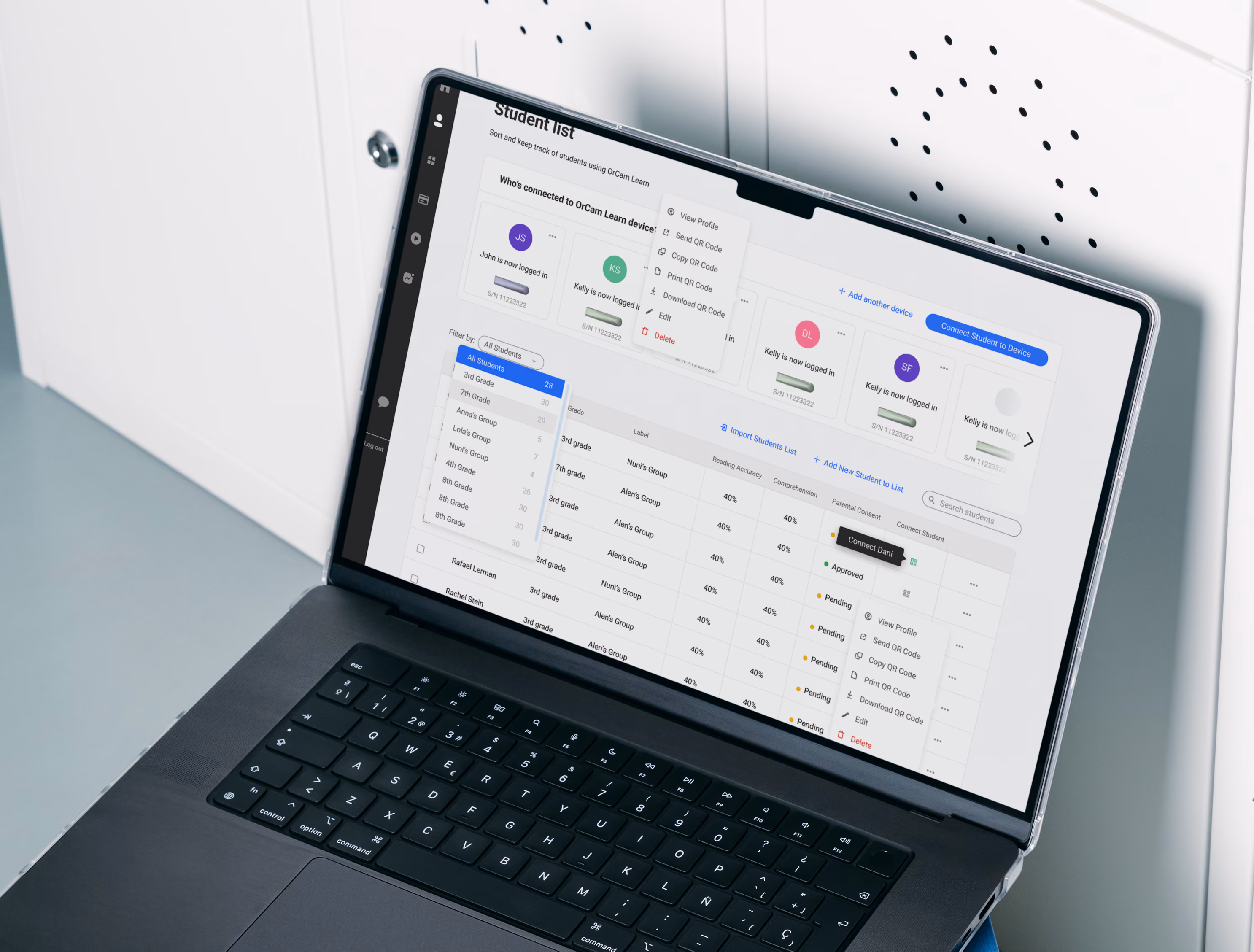
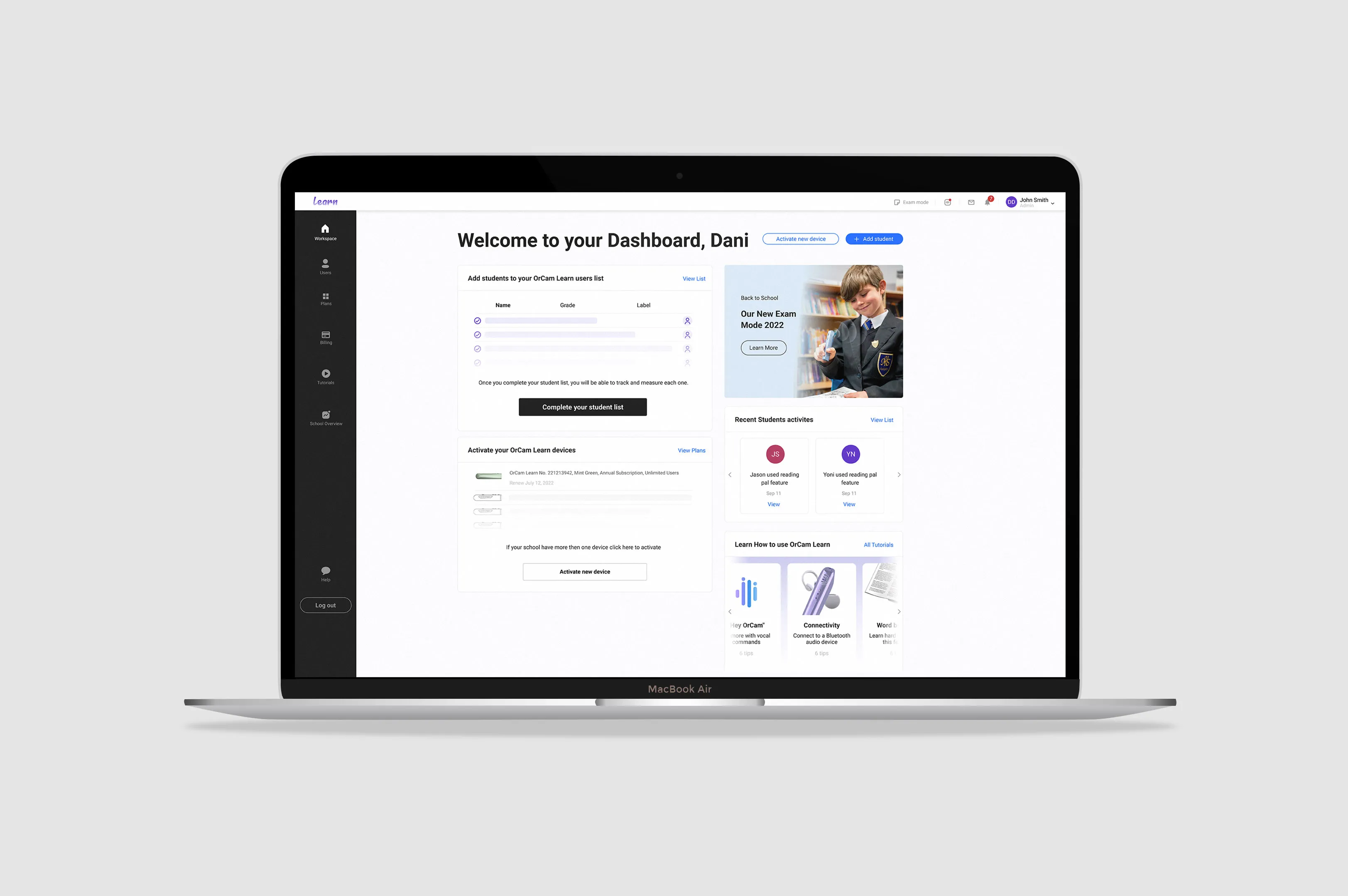
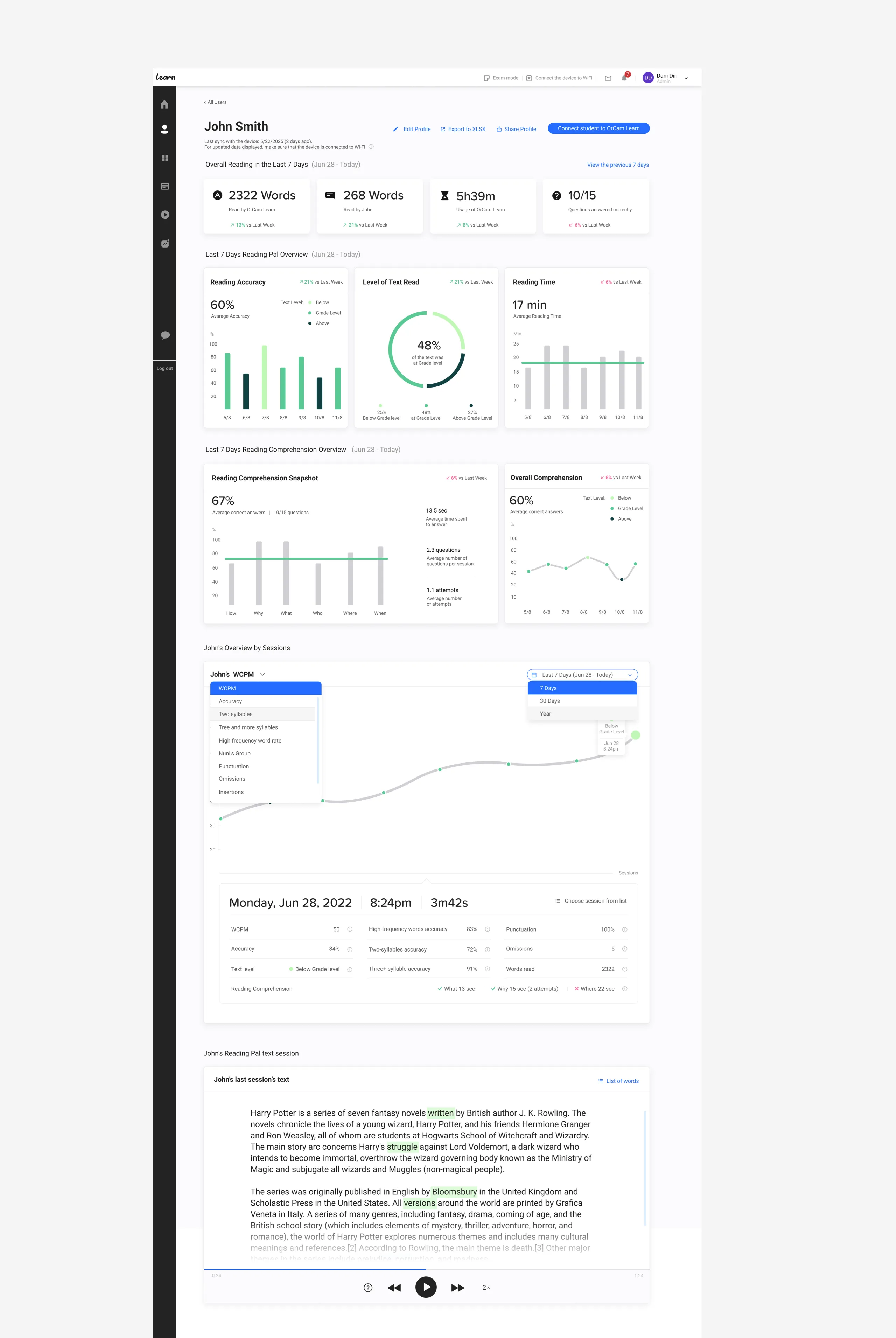
The dashboard reduces a week of device data to four summary cards at the top — words read, usage time, questions answered — because a teacher has about ninety seconds before class, and surfacing every available metric would bury the signal that matters: is this child engaging, and is it working. Below, the comprehension data is deliberately split into two single-signal charts rather than one combined graph, a direct response to usability testing where teachers couldn't tell what a dense multi-variable chart was asking them to do.The lower half shifts from overview to narrative — John's session timeline lets a teacher follow one student's progress over time, with the actual reading passage shown at the bottom, struggled-on words highlighted inline so difficulty appears in context rather than as an abstract score.I started where everyone starts — three standard patterns. A command palette like Linear.
"The same comprehension score that gave a teacher a plan gave a parent a panic. Identical numbers, opposite effect — that's when I realized I was building two products, not one."
Designing for Ninety Seconds
You've said a teacher has almost no time. How did that shape the actual interface?
A teacher opens this dashboard at seven-thirty in the morning and has about ninety seconds before a student walks through the door. That constraint became my design brief more than anything in the original spec.
Every element on the screen was competing for attention that simply didn't exist.So the first question wasn't what to show — it was what to surface first. I built the hierarchy around urgency. Not which student scored lowest overall, but which student needed attention today. A ranked list of scores is data. A prioritized list of who-needs-you-now is a decision. I wanted the dashboard to deliver a decision.
There was a specific failure in testing that taught me a lot. I'd designed a single reading-comprehension graph that showed several variables over time. It made perfect sense to me, because I'd been staring at it for weeks. Teachers couldn't read it. They kept asking what the graph was telling them to do.
So I split it into two separate graphs, each carrying one clear signal — and I resisted adding any further charts that would demand new learning.I also noticed teachers would fixate on the first problem they saw and miss a second one sitting right beside it. So I arranged the problems in a hierarchy — the primary issue prominent with a general tip attached, secondary issues present but quieter. The order things appear in isn't neutral. The sequence itself tells the teacher what to do first.
"A teacher has ninety seconds before a student walks in. A ranked list of scores is data. A prioritized list of who-needs-you-today is a decision. I wanted the dashboard to hand her a decision."
Heading
Was there a challenge in this project you didn't see coming?
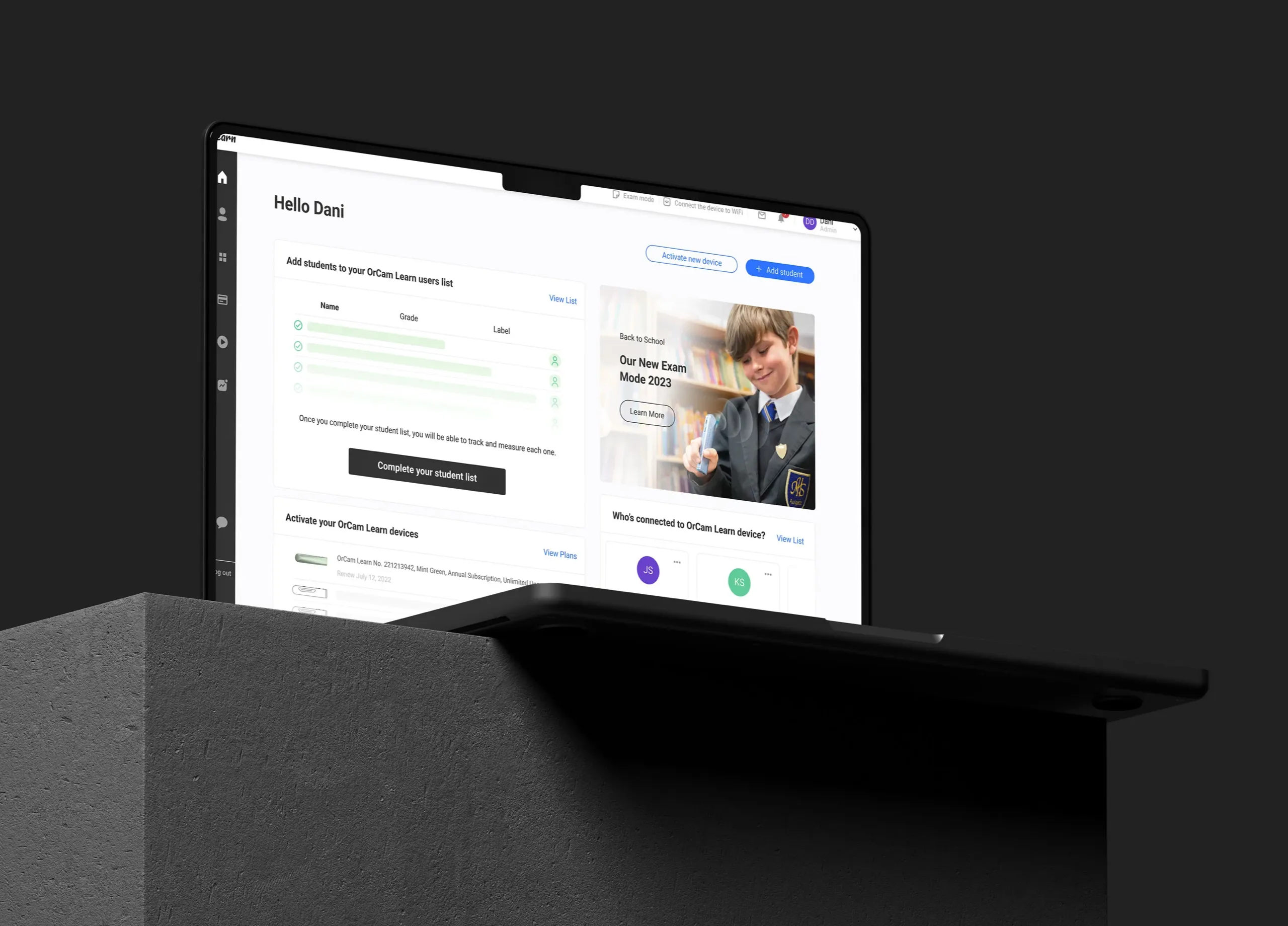
The cross-device problem. This was something I genuinely hadn't encountered before, and it didn't show up in the brief at all. You have a physical device — the OrCam camera the child uses — and a web platform the teacher uses. And somehow the physical device has to register itself as a user in the system.
Our first instinct was the engineering-logical one: activate the device, then have it force-register itself as a user in the platform. Clean from a systems standpoint. Completely confusing from a human standpoint. A teacher connecting a device for a student shouldn't have to understand that the device is "becoming a user" somewhere in a database.
So I had to design an interface layer that absorbed that complexity entirely — that let a teacher connect a child's device without ever being exposed to the registration logic underneath. The technical reality and the human reality were misaligned, and the design's job was to hide the seam.
It's a small part of the project, but it stuck with me, because it's a clean example of a principle I keep returning to. The system's internal logic is not the user's problem. When the architecture and the human don't agree on what's happening, the interface has to take that contradiction onto itself rather than passing it to the person.
What the Research Actually Changed
Heading
Looking at the final design — what concretely came out of the research that wouldn't have existed otherwise?
Three things, very concretely. First, the split of the comprehension graph into two — that came directly from watching teachers fail to parse a single combined chart. Without the usability test, that graph ships as one confusing visualization and teachers quietly ignore it.Second, the sorting.
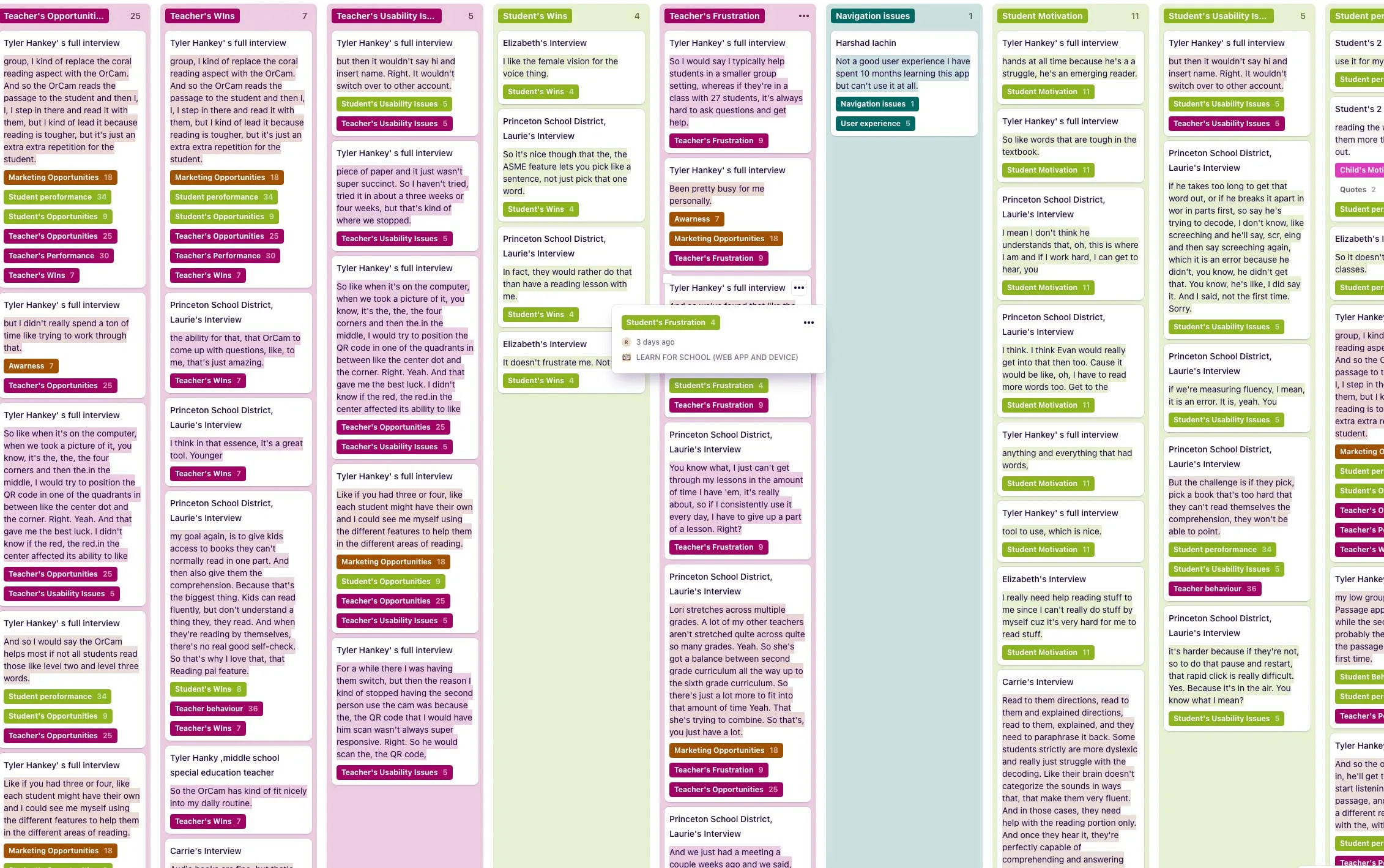
Teachers told me they needed to group students by their specific problem — not just see a list, but cluster everyone struggling with the same issue so they could address it together. So on the users' page I added a "sort by" that included sorting by specific problem type. That's not an idea I had at a desk. It's a direct transcription of how teachers described their work.
Third, and most fundamentally, the entire audience reframe. The original product would have buried teachers' needs under a parent-facing analytics layer that helped no one. The research is the only reason the school product became a genuine professional tool instead of a watered-down family dashboard wearing a teacher's badge.
None of these were aesthetic decisions. Every one of them was a behavioral finding turned into a structural choice. That's the part of the work I care about most — the design isn't the screen, it's the correct reading of what people actually do.